What's your X (formerly Twitter) banner situation? If you're like most brands, you don't pay nearly enough attention to what your X banner actually looks like—you just throw an image in there and go about your life. But optimizing your X profile by including the right X banner size is a powerful yet often overlooked way to share your promotions and content with your followers. If your X banner sizes are off, you look unprofessional. Plus, it's just a waste of excellent space that could be used for marketing. In this article, we're going to share some X banner sizes guidelines so you can make it work for you! In addition to the X banner sizes guidelines, we're going to tell you exactly what you can do to create a X banner that looks good along with some best practices for creating your X banner.
The Best X Banner Size
According to X (formerly Twitter), the best banner size for the platform is 1500x500 pixels with an aspect ratio of 3:1. But that's only part of the story. Creating a X banner to these dimensions isn't going to magically make your X banner look good. You also have to account for the space taken up by your profile picture. Naturally, trying to build your X banner around your profile picture isn't exactly straightforward—the position of your profile image changes depending on the device you're using and the available screen size.
Fun, right?
On a computer, your profile image will cover quite a large section of your X banner while on mobile devices, you'll be able to see more of your X banner. This means you'll need to leave enough space in the bottom left corner of your banner to keep your profile image from creeping into your banner design. Not only that, but the space at the top and bottom of the banner (about 60 pixels for each) tend to get cropped depending on the monitor size or browser being used. When you take the size of your X profile image (400x400 px) into consideration, the "safe area" for your X banner is only about 1500x360 px.
How to Account for Your Profile Image
Now that you know what a sneaky little space hog your X (formerly Twitter) profile image is, let’s talk about what it takes to create a X banner that's sized correctly and looks good... One that doesn't get cropped strangely and that continues to wow visitors as the header and profile image scale across different screen sizes and resolutions. Fortunately, now that you know the best X banner sizes (as well as your actual usable space) it's not going to be as difficult to create a gorgeous X banner as you think. In this section, we're going to cover exactly how you can make sure that your X banner shows up properly.
Once again, X's banner sizes guidelines indicate dimensions of 1500 px by 500px with an aspect ratio of 3:1. Photos can be in JPG, GIF, or PNG formats but it's important to note that X doesn't support animated GIFs for either profile or banner images. X also recommends that your files not exceed 2MB each.
As we mentioned, even if you follow the X banner sizes guidelines, you'll probably still end up with a X banner that doesn't look as good as it could because of the ridiculous scaling and cropping that happens. While X's banner images give you tons of space when you add in the profile image and cropping, you're really left with the purple area seen here:
And this varies depending on the kind of devices viewers are accessing your X profile from. The image above shows how your X cover photo will look on a desktop displayed at full-width. As the screen size is reduced, the amount of space taken up by your profile image will also decrease.
X Banner Best Practices: How to Create an X Banner That Actually Looks Good
X (formerly Twitter) has become one of the most powerful social media platforms for brands and influencers. 82% of all B2B businesses are using X as a marketing tool and about 75% of all businesses have a presence on the platform. And, it's no wonder why: 40% of X users report purchasing something after seeing it on X (Digital Marketing Institute). That's why it's important to make sure that your X banner looks great and is ready to help you generate leads and make sales.
Your X banner is the first thing your profile visitors are going to see when they check out your X account. With a visually appealing and effective X banner, you'll be able to increase brand awareness and put some life behind your marketing campaigns.
PlayStation, for example, is using their X banner to promote Call of Duty: Warzone:
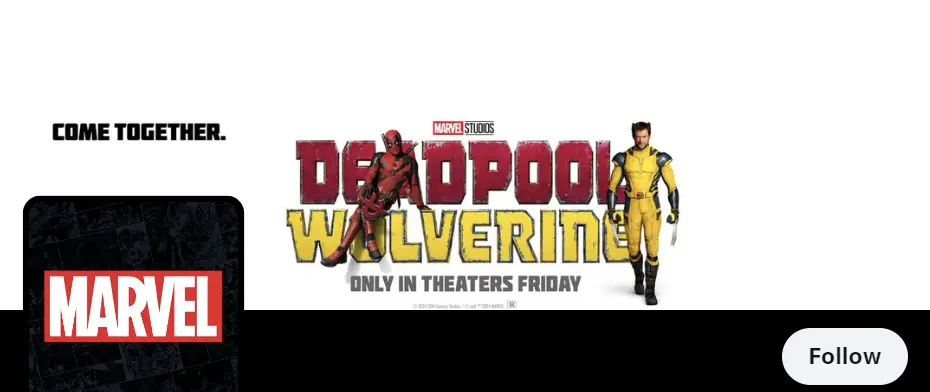
And, Marvel Entertainment is using its X banner to promote the new Deadpool & Wolverine movie:
What's the one thing all of these X (formerly Twitter) banners have in common? They're high-quality. So, that's a great place to start, with high-quality images. But that's not all you can do to make sure that your X banner is bringing in the attention your brand needs and deserves. Let's talk about some other steps you can take to ensure that you're putting your best X banner forward.
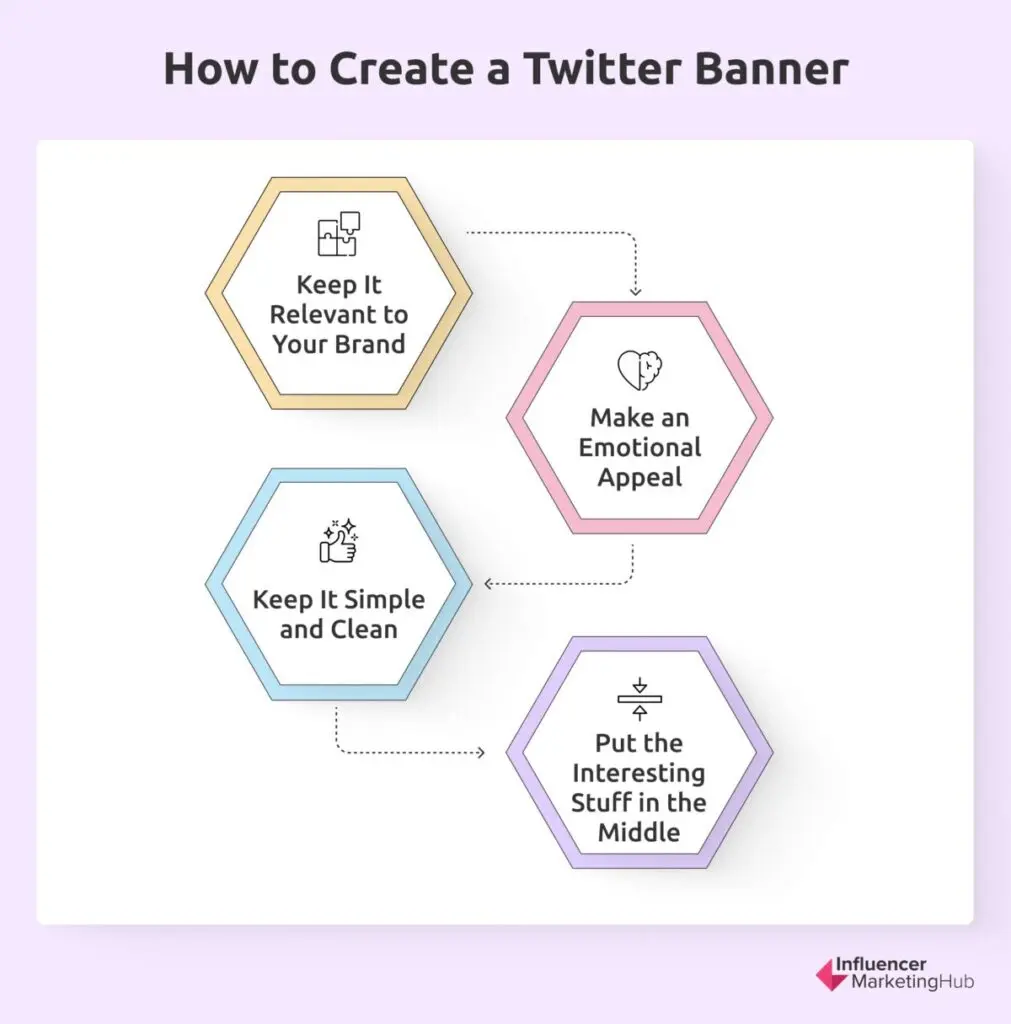
How to create Twitter banner
1. Keep It Relevant to Your Brand
Your X banner should be relevant to your brand and business. No matter what it is you're promoting, your audience should be able to see your X banner and know something about your brand. Bonus points if your X banner supports your marketing message.
2. Make an Emotional Appeal
As with every aspect of your marketing strategy, your X banner should make an emotional appeal. Remember that old adage "a picture is worth a thousand words?" That holds true for your X banner. Just check out this X banner example from diaper brand Pampers:
3. Keep It Simple and Clean
As you already know based on our discussion of X banner sizes guidelines, you don't have a whole lot of real estate to get your marketing message across. That makes it vitally important to present a simple and clean X banner that conveys your marketing message in a concise way while still generating interest and inspiring your visitors to take action.
Because of this, many brands opt to keep their X banners limited to just images. If you're going to use text, keep it simple and easy-to-read. Stick to standard fonts and high-contrast colors to make your X banner accessible from any device. Remember that more than 80% of X users visit the site via mobile devices so a detailed and cluttered X banner isn't going to have the effect you're going for.
4. Put the Interesting Stuff in the Middle
Since your X banner will be cropped and stretched depending on the devices your visitors are using, make sure that you keep the more important aspects of your banner near the center. Use the rest of your space to draw visitors' attention toward what you want them to see. And, make sure that your profile image doesn't cover the important bits of your image no matter what device visitors are using.
Using Your X Header to Make a Great First Impression
Now that you've got some X (formerly Twitter) banner best practices under your belt, you might be wondering how you can go about putting those best practices together to create a X banner that really knocks it out of the park. No matter whether you're a brand or influencer, your X banner should look high-quality and professional. Here are the seven steps to take to create a X banner that makes a great first impression. When combined with the X banner best practices we just covered, you have everything you need to effectively use this often overlooked marketing strategy.
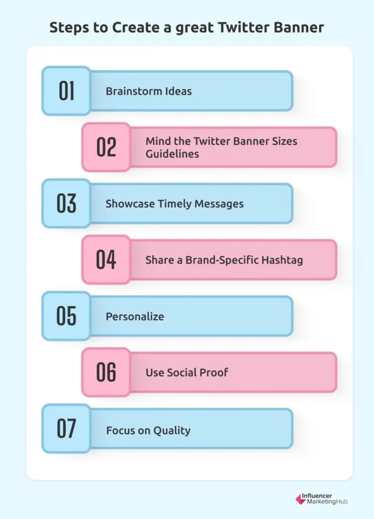
Steps to create a great twitter banner
1. Brainstorm Ideas
Nothing beats a good old brainstorming session to get your creative juices flowing and help you define the image that goes along with your marketing message. Really think about who your target audience is and what type of imagery they like to see. Also, it's important to consider your brand's personality when finding the right imagery for your X banner. If you're a white-collar, professional business brand, you probably won't want to use a cartoonish, illustrated X banner because it's inconsistent with your brand. Choose images that bring to mind the traits you want your target audience to connect with your brand.
2. Mind the X Banner Sizes Guidelines
We've talked a lot about X banner sizes in this article because it's important to make sure that your image doesn't get stretched or cropped and ruin the look you're going for. Plus, if your X banner is going to contain important information, that needs to be placed so it's not cut off in the cropping that happens on certain browsers and at some resolutions and that the important info isn't blocked by your profile image. Your X header should be 1500 x 500 pixels. With a profile image sized at 400 x 400 pixels square and areas that will potentially be cropped, you have about 1500 x 360 pixels to work with.
3. Showcase Timely Messages
Your X banner is a great place to advertise timely marketing messages. If you've launched a new product or service, your X head is a great place to mention it. You can also advertise events, webinars, online courses, contests, and a whole lot more.
4. Share a Brand-Specific Hashtag
If you have a branded hashtag you want people to know about and use, you can use your X banner to share that information. This can be helpful if you're trying to get more user-generated content. Just share in your X banner the hashtag you want people to use and why and you'll get tons of user-generated content you can use for additional marketing.
5. Personalize
Your X banner should immediately make visitors think about your brand (remember our best practices). That doesn't mean you can't use stock photos, but it's important to personalize your X banner to be truly yours. There are plenty of editing tools or graphic design agencies that can help you create something amazing that fits your brand.
6. Use Social Proof
Social proof is a powerful marketing tool and your X banner is a great place to show it off. If your brand is based on your professional credentials, share those credentials on your X banner. You could also highlight a customer testimonial, share a few of the big names that you're affiliated with, or share details of any awards you've won.
7. Focus on Quality
If you want to be taken seriously, you'll want to ensure that your X banner is high-quality. Remember, your X banner is the first impression your brand makes on visitors to your X profile, similar to a storefront. If your storefront looks messy, dirty, and generally unkempt, you're going to discourage potential customers.
Wrapping Up
Having the right X (formerly Twitter) banner size is important to building your brand's presence on the platform. Keep your X banner sized at 1500 x 500 pixels, keeping design elements towards the center of the image and ensuring that nothing gets lost through cropping or hidden under your profile image. By following the X banner sizes guidelines and best practices we've included here, you're sure to create a X header that will keep visitors engaged and show your brand in the best light.
The best size for an X banner is 1500x500 pixels with an aspect ratio of 3:1. However, considering the space taken up by your profile image and potential cropping, the safe area is approximately 1500x360 pixels. To ensure your X banner looks good across different devices, keep important design elements in the center of the image. Avoid placing crucial details in the bottom left corner where the profile image overlaps and account for cropping at the top and bottom of the banner. X supports JPG, GIF, and PNG formats for banner images. However, animated GIFs are not supported for profile or banner images. The file size should not exceed 2MB. Best practices for creating an effective X banner include keeping the design simple and clean, making an emotional appeal, ensuring relevance to your brand, and using high-quality images. Additionally, highlight important elements in the center, and if you include text, use high-contrast colors and standard fonts. You can use your X banner to showcase timely marketing messages, promote events, share branded hashtags, personalize your brand's presence, and highlight social proof such as customer testimonials or professional credentials. By doing so, you can engage visitors and enhance your brand's visibility on the platform.Frequently Asked Questions
What is the best size for an X banner in 2024?
How can I ensure my X banner looks good across different devices?
What file formats and size limits should I use for my X banner?
What are some best practices for creating an effective X banner?
How can I use my X banner for marketing purposes?


