Are you happy with your Google Adsense performance? If you’re like many Google Adsense users, you may not be familiar with all of the options available to you and how to use them. You want your banner ads to perform as best they can but if don’t know what the highest-performing Adsense banner sizes and formats are, or what the ideal placement for your banner ads is, you’re probably leaving money on the table.
In this article, we’re going to cover the 10 highest-performing Adsense banner sizes and formats so you can choose the one that’s right for your goals. You’ll be able to maximize ad revenue without turning viewers off with too many ads. If you don’t already use Google Adsense, this article will get you started on the right foot.
10 Highest Performing Adsense Banner Sizes and Formats:
What Is Adsense?
Google Adsense is essentially a pay-per-click ad network in which users get paid for clicks. It’s one of the most robust and flexible programs Google offers. Advertisers can get their brands seen on different social media platforms and websites using different banner ad sizes to grow their market. It’s a bit of a balancing act for Adsense users who want to encourage their viewers to click on the ads without cluttering their sites with ads and ruining the user experience. Google Adsense offers multiple ad sizes that both advertisers and site owners can work with.
Google Adsense is auction-based. Advertisers largely bid for clicks or, to a lesser extent, impressions. To help website owners maximize earnings, Google uses intelligent ad placement to show ads related to the page content or user interest.
Does the Google Ads Banner Size Matter?
The size of the Google Ads banners you display on your site makes a difference. Some sizes and formats perform better depending on where they’re placed. The best performing ads are those that show up closer to the content on the site and that are visible when the page loads. As such, it’s important to choose ads that aren’t too small. There are also ad formats that are more popular than others. This means that you’ll have a larger ad inventory and better-paying ads to use on your site.
Mobile optimization is also a big consideration. If you have a large segment of mobile users coming to your size, you’ll want to be sure to choose ads that show up nicely on mobile devices.
Some Google Adsense banner sizes and formats also fit better within a specific web design. When your ads are well-integrated and don’t negatively impact user experience you’re likely to get a better click-through rate and higher earnings.
Highest-Performing Adsense Banner Sizes and Formats
Website owners typically don’t just pick an ad size and run with it forever, never looking back. Most will try out different banner ad sizes to find out which sizes and formats work best in different places on their website. In addition to that testing, Google Adsense also runs testing to find out how their ads perform.
So, based on all this testing, which Google Adsense banner sizes and ad formats offer the best bang for your marketing buck? Let’s take a closer look at the 10 highest-performing Adsense banner sizes and formats and how you can use them to increase your click-through rate and revenue.
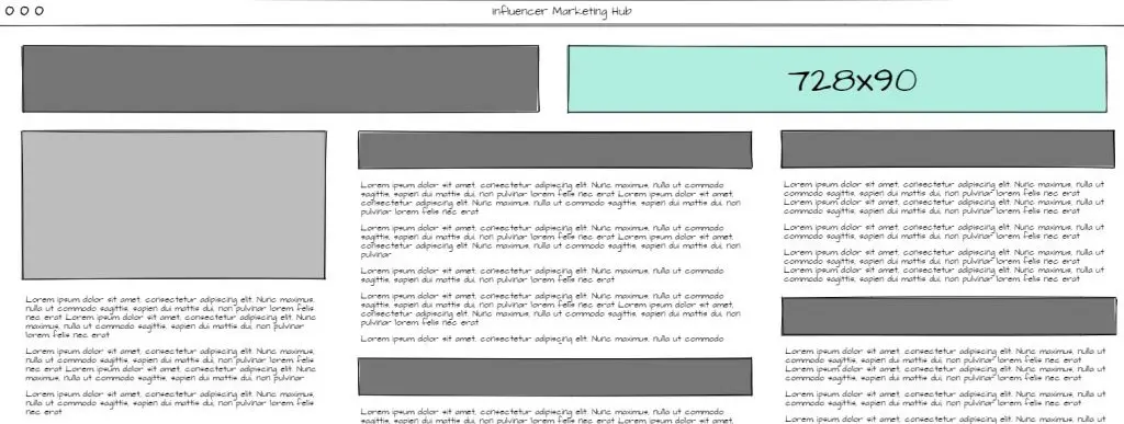
1. The Leaderboard (728×90)
The leaderboard format is a standard banner ad size that works really well as a website header. These ad formats utilize both text and images. Mobile ads aren’t supported.
Advertisers love the leaderboard largely because it fits well before or immediately after the website header. And, since advertisers are fond of this Adsense banner size and format, more ads are created in this size. Because of this, the leaderboard ads tend to be of better quality.
This Adsense size performs well on most websites due to its size and placement above the fold.
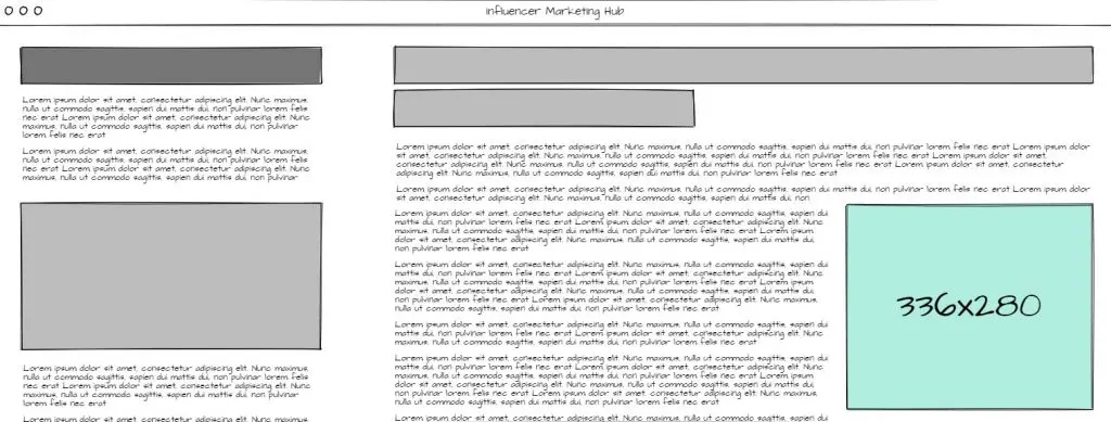
2. The Large Rectangle (336×280)
Large rectangle ads are, as their name suggests, larger and more noticeable. Unfortunately, due to their size, they might not fit in the sidebar for all website themes. Placing this ad in a sidebar that isn’t as wide as the large rectangle Adsense format could cause the content to be distorted, disrupting the user experience. This ad format is also not mobile optimized.
Large rectangle Adsense banners support both image and text ads and are ideally placed in between paragraphs or other content vertically, rather than squeezing them into a sidebar. Thanks to its size and placement options, this is one of the highest-performing Adsense banner sizes and gets a better ad inventory.
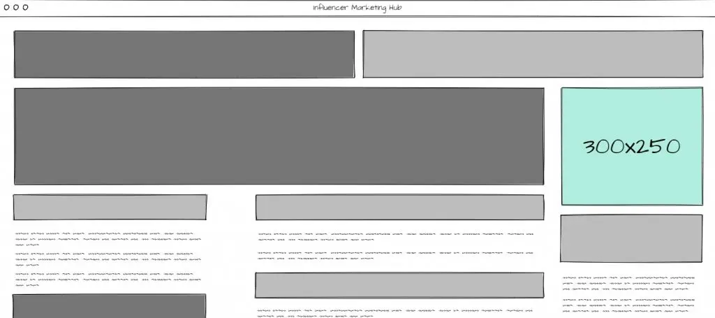
3. The Medium Rectangle (300×250)
The medium rectangle ad format works for both text and display ads and can also be used in mobile page layouts. At a width of 300px, this Adsense banner size will typically fit into a sidebar or within the content area of a website without impacting user experience.
Thanks to its versatility, the medium rectangle ad format gets a large ad inventory, translating to better-paying ads for you. Rumor has it this is the ad size that brings in the best click-through rate for more sites.
4. The Large Mobile Banner (320×100)
The large mobile banner is the first mobile-specific ad to make our list of the highest-performing Adsense banner sizes and formats. It works best when displayed at the top of the page, just underneath the site header. You can also place it farther down the page and throughout content for an effective ad that has less impact on user experience.
As more and more website traffic comes from mobile devices, advertisers are focusing on creating more and more mobile ads. That means this ad format brings a better ad inventory with it.
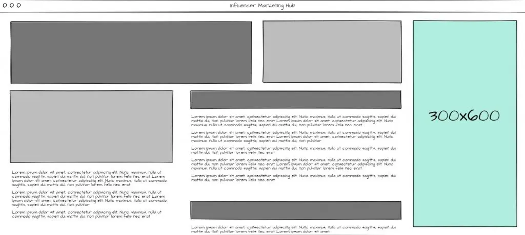
5. The Half Page or Large Skyscraper (300×600)
The large skyscraper Adsense banner size is a wide vertical banner. It’s sometimes referred to as the “half-page” due to its large size. As you can probably guess, its size is what makes this one of the highest-performing Adsense banner sizes and formats. It’s a favorite among advertisers that need more space to share their message.
More and more publishers are opting for this ad size, too, since it draws more attention. That can translate into more clicks and higher revenue. It really comes down to whether or not the ad size fits your website. If so, it can make a great addition to your sidebar.
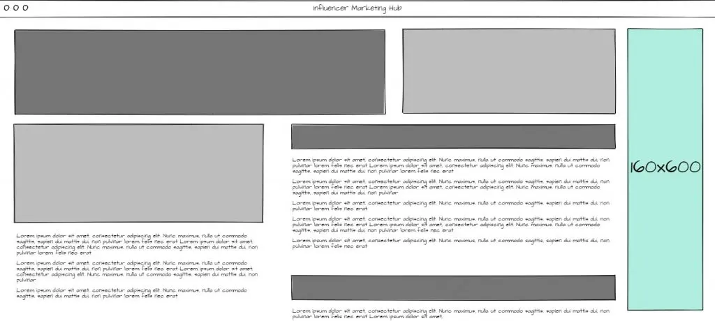
6. The Wide Skyscraper (160×600)
This ad format is a vertical Adsense banner that’s designed with narrow sidebars in mind. It uses both text and image ad formats and is a favorite with advertisers and website owners. Since it fits in narrow sidebars, site owners find it to be less disruptive to user experience.
Since it’s about half the width of the large skyscraper ad format, it’s less intrusive and will draw less attention.
7. The Mobile Leaderboard (320×50)
The mobile leaderboard is the second mobile-specific Adsense banner format on our list. It’s about half the height of the larger mobile ad format, making it a little less effective for earnings but offering a better user experience on smaller mobile devices. If you find that your mobile viewers are visiting from these smaller devices, this ad will be a much better option for you. And, since mobile ads are popular with advertisers, rest assured you’ll enjoy a large ad inventory.
8. The Portrait (300×1050)
The portrait Adsense banner format is quite a bit longer than the other vertical ads we’ve talked about. This is used by advertisers who need the real estate for brand-centered advertising and retargeting messages. It’s best placed in your site’s sidebar but its length can sometimes impact the user experience. Overall, it’s an effective ad that should be used with great care paid to the overall ad experience.
9. The Billboard (970×250)
Billboards are another large Adsense banner format that are best placed at the top or bottom of your webpages. Due to its size and placement options, you’re likely to see better ads. However, this ad type does have a smaller inventory. While it is a great ad size for certain keywords, you may struggle with the limited inventory.
10. The Square (250×250)
The square is the smallest Adsense banner size on our list. The advantage of smaller ads is that they’re more likely to fit into your site’s design than some of the larger ads on our list. However, larger ads tend to be much more noticeable. If your design doesn’t have a lot going on, this might be a good option you could plug in just about anywhere. Of course, being a smaller ad, you’re going to end up with a smaller ad inventory.
How to Boost Your Google Adsense Earnings
Now that you know about the highest-performing Adsense banner sizes and formats, how can you make the most of whatever options you pick for your site? There are several ways to go about bringing in a decent revenue with Google Adsense. Here are some tips we’ve found to be helpful in setting yourself up for maximum Adsense earnings.
Create High-Quality, Valuable Content
Before you can even get started with Google Adsense, you’ll have to have some high-quality content on your site. Then, you have to keep it up. Yes, that’s right, they sometimes review already approved sites for quality. To make sure that your content is high-quality and you can keep producing that same caliber of content, we recommend creating content about a topic you’re interested in and passionate about. You can also check out these content marketing tools to get you started.
And, don’t forget that you can always bring in other creators and influencers to help you out!
Increase Time on Site
Increasing the time that visitors spend engaged and active on your site can go a long way towards increasing your Adsense revenue. When visitors navigate away from your site quickly, after just viewing a single page, it’s not likely that they’ll be coming back any time soon. That, in turn, means that you get kiss their ad clicks goodbye. If that happens, the highest-performing Adsense banner sizes and formats aren’t going to make a bit of difference.
But how do you make your site “sticky?” That is, how do you grab the attention of your site visitors and make this want to explore your site further? We just talked about one way: creating high-quality content. But there are other ways to keep visitors around, too.
For starters, make sure your site is easy to navigate. This means adding an accessible and simple menu on your site, along the top or side, that gives visitors a way to move around. And adding a search bar to your site’s navigation menu is a great idea, too.
Next, you’ll want to show off your best content marketing on every page of your site so it’s easy for visitors to get to the content that you already know performs well. This might mean adding a table of contents with links to the content you want to feature in your sidebar. When links like this show up next to content that a view is already interested in, it can help pull them deeper into your site (and give them more opportunities to see the ads on your site).
It’s also a really good practice to link out to related content from each piece of content on your site. You’ll notice in this article, we’ve linked out to several other useful pieces of content on our site that we think will be great supplements to what you’re reading right now.
Keep Visitors Close
Even with the best navigation and the best content, your visitors are going to leave. They can’t sit around reading your site all day when they have jobs and places to be, right? But that doesn’t mean that you’ve lost them forever. Encourage them to stay in touch by including various ways they can connect with you. We recommend directing your visitors to connect with you on social media as well as giving them the chance to subscribe to your email list.
This makes it really easy to share our content with visitors we know are interested in what we have to say and bring them back into our site. You can use these same techniques to get visitors to come back and hopefully click on more ads!
Create a Great User Experience
We can’t stress the importance of user experience. This means making sure that your site design is easy on the eyes while still being interesting enough to keep attention. You’ll also want to make sure that your site loads quickly for both desktop and mobile users. Any more than 2–3 seconds and visitors are going to bounce.
You can check out your site’s performance using the free tools Google offers, from Test My Site to Google Analytics to Google Search Console. Those last two will come in handy when you’re working on SEO to make it easier for more visitors to find your content and when you’re looking for the content that already performs well so you can direct more visitors to it.
Frequently Asked Questions
What size should banner ads be?
The size of the Google Ads banners you display on your site makes a difference. Top performing banner ad sizes in 2021 include square (250 x 250), small square (200x200), banner (468x60), and leaderboard (728x90).
What are the sizes of a banner?
Some banner sizes and formats perform better depending on where they’re placed. Top performing banner ad sizes in 2021 include square (250 x 250), small square (200x200), banner (468x60), and leaderboard (728x90).
What are the sizes for Google display ads?
The sizes for Google display ads include:
- 250 x 250 – Square.
- 200 x 200 – Small Square.
- 468 x 60 – Banner.
- 728 x 90 – Leaderboard.
- 300 x 250 – Inline Rectangle.
- 336 x 280 – Large Rectangle.
- 120 x 600 – Skyscraper.
- 160 x 600 – Wide Skyscraper.
What is the best banner size?
The 320x50 banner is by far the most commonly used ad for mobile ads, both in browsers and apps. To maximize your ad reach, it’s important to have a few different formats.
How do you calculate banner size?
To calculate your banner size, you will need to divide the height and width of your image by 36 and 72 respectively. This will get you the dots per inch for your final image.





![The Ultimate YouTube Banner Size Guide [Fully Updated for 2023]](https://s.influencermarketinghub.com/imaginary/resize?width=400&height=200&type=webp&url=https://influencermarketinghub.com/wp-content/uploads/2021/08/The-Ultimate-YouTube-Banner-Size-Guide.png)