Social media reporting has become increasingly fragmented as brands manage organic content, paid campaigns, influencer partnerships, customer service workflows, and social commerce across multiple platforms simultaneously.
Native analytics tools rarely provide the centralized visibility required for executive reporting, campaign optimization, or cross-channel attribution.
Social media dashboards help marketing teams consolidate performance data into a single reporting layer.
Teams use them to track engagement trends, monitor paid campaign efficiency, benchmark competitors, measure creator performance, analyze audience sentiment, and connect social activity to business outcomes. With U.S. social media ad spend projected to exceed $120 billion in 2026, pressure on marketers to prove ROI and improve reporting accuracy continues to grow.
This guide breaks down the most important social media dashboard examples by use case, KPIs, reporting goals, and team needs.
What Is a Social Media Dashboard?
Social Media Dashboard Definition
A social media dashboard is a centralized reporting interface that consolidates performance data from multiple social platforms into a single view. Marketing teams use dashboards to monitor KPIs, analyze campaign performance, compare channels, and report results without manually pulling data from each platform individually.
Most social media dashboards combine analytics from platforms like Instagram, TikTok, LinkedIn, Facebook, YouTube, and X alongside paid media, influencer marketing, ecommerce, or customer service data.
Dashboards typically include visualizations such as trend graphs, engagement breakdowns, conversion tracking, sentiment analysis, and audience comparisons.
Dashboard structures vary depending on the reporting objective.
Executive dashboards prioritize ROI and high-level trends, while engagement dashboards focus on content performance and audience interaction. Paid social dashboards track metrics like ROAS, CPA, and CPM, while social listening dashboards monitor sentiment, mentions, and competitive positioning.
A modern dashboard tool, such as Brandwatch, increasingly functions as an operational reporting system rather than a standalone analytics tool.
Why Different Teams Need Different Social Media Dashboards
Different teams use social media data for entirely different operational decisions. A content team analyzing engagement trends requires a very different reporting structure than an executive team evaluating revenue impact or a paid media team optimizing ROAS.
- Engagement dashboards typically prioritize metrics like saves, shares, watch time, engagement rate, and top-performing post formats.
- Paid social dashboards focus more heavily on CPC, CPA, CPM, conversion rate, and audience targeting efficiency.
- Customer service dashboards monitor response times, ticket resolution, sentiment trends, and escalation rates.
- Executive dashboards aggregate high-level KPIs tied to growth, attribution, and overall marketing performance.
Dashboard structure also changes depending on reporting cadence. Daily operational dashboards often surface granular campaign or platform data, while monthly or quarterly executive dashboards emphasize trend analysis and strategic performance summaries.
Stakeholder alignment is equally important.
Social media managers need tactical visibility into content and channel performance, while leadership teams typically require simplified reporting tied directly to business outcomes.
Types of Social Media Dashboards
Different dashboard structures solve different reporting problems. Some dashboards prioritize executive visibility and ROI tracking, while others focus on engagement analysis, campaign optimization, customer support workflows, or competitive benchmarking.
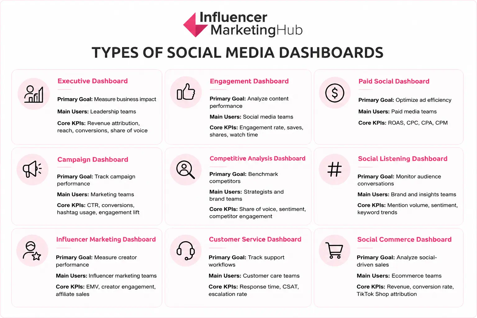
The most effective reporting systems separate dashboards by business objective rather than attempting to centralize every metric into a single interface.
Dashboard complexity also varies by organization size. Smaller brands often rely on lightweight reporting dashboards. At the same time, enterprise organizations typically centralize reporting across platforms like Brandwatch to support larger reporting operations, stakeholder groups, and cross-channel analytics workflows.
Social Media Dashboard Examples by Use Case
Dashboard structure should reflect the operational question a team is trying to answer. The following dashboard examples break down the most common reporting structures used across modern social media operations, including the KPIs, visualizations, workflows, and tools that support each use case.
Executive Social Media Dashboard Example
Executive social media dashboards consolidate high-level performance data into a reporting layer designed for leadership teams, department heads, and stakeholders. Most executive dashboards prioritize strategic visibility and business outcomes rather than post-level analytics or publishing workflows.
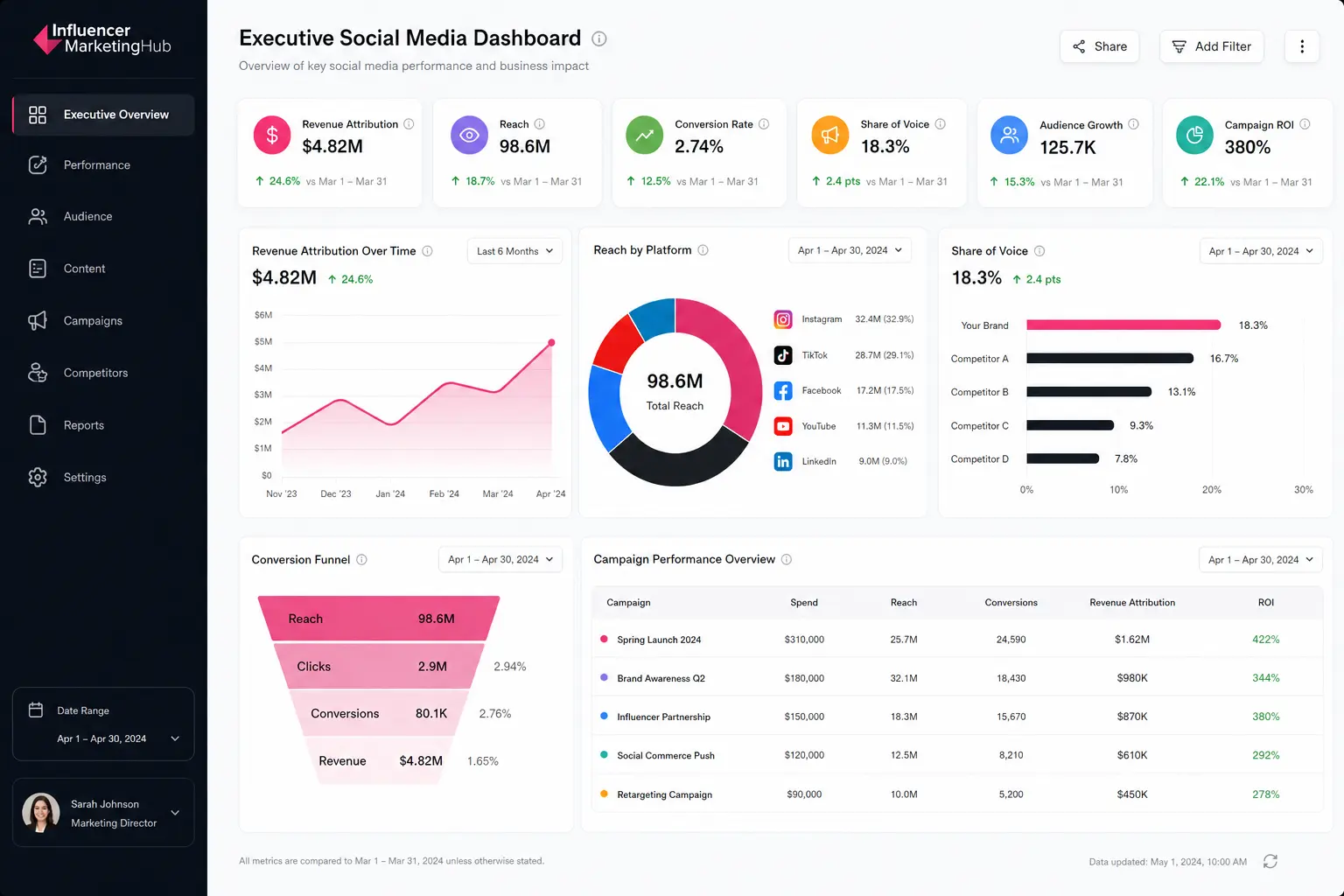
- Revenue attribution is typically one of the most important KPIs because it connects social media activity directly to business impact. Executive teams often use attribution reporting to understand how paid campaigns, organic content, influencer partnerships, and social commerce initiatives contribute to revenue generation and customer acquisition.
- Reach and audience growth metrics help leadership teams evaluate long-term brand visibility across platforms. Reach measures how many unique users were exposed to social content, while audience growth tracks whether brand visibility is expanding over time across channels like TikTok, Instagram, LinkedIn, and YouTube.
- Conversion rate and campaign ROI metrics provide additional operational context. Conversion reporting helps executives evaluate how effectively social traffic turns into measurable business actions, while ROI reporting compares revenue generated against campaign spend.
- Share of voice metrics are also commonly included to benchmark brand visibility against competitors and monitor market positioning over time.
Most executive dashboards rely on simplified visualizations that make trend analysis easier to interpret quickly during stakeholder reviews. Common formats include:
- KPI summary scorecards
- Quarterly trend graphs
- Revenue attribution funnels
- Cross-platform comparison tables
- Campaign performance summaries
Enterprise organizations frequently centralize executive reporting through dedicated platforms, especially when reporting spans organic social, paid media, influencer marketing, and ecommerce attribution simultaneously.
One of the most common executive reporting mistakes involves overwhelming dashboards with operational metrics such as posting cadence, platform-specific engagement breakdowns, or individual content analytics.
Executive dashboards perform best when they focus on trend visibility, business performance, and cross-channel strategic reporting.
Social Media Engagement Dashboard Example
Engagement dashboards help social media teams analyze how audiences interact with content across platforms. Most engagement dashboards focus on identifying which content formats, creative approaches, posting schedules, and messaging strategies generate the strongest audience response.
- Engagement rate is usually one of the most important KPIs because it measures how actively users interact with content relative to audience size or impressions. High engagement rates often indicate stronger audience resonance, better creative alignment, and improved content relevance across social channels.
- Save and share metrics provide additional context around content quality and amplification potential. Saves typically signal long-term content value, while shares measure how frequently audiences redistribute content across their own networks.
- Comments and click-through rates help teams evaluate conversation quality and how effectively content drives downstream actions such as traffic or conversions.
- Video watch time has become increasingly important as short-form video formats dominate platforms like TikTok, Instagram Reels, and YouTube Shorts.
- Retention metrics help teams identify which creative formats maintain audience attention most effectively over time.
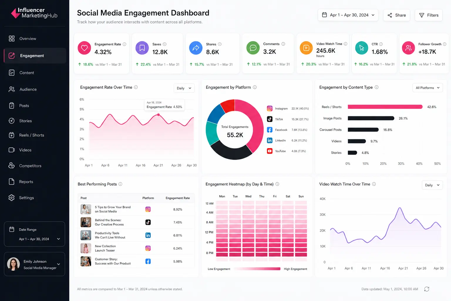
Most engagement dashboards rely on visualizations designed for fast content analysis and publishing optimization. Common formats include:
- Post-performance leaderboards
- Engagement trend graphs
- Content format comparison charts
- Publishing time heatmaps
- Video retention curves
- Audience interaction breakdowns
Brandwatch is a platform commonly used to centralize engagement reporting across Instagram, TikTok, LinkedIn, Facebook, and YouTube.
One of the most common reporting mistakes involves prioritizing impressions without evaluating interaction quality or retention behavior. Strong engagement dashboards focus more heavily on audience response depth, watch time trends, and content amplification patterns rather than visibility metrics alone.
Paid Social Media Dashboard Example
Paid social dashboards help performance marketing teams monitor advertising efficiency across platforms like Facebook, Instagram, TikTok, LinkedIn, YouTube, and Pinterest. Most paid social dashboards focus on conversion performance, budget allocation, audience targeting efficiency, and return on ad spend.
- Cost-per-click (CPC) and cost-per-acquisition (CPA) metrics are usually central because they measure how efficiently campaigns generate traffic and conversions. Lower CPC and CPA values often indicate stronger audience targeting, better creative alignment, and more efficient campaign delivery.
- Return on ad spend (ROAS) is another critical KPI because it connects advertising spend directly to revenue generation. Paid social teams use ROAS reporting to evaluate campaign profitability and determine which creatives, audiences, or channels drive the strongest commercial outcomes.
- CPM metrics provide additional visibility into media buying efficiency and audience reach costs, while conversion rate metrics help teams evaluate how effectively traffic converts after users engage with ads.
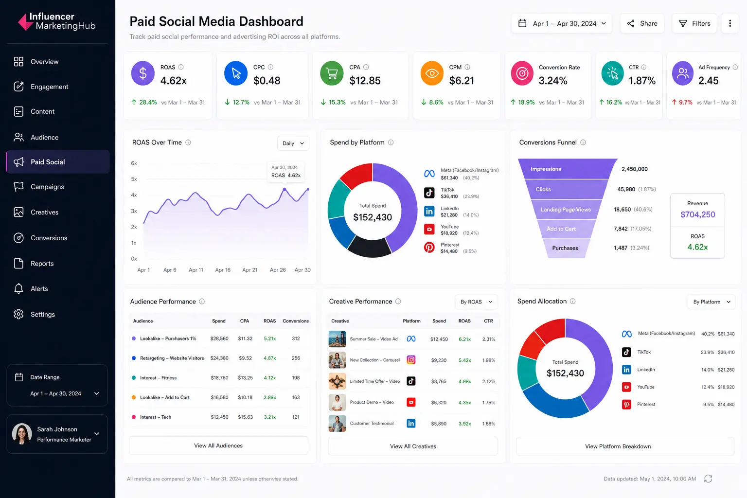
Most paid social dashboards prioritize fast performance analysis and campaign optimization workflows. Common visualization formats include:
- ROAS trend graphs
- Conversion funnels
- Audience performance breakdowns
- Creative comparison tables
- Spend allocation charts
- Platform-level performance summaries
Daily reporting cadences are common because paid social campaigns often require rapid optimization decisions around targeting, bidding strategies, creative performance, and budget allocation.
One of the most common paid social reporting mistakes involves prioritizing reach or impressions without evaluating downstream conversion efficiency. Strong paid social dashboards focus more heavily on profitability, acquisition cost trends, conversion quality, and audience performance rather than visibility metrics alone.
Social Listening Dashboard Example
Social listening dashboards help brands monitor conversations, sentiment trends, audience perception, and emerging topics across social platforms. Unlike engagement dashboards, which focus on owned content performance, listening dashboards analyze broader conversations happening around brands, products, industries, competitors, and cultural trends.
- Mention volume is usually one of the most important KPIs because it measures how frequently a brand, campaign, or keyword appears across social platforms. Sudden spikes in mentions often signal viral momentum, campaign traction, customer feedback shifts, or potential reputation risks.
- Sentiment analysis provides additional context by evaluating whether conversations are positive, negative, or neutral. Brand and insights teams use sentiment reporting to identify perception trends, monitor campaign reactions, and detect emerging customer concerns before they escalate into larger reputation issues.
- Share of voice metrics help organizations benchmark visibility against competitors by measuring how much of the total conversation belongs to their brand within a category or industry.
- Keyword trend tracking and hashtag monitoring also help teams identify emerging audience interests, content opportunities, and trend acceleration across platforms like TikTok, X, Reddit, Instagram, and YouTube.
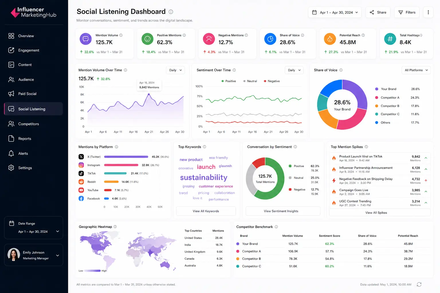
Most social listening dashboards prioritize real-time monitoring and trend analysis. Common visualization formats include:
- Sentiment trend graphs
- Mention spike alerts
- Share of voice comparison charts
- Keyword cloud visualizations
- Geographic conversation heatmaps
- Competitor benchmark tables
Enterprise organizations can turn to Brandwatch to centralize listening dashboards across global campaigns, customer experience teams, PR operations, and market research workflows.
One of the most common listening dashboard mistakes involves monitoring brand mentions without contextualizing conversation quality or competitive positioning. Strong listening dashboards combine sentiment analysis, trend monitoring, and benchmark reporting to provide a more complete picture of audience perception and market visibility.
Audience Sentiment Is Becoming a Competitive Intelligence Layer
Social listening dashboards only surface part of the picture. Dedicated sentiment analysis platforms help brands monitor perception shifts, identify reputation risks, analyze customer feedback trends, and benchmark audience reactions across channels in real time.
Explore our guide to the Best Sentiment Analysis Tools to compare the platforms marketers use for brand monitoring, competitive analysis, and audience intelligence.
Influencer Marketing Dashboard Example
Influencer marketing dashboards help brands measure creator performance, campaign efficiency, affiliate attribution, and content impact across creator partnerships.
Unlike traditional engagement dashboards, influencer reporting systems combine social metrics with ecommerce, paid media, and attribution data to evaluate how creator campaigns contribute to broader marketing objectives.
- Earned media value (EMV) is often one of the most closely monitored KPIs because it estimates the media value generated through creator content exposure and engagement. Brands use EMV reporting to benchmark campaign efficiency and compare influencer performance against paid media equivalents.
- Creator engagement metrics provide additional visibility into audience response quality across sponsored posts, TikTok videos, Instagram Reels, YouTube integrations, and creator-driven campaigns. Strong creator engagement often signals higher audience trust, stronger content alignment, and improved sponsored content performance.
- Affiliate sales and creator-driven revenue metrics have become increasingly important as influencer programs move closer to performance marketing models. Many brands now track creator attribution directly through affiliate links, discount codes, TikTok Shop integrations, and social commerce reporting systems.
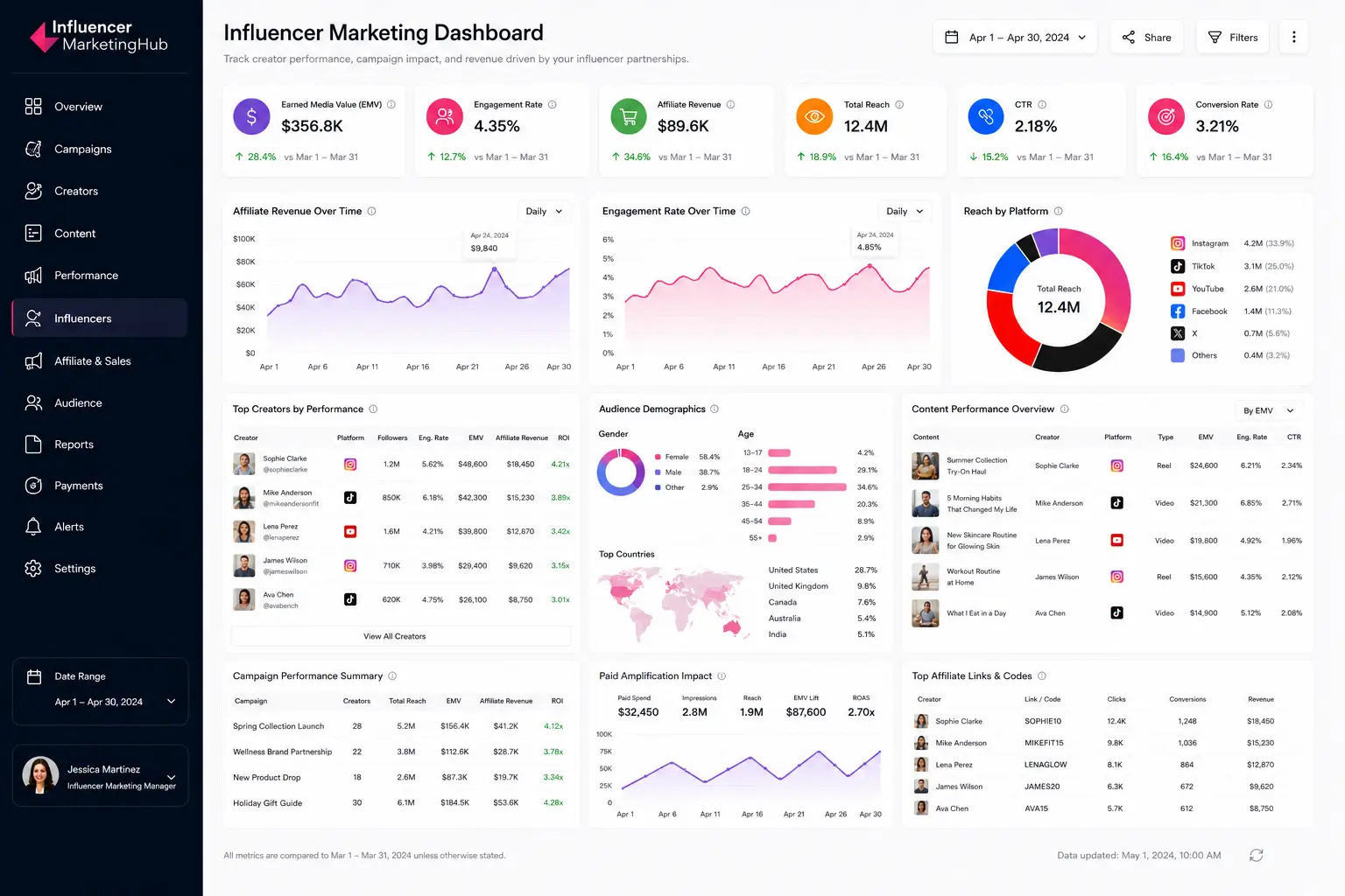
Most influencer dashboards prioritize cross-platform campaign visibility and creator benchmarking workflows. Common visualization formats include:
- Creator performance leaderboards
- Engagement comparison charts
- Affiliate revenue trend graphs
- Campaign reach summaries
- Audience demographic breakdowns
- Content performance comparison tables
Modern influencer reporting increasingly combines organic creator metrics with paid amplification performance. Brands frequently track Spark Ads, whitelisting campaigns, creator licensing performance, and paid usage rights reporting alongside traditional influencer KPIs.
Platforms like Brandwatch are commonly used to centralize creator reporting, campaign tracking, and influencer attribution workflows.
One of the most common influencer reporting mistakes involves focusing exclusively on reach or impressions without evaluating engagement quality, conversion efficiency, or creator-to-business alignment.
Strong influencer dashboards combine visibility metrics with attribution reporting, audience analysis, and revenue performance to provide a more complete view of creator impact.
Modern influencer dashboards now combine creator analytics, affiliate attribution, ecommerce reporting, paid amplification tracking, and audience insights into a single operational layer. Explore our guide to the Top Influencer Analytics Tools to compare the platforms brands use for creator reporting, campaign measurement, attribution tracking, and influencer performance analysis at scale.
Influencer Reporting Is Becoming Performance Marketing Infrastructure
Modern influencer dashboards now combine creator analytics, affiliate attribution, ecommerce reporting, paid amplification tracking, and audience insights into a single operational layer.
Explore our guide to the Top Influencer Analytics Tools to compare the platforms brands use for creator reporting, campaign measurement, attribution tracking, and influencer performance analysis at scale.
Competitive Analysis Dashboard Example
Competitive analysis dashboards help brands benchmark performance against competitors across engagement, audience growth, posting activity, sentiment, and share of voice. Unlike engagement dashboards, which focus on owned content performance, competitive dashboards prioritize comparative market visibility and positioning.
- Share of voice is usually one of the most important KPIs because it measures how much of the total industry or category conversation belongs to a brand relative to competitors. Higher share of voice often signals stronger visibility, audience attention, and campaign reach across social platforms.
- Competitor engagement metrics provide additional context around content performance quality. Brands frequently compare engagement rates, video performance, posting cadence, and audience interaction patterns to identify content strategies gaining traction within their industry.
- Audience growth and sentiment trends help teams monitor long-term competitive momentum. Rapid audience growth may indicate successful campaign execution or emerging creator partnerships, while sentiment analysis helps brands evaluate how audiences perceive competitors relative to their own positioning.
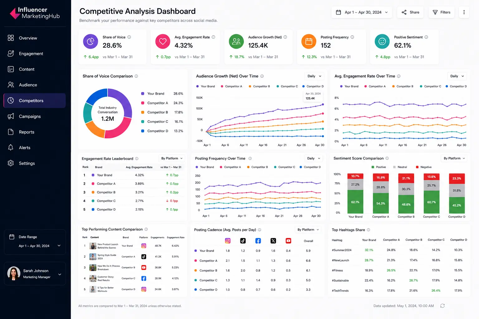
Most competitive dashboards prioritize benchmarking workflows and trend monitoring. Common visualization formats include:
- Share of voice comparison charts
- Competitor engagement leaderboards
- Audience growth trend graphs
- Posting cadence timelines
- Sentiment comparison dashboards
- Top content comparison tables
Enterprise brands can use Brandwatch to centralize competitive benchmarking across multiple social platforms and campaign categories.
One of the most common competitive reporting mistakes involves tracking competitor metrics without contextualizing audience size, industry positioning, or campaign objectives. Strong competitive dashboards focus more heavily on trend analysis, relative performance shifts, and benchmark comparisons rather than isolated vanity metrics alone.
Competitive Benchmarking Requires More Than Engagement Tracking
Modern competitor dashboards combine share of voice analysis, sentiment monitoring, audience growth tracking, and content benchmarking to help brands understand how they perform relative to the market.
Explore our guide to the Top Competitor Analysis Software to compare the platforms marketers use for competitive intelligence, benchmark reporting, audience analysis, and cross-platform market monitoring.
Social Commerce Dashboard Example
Social commerce dashboards help brands track how social media activity contributes directly to ecommerce performance, product discovery, and revenue generation.
Unlike traditional engagement dashboards, commerce dashboards prioritize transactional metrics tied to platforms like TikTok Shop, Instagram Shopping, YouTube Shopping, affiliate storefronts, and creator-driven product sales.
- Revenue attribution is usually one of the most important KPIs because it measures how much revenue originates from social campaigns, creator content, paid amplification, or platform-native shopping experiences. Ecommerce and performance marketing teams use attribution reporting to identify which channels, creators, products, or campaigns drive the strongest commercial outcomes.
- Conversion rate metrics provide additional visibility into how effectively social traffic converts after users engage with content, livestreams, creator videos, or shopping ads.
- Average order value (AOV) and customer acquisition cost (CAC) metrics help brands evaluate profitability across social commerce campaigns. Teams frequently compare AOV trends between creators, audiences, and product categories to identify which campaigns generate the highest-value customers.

Most social commerce dashboards prioritize attribution analysis and product-level reporting workflows. Common visualization formats include:
- Revenue trend graphs
- Conversion funnels
- Product performance leaderboards
- Creator sales comparison tables
- Add-to-cart dropoff visualizations
- Channel attribution summaries
Many commerce dashboards now combine influencer reporting, affiliate tracking, and paid media attribution into a single reporting layer. Brands increasingly monitor livestream performance, creator storefront conversions, Spark Ads attribution, and platform-native shopping activity simultaneously.
One of the most common social commerce reporting mistakes involves focusing exclusively on traffic or engagement without evaluating downstream purchase behavior and profitability. Strong commerce dashboards prioritize attribution clarity, conversion quality, customer value, and revenue efficiency rather than surface-level engagement metrics alone.
How to Build an Effective Social Media Dashboard
Strong dashboard design starts with the reporting structureg. The most effective social media dashboards organize data around operational decisions, stakeholder needs, and KPI visibility rather than trying to display every available metric at once.
Start With a Clear Reporting Goal
Dashboard structure should reflect the business objective it supports. Executive dashboards prioritize revenue attribution and trend visibility, while engagement dashboards focus more heavily on content performance, audience interaction, and publishing optimization.
Paid social dashboards require conversion reporting and budget efficiency tracking, while influencer dashboards prioritize creator attribution, engagement quality, and affiliate performance. Defining the reporting objective early helps reduce unnecessary metrics and improves dashboard usability.
Prioritize KPIs Before Dashboard Design
Most ineffective dashboards fail because they overload reporting interfaces with metrics that do not support decision-making. KPI selection should happen before visualization planning.
Executive dashboards typically require:
- revenue attribution
- campaign ROI
- audience growth
- share of voice
Engagement dashboards often prioritize:
- engagement rate
- saves
- shares
- watch time
- content performance
Limiting dashboards to the most operationally useful KPIs improves readability and reporting clarity.
Use the Right Visualization Types
Different metrics require different visualization formats. Trend graphs work best for long-term performance analysis, while scorecards simplify executive KPI reporting. Conversion funnels help teams analyze ecommerce dropoff behavior, while comparison tables support creator benchmarking and competitive analysis.
Common dashboard visualization formats include:
- Trend graphs for growth analysis
- KPI scorecards for executive reporting
- Funnels for conversion tracking
- Heatmaps for publishing schedules
- Leaderboards for creator or content comparisons
- Share-of-voice charts for competitor analysis
Visualization choice directly affects how quickly teams can interpret reporting data and identify performance shifts.
Organize Dashboards Around Stakeholder Needs
Social media managers, executives, paid media teams, and ecommerce teams all require different reporting structures. Executive stakeholders typically need simplified summaries and trend visibility, while operational teams require more granular analytics tied to optimization workflows.
Many enterprise organizations create multiple dashboard layers inside platforms like Brandwatch to support different reporting audiences across departments.
Avoid Dashboard Clutter
Large reporting systems often fail because they attempt to centralize too much information into a single interface. Excessive widgets, overlapping metrics, and redundant charts reduce reporting clarity and slow down decision-making.
Effective dashboards prioritize:
- visual hierarchy
- metric grouping
- whitespace
- simplified layouts
- reporting consistency
Strong dashboard design makes high-priority insights immediately visible without requiring teams to search through unnecessary reporting layers.
Social Media Dashboards Are Becoming Operational Reporting Systems
Modern social media dashboard systems now combine engagement tracking, paid media attribution, influencer performance, competitive benchmarking, sentiment analysis, and ecommerce reporting into centralized operational workflows.
Different teams require different reporting structures. Executive stakeholders prioritize ROI and trend visibility, while social teams focus on engagement patterns, creator performance, campaign optimization, and audience behavior. Strong dashboard design depends on KPI selection, stakeholder alignment, and reporting clarity rather than the number of metrics displayed.
As social commerce, creator marketing, and cross-platform attribution continue to expand, dashboard systems are becoming a core layer of modern marketing operations rather than standalone reporting tools.
Frequently Asked Questions
What should a social media dashboard include?
Most social media dashboards include engagement metrics, audience growth, reach, impressions, conversions, and campaign performance data. More advanced dashboards may also include sentiment analysis, influencer attribution, paid media reporting, social commerce tracking, and competitive benchmarking.
What is the difference between a social media dashboard and a reporting dashboard?
A social media dashboard focuses specifically on social platform performance, while a reporting dashboard may combine data from multiple marketing channels such as email, paid search, ecommerce, CRM systems, and web analytics platforms.
What are the best KPIs for a social media dashboard?
The best KPIs depend on the reporting objective. Engagement dashboards often prioritize saves, shares, and watch time, while executive dashboards focus more heavily on revenue attribution, campaign ROI, audience growth, and share of voice.
Which tools are commonly used to build social media dashboards?
Popular dashboard tools include Looker Studio, Tableau, Hootsuite, Sprout Social, and Brandwatch.
How often should social media dashboards be updated?
Paid social dashboards are often updated daily because campaigns require rapid optimization. Executive dashboards are typically reviewed weekly, monthly, or quarterly depending on reporting cadence and stakeholder requirements.
What is an executive social media dashboard?
An executive dashboard is a high-level reporting interface designed for leadership teams. These dashboards typically focus on revenue attribution, campaign ROI, audience growth, and trend visibility rather than granular post-level analytics.
Can social media dashboards track ROI?
Yes. Many dashboards connect social media activity to conversions, revenue attribution, affiliate sales, and ecommerce reporting. Paid social and social commerce dashboards are especially important for ROI tracking.
Why do brands use social listening dashboards?
Social listening dashboards help brands monitor audience sentiment, brand mentions, competitor activity, emerging trends, and reputation risks across social platforms. Many enterprise teams use listening dashboards for market research, campaign monitoring, and competitive intelligence.