
Good content is at the heart of a great podcast. But you can’t completely ignore the visual aspect associated with podcasts. Even before a user listens to your podcast, they see your cover art. It can play a major role in giving them the right first impression.
It’s worth noting that there are 700,000+ podcasts on iTunes and other platforms. If you want your podcast to stand out, you need visuals that will get your target audience’s attention. You need visuals that will keep them from scrolling past your podcast.
Not only can a well-designed podcast cover entice your audience but it can also convey what the podcast is about. It can also improve your visibility. Apple considers artwork as a key feature while selecting podcasts to feature in their New and Noteworthy section.
In this article, we’ll take a look at some of the things you should keep in mind while designing your podcast cover art.
8 Things to Keep in Mind While Designing Your Podcast Cover Art:
1. Know Your Subject and Audience Thoroughly
Before you jump into the design aspect, take a step back. Invest some time into understanding what the focus of your podcast is.
For instance, if your podcast is about books, ask yourself what genre you want to focus on. Are you going to cover romance or crime? Will you focus on classics in the genre or on the latest releases?
The first step to deciding upon a podcast cover is to be clear about your podcast’s topic. But that’s not all. You also need to keep in mind who your target audience is. After all, the main purpose of your podcast is to get the attention of your target audience.
To begin with, you should consider at the age groups and genders of your target audience. You also need to consider common interests they might have. Will your audience be familiar with the topics you will cover on your podcast?
These are some of the questions you should answer before creating your podcast cover art. They will help you get clarity and decide on the tone of your podcast content. If you’re targeting millennials, for example, you may want to keep the discussion more informal.
2. Keep Your Cover Dimensions in Mind
Users can view your podcast artwork on their phones, computers, or on a tablet. You need to keep this in mind while designing your cover. It should look great on screens of all sizes.
For this, you need to check out the format requirements for podcast covers. Luckily, on most platforms the requirements are the same — the size should be 3000 x 3000 pixels.
When you’re designing your podcast artwork, you’ll want to make sure that it looks great everywhere it’s displayed, from a large monitor to an app on a phone. You can create your files in PNG or JPEG format with relevant extensions i.e. “.png” and “.jpg.”
Additionally, you should ensure that your podcast cover is designed keeping in mind the RGB colour space. For mobile optimisation, you can compress your files.
However, these requirements may not stay the same forever. When podcasts were just entering the content space, the cover art requirements were close to 300 x 300. But that’s not the case now. It’s a good idea to check the latest requirements when you design your podcast cover.
Another thing to remember is that your artwork needs to fit into a square format. It may seem like a major restriction for your design. But you’ll need to come up with a design that fits inside a square.
Your podcast cover needs to look great on a screen as well as in a thumbnail. Make sure your design holds up whether it is stretched or sized down.
Here are the approximate dimensions for different pages for Apple Podcasts:
- Preview Page: 276 x 276 pixels
- New and Noteworthy Section in iTunes: 125 x 125 pixels
- Mobile App: Less than or equal to 55 x 55 pixels
3. Keep It Simple
Simplicity is the key to designing a good podcast cover. You don’t need to fill your space with complex elements to make something visually appealing. Instead, opt for a simple design that is neat and high quality. If your cover has too many elements, it may come across as cramped or unattractive.
When it comes to podcast artwork, less is more. The best idea is to use a simple picture that fits in with the context of your podcast. Alternatively, you could also add a logo or words against a background.
The cover of the podcast, “Serial Killers,” manages to convey the theme of the podcast with its clever typography. It’s simple yet eye-catching.
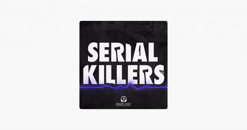
Image via Apple
4. Pick Contrasting Colours
Using the right colours can be a great way to ensure that your podcast stands out among the rest. First, check out the other popular podcasts in your category.
If most of them use black backgrounds, you may want to pick something bright and colourful. Choose a colour that is in contrast to the others.
In addition to this, you can also use a contrasting colour scheme in your artwork to make it more attractive. This trick works really well with podcast covers that use more text as it helps optimise readability.
“Hello Monday with Jessi Hempel” uses this strategy to make their podcast artwork pop. It’s bright, simple, uncluttered, and eye-catching.
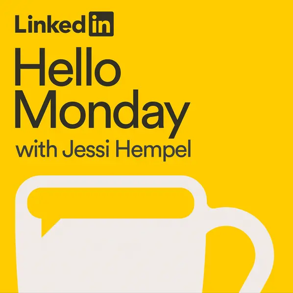
Image via Stitcher
5. Add Images of the Host
If your podcast host is a well-known personality or celebrity, you should consider using a photo of them on your cover. It can help you get more publicity. You’re likely to get the attention of their fans more easily with their photo on the cover.
Even if you’re just starting out, you could use this strategy if your podcast’s reputation is primarily driven by your personal brand. From Conan O’Brien to Tim Ferris, a lot of famous personalities use their own pictures on their podcast covers.
Think photos are too mainstream? You could add in some funk with a caricature. Take some inspiration from the podcast cover of the Bill Simmons podcast.
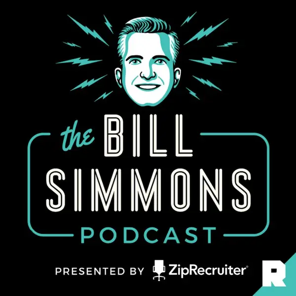
Image via Art19
6. Be Mindful of Your Branding
Whether you’re aware of it or not, your podcast is an extension of your brand. So, it’s important to ensure that your branding stays consistent even on your cover.
Is your brand serious or edgy? Is your content funny or simplistic? Your podcast cover should reflect your brand voice and tone.
Not only does it make your brand more recognisable, it also ensures that you attract the right kind of people. It’s also a good idea to use your business’ colour scheme, tagline, and logo.
In the cover for National Geographic’s podcast, “Overheard,” their logo is placed at the centre of the artwork. It’s prominent, so it’s easy to relate it to the brand.
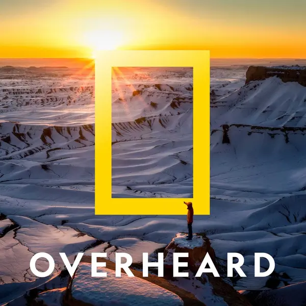
Image via Stitcher
7. Avoid Using Common Visuals
Microphones, headsets, mics, earphones — these are some of the most commonly used visuals in podcast covers.
Unless your theme is podcasting, it doesn’t make sense to use such imagery. It doesn’t convey what your podcast is. Plus, there are dozens of covers with similar visuals. So, your podcast is likely to blend in.
Even for your chosen niche, avoid using the most obvious visuals. For instance, it’s not necessary for you to use hearts if you’re talking about romance. Get more creative and opt for something more unique.
However using mics on your podcast artwork isn’t a complete no-no. You can use it if you find a way to incorporate it creatively. Take a look at how “FoodBrews” uses it in their podcast cover:

Image via Apple
8. Do Not Use Too Many Fonts
The text you add to your cover art needs to be clearly visible. That is why you need to pay attention to the fonts that you pick.
Fonts that use thin lines may look great but they may not always be readable against the background. Similarly, script fonts may look ornate.
Ideally, you should opt for fonts that have thick lines and clear characters. Also, keep in mind that too many fonts can be distracting and spoil your design.
It’s best to stick to one font style for your title. However, in some cases, you may need to use more than one font. As you can see in the screenshot below, two different font styles are used for the cover art of the “Man in the Window” podcast.
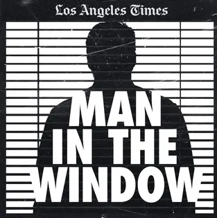
Image via Stitcher
In this case, it’s a necessity because the Los Angeles Times uses a peculiar font. The purpose here is branding, not design. In most cases, you should not use more than two fonts at once.
Conclusion
Your audience is going to see your podcast cover even before they hear your first episode. What’s more, the podcasting space is overcrowded already.
But with an eye-catching cover, you can get the attention of your target audience and make a great first impression.
It is what sets you apart from the others in the same category.
Follow the tips above and come up with a unique, attractive, and engaging design for your podcast cover art.
SUGGESTED

Podcast Marketing: The Ultimate Guide to Promoting a Podcast in 2026
If you're starting a new podcast or want to grow an existing podcast we've got 19...

A Full Guide to Podcast Sponsorship and Ad Rates
What’s podcast sponsorship and how does it work? Here’s all the key details...

A Reliable Guide to Get You Started With Your Podcast
Want to start your own podcast and reach out to a massive audience? Here is a...