A recent HubSpot marketing report dubbed short-form video as the most popular and effective social media content format this year. So it makes sense that 33% of marketers plan to invest more in short-form video than any other type of social media strategy.
If increasing your short-form video content is on your list of objectives for the year as well, you’ve come to the right place. We’ve put together a complete guide on short-form video content so you’ll know the right platforms and best practices for creating engaging short-form videos your audience will love.
Let’s get started.
The Ultimate Guide to Short-Form Video Content:
What is Short-Form Video Content?
Short-form video content is any type of video content that’s less than 60 seconds, though some marketers agree short-form video content can be as long as three minutes. Short-form videos are meant to be bite-sized, easily digestible pieces of content that are easy for viewers to scroll through and view several at a time.
Why is Short-Form Video Content Important?
Short-form video content is quickly becoming one of the most popular forms of social media content, so if your brand isn’t currently creating any, you need to start.
A few key statistics that help prove the importance of short-form video content include:
- TikTok continues to grow, with over 1.6 billion active users globally in 2024. It remains the leading platform for short-form video content, dominating user engagement
- Short-form videos are the most preferred content type, with 71% of viewers deciding on the value of a video within the first few seconds. This format continues to yield the highest ROI for marketers
- In the U.S., adults currently spend an average of 58.4 minutes daily on TikTok, with a projection of further increases by 2025 as the platform integrates more e-commerce and interactive features
- According to a survey by HubSpot, 47% of marketers agree that short-form videos are the most likely format to go viral and are considered the most effective for brand awareness and lead generation
- 73% of video marketers report that video marketing is effective in helping them achieve their overall business goals.
- Engagement rate is the top metric to track for 43% of marketers, as it measures how well the video resonates with the audience, including likes, comments, and shares.
Short-form video is captivating, engaging, and well-converting. The time to create short-form video content was yesterday—but if you haven’t started, there’s no better time than the present.
Top 3 Short-Form Video Platforms
There are three main short-form video platforms available to use. While Vine’s launch back in 2020 started the short-form video initiative with its six-second videos, the hype didn’t last. Then, Musical.ly was launched for the purpose of quick lip-syncing videos, was bought by TikTok, and relaunched into the short-form pioneer we know and love today.
To hop onto some of TikTok’s momentum, Instagram and YouTube added their own short-form video features in the form of Instagram Reels and YouTube Shorts.
TikTok

TikTok was launched in 2016 and was the first of the major short-form video platforms on our list. TikTok’s platform is dedicated exclusively to short-form content, though the app has just added a BeReal competitive feature with TikTok Now.
The home screen allows users to toggle between their “For You” page (which is based on algorithmic suggestions for each user) and the “Following” option (which allows users to view videos posted only by the people they follow).
TikTok also has a great Discover section (which can be accessed by tapping the magnifying glass icon in top right corner) that many viewers use as a search engine for discovering content, how to do things, etc.
TikTok Followers Growth
Instagram Reels

Instagram was launched back in 2010 as a photo-sharing app and has consistently grown and evolved since then. Now owned by Facebook’s parent company Meta, Instagram launched its own version of short-form videos called Instagram Reels in 2019.
To access Reels, users can tap on the center icon of the home screen. However, Reels have become extremely popular with Instagram’s algorithm, and simply scrolling down your feed will likely put a ton of Reels front and center. Tap the Reel to open it, then scroll down to view more, just like how you would in TikTok.
YouTube Shorts

YouTube launched way back in 2005 and has steadily held its own as the leading video platform. So it only makes sense that they, too, would want to forge a path in the short-form video world.
Recommended Shorts can be discovered right on the YouTube home screen, or you can click the Shorts icon in the bottom menu to watch shorts, scrolling up after each video to view something new.
![]()
![]() Video total
Video total
![]() Most recent video
Most recent video
![]() Subscribers growth
Subscribers growth
![]() Avg engagements per video
Avg engagements per video
![]() Reactions
Reactions
![]() Comments
Comments

![]() Estim. earnings per video
Estim. earnings per video
Short-Form Video Content Best Practices
Ready to start creating your own attention-grabbing short-form videos? Keep these ten best practices in mind as you create.
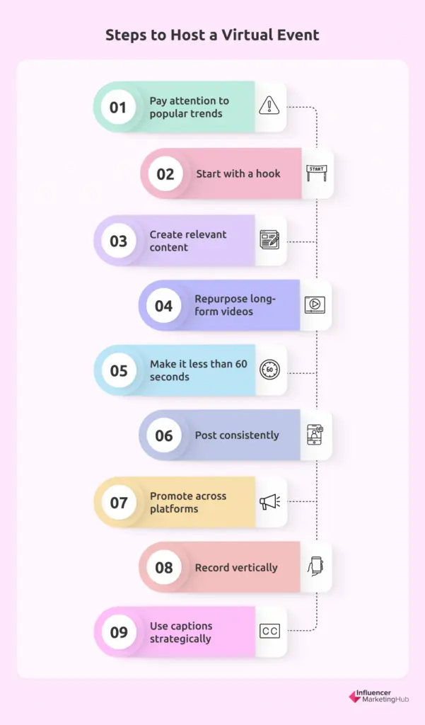
1. Pay Attention to Popular Trends
In order to create content that fits on the short-form video platforms, you need to first dedicate time to consuming content on these platforms. This is the fun part, but make sure you still spend your time wisely.
Are there sound bytes or songs that are being used again and again? If so, that’s likely part of a trend. Creators and brands often try to hop on trends as doing so can increase the chances that your video reaches more people. Plus, if someone recognizes a trend as they happen upon your video, it makes it more likely that they watch all the way through.
Here’s a great example of a popular sound byte that tons of content creators and brands hopped on—the “corn” song. Graphic design software Visme repurposed this song to focus on their presentation templates:
@vismeapp For me, I really like co- ✨Cool Presentations✨ I can’t imagine a more beautiful thing ? #Corntok #itscorn #presentationtips #productivitytips #digitalmarketing #corporatemillennial ♬ original sound - Jennylv702
While you only want to use trending sound clips that you can actually relate back to your brand, there are a lot of ways to do this. Start spending some time scrolling through TikTok, Instagram Reels, and YouTube Shorts to find trends that would make sense for your brand.
2. Start With a Hook
The nature of these short-form video platforms is that users scroll up to quickly go from video to video. This means it’s extremely easy for viewers to scroll past your video if it doesn’t immediately draw them in. To combat this, start with a hook.
You can do this by starting your recording on something eye-catching, or you can make sure your sound grabs attention.
The Sill went with the latter in this example by using a sound byte that starts off with an excited, “Oh my god!”
@thesill It’s HAPPENING!!!! #plantsmakepeoplehappy ♬ original sound - DYLAN O’BEMINE
This gets people excited for what’s to come—especially if they’re part of The Sill’s target audience.
3. Create Relevant Content
Regardless of whether you choose to add a music clip or a trending sound byte to your videos or choose to create completely original content, you need to make sure it’s still relevant to your brand and the type of content your target audience would want to see from you.
Here’s an example from accounting software Honeybook using a trending sound byte from the popular TV show New Girl:
@honeybook You just never know when you’ll need something, so it just makes sense! ? Double-tap if this is you! #HoneyBook #IndependentBusinessOwner #SmallBusinessOwners ♬ original sound - Classic Sitcoms
Although the sound byte doesn’t relate back to their business, the captions added in make it relatable to their target audience.
Other ideas for relevant short-form video content include:
- How-to videos or tutorials
- Storytime
- Industry tips
- Reviews or testimonials
- Fun facts
4. Repurpose Long-Form Videos
If you’ve previously invested in a log of long-form videos, use those! You can easily crop the footage to fit a vertical screen and pick clips out from your longer videos using a video editing tool. This is a great way to start publishing short-form content while still finalizing your strategy and brainstorming ideas.
Here’s an example of what this could look like from social media management tool Sprout Social:
@sproutsocial Another look at some of our team’s favorite @Slack reactjis. ? #socialmediamarketing #socialmediamanager #slacktips #socialmediamanagement ♬ original sound - Sprout Social
This clip easily could have come from a longer video where they interviewed multiple employees to see what their favorite Slack reactions were, then spliced down into bite-sized clips to share on TikTok, Reels, and Shorts.
5. Keep it Less Than 60 Seconds
While some videos, like in-depth tutorials or stories, might make it to the 3-minute TikTok limit, the best case scenario is less than 60 seconds—or even sometimes less than 15 seconds. This makes sure your video really is bite-sized.
Here’s a great example from project management software Asana:
@asana on the brightside… short week! #asana #withasana #notifications #workhumor ♬ original sound - Mark Humphries
This video is less than 10 seconds long. But it’s relatable, uses a fun sound byte, and gets the job done.
Your videos don’t have to be a whole production for a short-form video platform—take advantage of that by fluctuating between extremely micro videos and videos that are between 30-60 seconds long.
6. Share Consistently
If you want results from your short-form video content, you have to post new videos regularly. Aim to post once per day, or at the very least once per weekday. This will make sure you have enough content for the algorithm to choose from and show to your target audience.
7. Promote Across Platforms
We’ve mentioned this earlier, but it’s key: you don’t need to create separate strategies for TikTok, Instagram Reels, and YouTube Shorts. While you might choose to share certain videos on only one of those platforms, you can easily share your short-form videos across the three platforms, as well as on your Instagram Stories, Facebook Stories, or even Twitter account.
8. Record Vertically
Short-form video platforms are meant to be viewed on mobile devices in a vertical format. While repurposed long-form content can be cropped into a vertical format, your best bet when creating new short videos is to record vertically so you don’t have to worry about that. Plus, the last thing you want to do is post a horizontal video on a vertical platform—your audience won’t be able to see the video as easily and it won’t be as attractive on their screen.
Instead, record vertically. Take a look at this exercise routine video from fitness equipment brand Bala:
@bala ATTN: Pilates lovers! ? #pilates #sculpt #lowimpact ♬ original sound - bala
Recording vertically makes it immediately optimized for mobile screens. Especially with a video with someone exercising, if you were to record this horizontally, it might be difficult to adapt for a vertical screen, leaving key parts of the motion out.
9. Use Your Caption Strategically
While you don’t have a ton of space in your caption, it’s still a great place to provide additional context to your video, so use it wisely. You can include a call-to-action, share more information not covered in the video, and more.
Here’s an example from financial advice brand Her First 100K:
@herfirst100kWhat questions do you have about life insurance? Ask away in the comments and visit herfirst100kDOTcom/money-tools for my recommendation.♬ Monastery of Sound Hibell Edit - Aaron Hibell
It’s an informational video, but then she includes a CTA in the caption for people to ask more questions in the comments or check out a place on her website to learn even more. This is a great use of the caption area and can also help to increase engagement.
Take a page out of food content creator Justine’s book with this video:
@justine_snacks #ad Ok when I say seeds I’m talking mostly about @Dave’s Killer Bread Organic Good Seed bread. So tasty - but the ebtb seeds aren’t bad either - recipe is in bio! #daveskillerbread #everythingbutthebagel #bread #avocadotoast #seedsonseeds ♬ Energetic Upbeat, Vocal EDM Track - soundnestro
And not just that one—she uses this loop in almost every recipe video she creates. The video will start with the final product then cut to her step-by-step creation before showing the final product again and seamlessly looping the video footage back to the start of the video. A lot of times she’ll even make her voiceover connect as well.
Get creative with your videos. Make the loop work to your advantage and try to get people to watch your videos multiple times.
Master Your Short-Form Video Strategy
Add short-form video content to your marketing strategy. Discover even more short-form video trends to incorporate into your strategy and help you brainstorm video ideas. Then start creating, publishing, and watching the engagement pour in.
Frequently Asked Questions
What is a short-form video?
A short-form video is a video (typically in vertical video format) that is 60 seconds or less.
What makes a short-form video engaging?
One of the most engaging things about short-form content is how humor can so easily be incorporated. People love to watch funny videos. Another big part is that shorter videos are much more digestible, meaning people can watch multiple videos in one sitting without dedicating a ton of time.
What platform is best for short-form video?
TikTok is the most-watched short-form video platform. However, the platforms tend to have different audiences. Repurposing your videos across each platform is a great way to get more bang for your buck.
How long are short-form videos?
Short-form videos tend to be between 15 and 60 seconds, though some platforms allow you to publish videos up to 3 minutes.
Can you make money from short-form video content?
Yes! All three platforms have their own creator funds that they pay out to content creators who reach a certain number of views with their content each month.