Clicks, traffic, and impressions are all great, but what does your conversion rate look like? It’s not enough to get people to click on your ad or visit your website. What matters the most is whether the people who come to your website end up converting. This is where strategies like conversion marketing come into play, enabling you to translate your website traffic into something that contributes to your bottom line.
In this post, we help you explore the topic of conversion marketing and what it entails. We also look into the common tools used for boosting conversion and provide you with tips to get started with conversion marketing. Let’s kick things off by understanding what conversion marketing is.
What is Conversion Marketing?
Conversion marketing is a strategy to get more website visitors to take the desired action, thereby increasing your conversion rate. This conversion action may be anything from filling out a form to making a purchase depending on the specific goals of your business. For instance, a B2B company may be tracking conversions in terms of demo downloads or webinar signups. Meanwhile, B2C companies may focus more specifically on product purchases.
The key difference with this type of marketing strategy is that it doesn’t focus on attracting new visitors but on getting more value out of your existing visitors. As such, you may improve various website elements and run tests to make changes that will drive more conversions.
Common Tools Used for Boosting Conversion
Conversion marketers make use of various tools to discover what needs improving for increased conversions. Some of the most common tools used for boosting conversions include:
A/B Testing
This involves creating multiple versions of a webpage and testing them to see which performs best. These variations are created based on hypotheses formed from website analytics data. A/B testing helps marketers to conduct experiments proving their hypotheses.
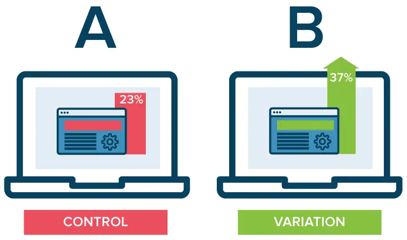
Source: optimizely.com
Website Surveys
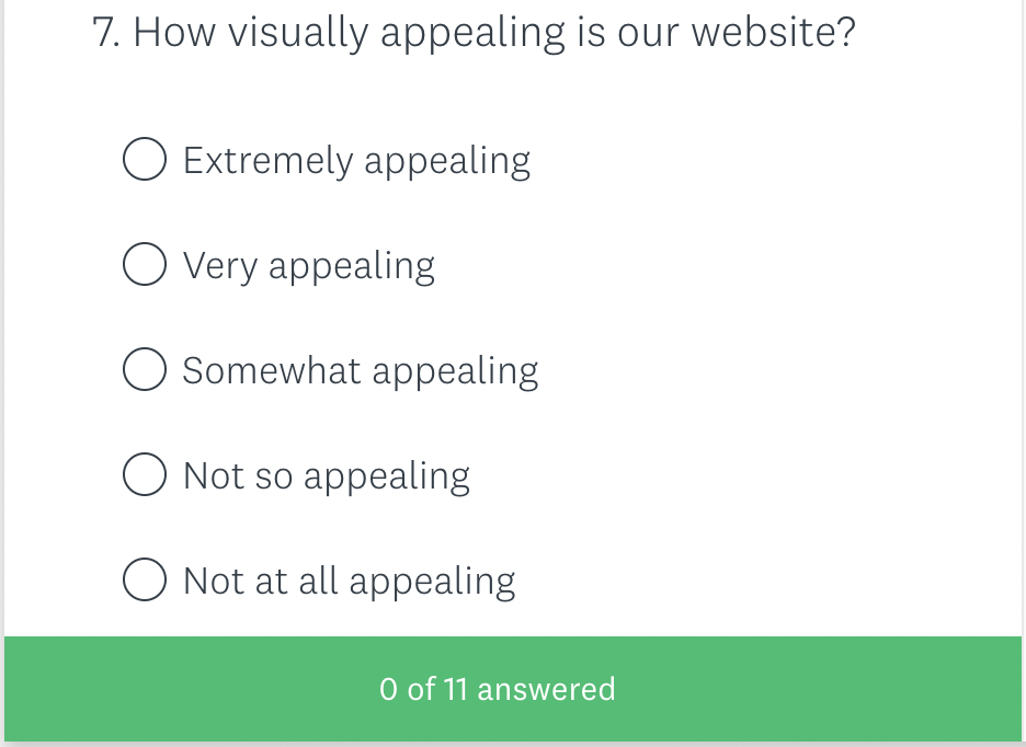
What better way to find out what your customers think than to directly ask them? Website surveys allow you to collect qualitative feedback directly from your customers so you can learn what’s working and what needs improving. The key is to ask the right questions and deliver surveys at just the right time.
Source: surveymonkey.com
Heatmaps
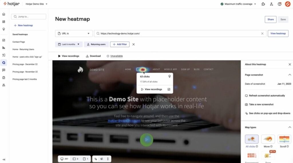
Heatmaps help you visualize how visitors interact with your website. There are different types of heatmaps that will help you understand various aspects of visitor behavior such as which sections get the most clicks or where your visitors stop scrolling. So you can get a better sense of what draws their attention and what distracts them, thus informing your conversion optimization efforts.
Source: hotjar.com
Form Analytics
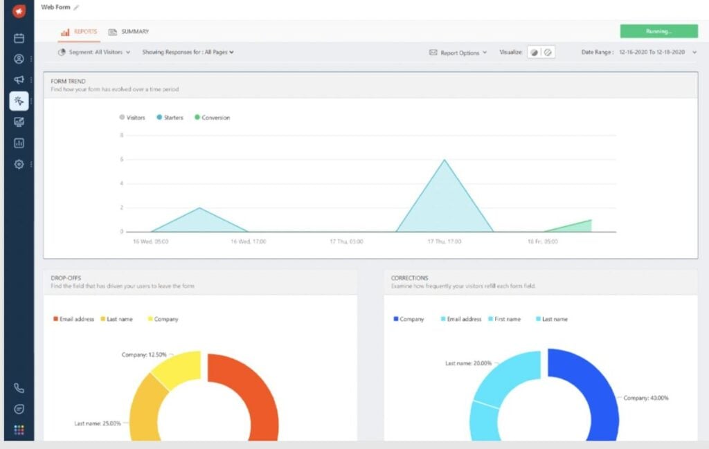
For many businesses, form fill-ups are an important conversion action. So analyzing how people interact with your forms is an excellent way to understand how you can improve them and drive more conversions. Form analytics can provide you with data such as time spent filling out the form, drop-offs, form fields that were ignored, and so on.
Source: freshworks.com
Customer Support Tickets
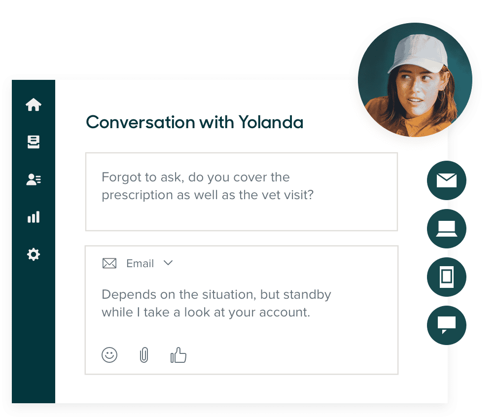
Support tickets can also provide you with valuable insights about customer pain points that aren’t too obvious. They can help you identify the most common issues visitors experience and the most common questions they have that may be impacting conversion decisions.
Source: zendesk.com
Best Practices for Conversion Marketing
When you’re ready to get started with conversion marketing, you might find it overwhelming at first. So here are a few tips and best practices to follow to help you get it right.
1. Improve Page Load Speed
The first thing that people notice about your website isn’t the headline or the attractive image– it’s how quickly the page loads. If a page takes too long to load, visitors may not have the patience to stay; let alone convert. So start by ensuring that your web pages load quickly to enhance the visitor experience and improve their chances of converting.
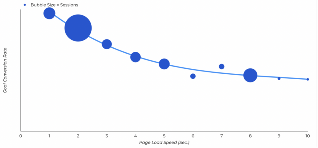
A Portent study found a direct correlation between page load speed and conversion rates. A site with a 1-second load time had a 3x higher conversion rate than a site with a 5-second load time. More impressively, there was a 5x higher conversion rate compared to a site that loaded in 10 seconds.
So every second counts when it comes to page load speed. Look for ways to speed things up by following ecommerce website design best practices. This may include compressing and optimizing your images, using a performance-focused hosting solution, and reducing redirects for a start. Browser caching, removing unnecessary elements, and leveraging a content delivery network are additional solutions.
2. Use Smart Popups to Your Advantage
Imagine almost leaving a website because the product is a bit out of your budget only to see an offer for 10% off if you sign up. This kind of timely offer delivered through smart popups can help you entice visitors to convert. In fact, according to Optimonk, the average popup converts at a rate of 11.09%.
You can use popup software to deliver smart popups to visitors based on different behavioral factors such as how long they’ve spent on a page, whether they’re trying to exit the page, and so on. Ideally, you should include discounts, last-minute offers, and other types of incentives to nudge them closer to a conversion action. For instance, Sprout Social targets blog readers with exit intent popups that offer a free trial.
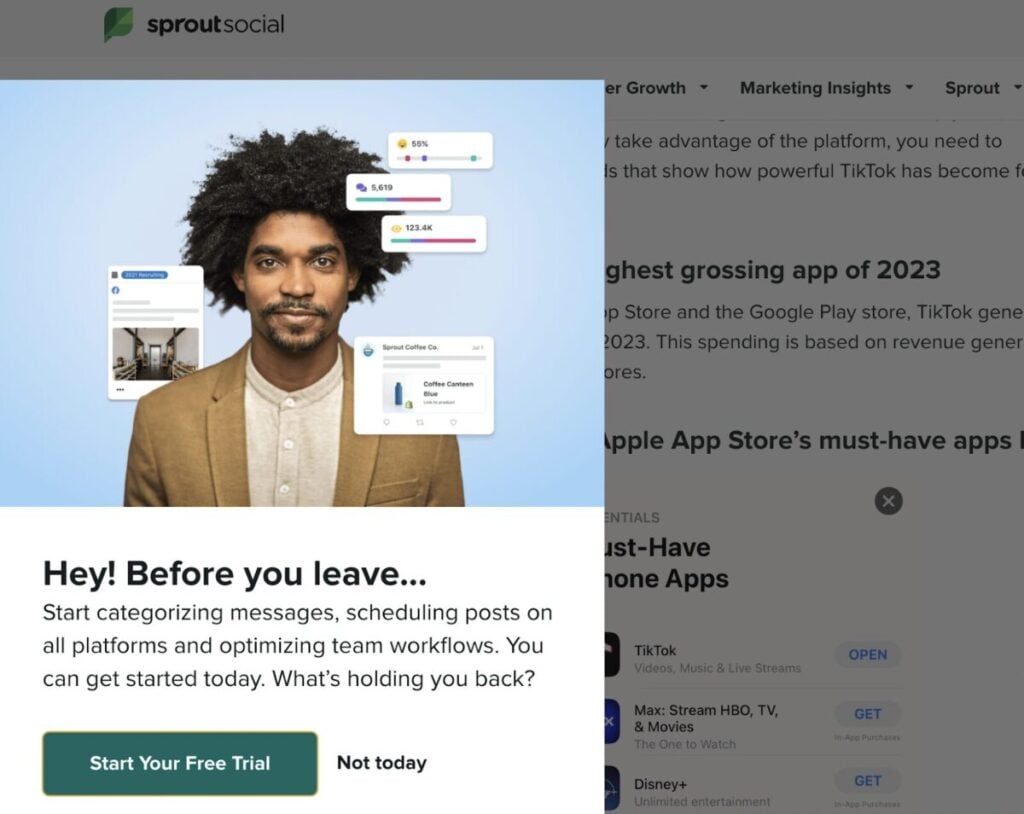
Source: sproutsocial.com
3. Test and Optimize Landing Pages
Landing pages are built specifically to receive and convert a specific subset of your audience. So it’s important to make sure that these pages are optimized for conversion. Every element on the page should serve a purpose in guiding visitors toward the desired action.
That means you’ll need to remove unnecessary elements that might distract visitors away from the action. You might even need to reduce the number of form fields to speed up the conversion process. It also means prominently highlighting the CTA buttons so visitors know exactly what steps they need to take. Don’t hide away important conversion elements at the corner of the page.
Another important landing page optimization step is to focus on creating headlines and copy that address the visitor’s needs and pain points. If someone landed on the page after clicking on an ad about designing emails, the copy should immediately address how visitors can design emails.
More importantly, make sure to test different landing page elements to see which ones work best at converting your target audience. Use a landing page optimization tool to test the headline and the CTA button placements as well as the button colors. Experiment with the number of form fields to see how people are most likely to convert.
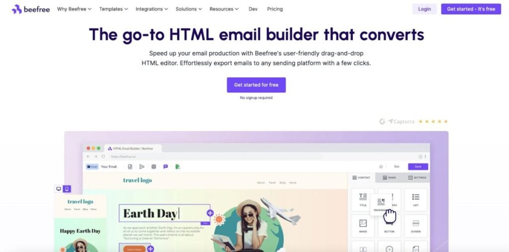
Beefree keeps their landing page simple and clutter-free with a single CTA button that encourages visitors to get started for free. They make sure to include a footnote about how you don’t need to sign up, which might make it even more enticing to use the tool. Moreover, the headline and copy are short and to the point, instantly highlighting the value that users can get from using the tool.
4. Craft a Compelling Value Proposition
Before people actually convert, one of the main things they’ll look at is your value proposition. If it’s not relevant to them or if it doesn’t address their needs, they’re not going to convert. Your value proposition should highlight your unique selling point with a focus on how it can deliver value to your target audience.
Use copywriting best practices to create clear and concise copy that effectively relates to the audience. Focus on how the product or offer will benefit them so they can understand why they should convert.
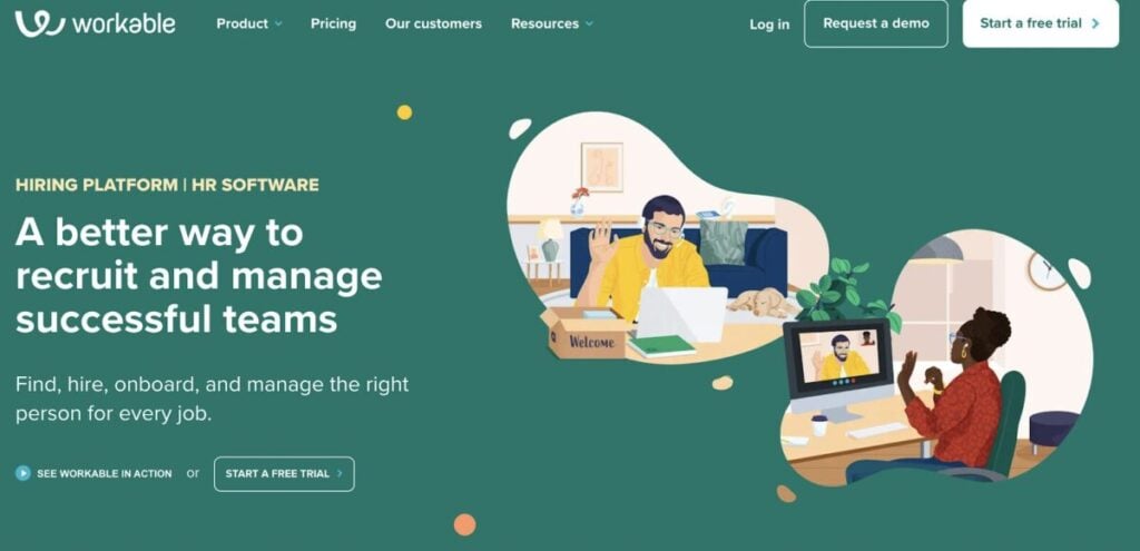
Workable does a great job of relaying their value proposition with clear and simple sentences. The headline highlights how the product offers a better way to recruit and manage successful teams. The subhead follows up with a short statement about what users can do with the product.
5. Create High-Converting CTAs
While the value proposition itself may be great, the call-to-action is what seals the deal. It’s where the actual clicks and conversions happen, which makes it crucial to optimize if you want to get more people to convert. So you need something that catches the eye and motivates people to take action.
Ideally, you should have a CTA button to prominently highlight where users can click to convert. In fact, CTAs shaped like a button had a 45% increase in clicks. Including an arrow at the end of the button could further boost clicks by 26%. Additionally, red CTAs performed 21% better than green CTAs.
However, it’s important to test different colors, designs, and placements to see what works for you. You can browse various CTA examples to find inspiration and come up with variations you can test.
Similarly, you’ll also want to test and optimize your CTA copy to see what performs best. The copy should ideally be customized to fit your product and offering. But you can also use tried-and-true options such as “get started,” “download now,” and “sign up for free” among others.
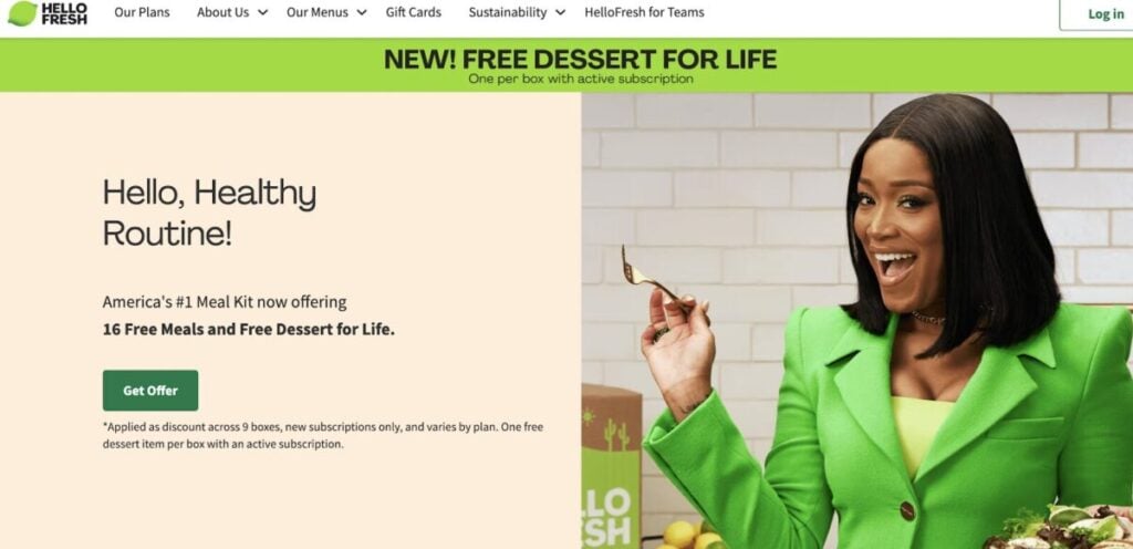
Hello Fresh entices people with an opportunity to “get offer.” This type of language highlights what’s in it for them, which could compel many people to take action.
6. Make the Most of Videos
Did you know ecommerce businesses can increase conversions by up to 80% with video marketing? This makes sense since videos provide audio and visual stimulation to effectively engage your audience. Not only does this help you get your message across more clearly, but it also helps the audience assess your products more closely.
Being able to see the product in a video is an excellent alternative to seeing it in person as it allows them to sense the look and feel. They’ll be able to get a more realistic understanding of what the material feels like and how it looks compared to the product photo. In some cases, they can even see the product in action through video, which could further guide their purchase decision.
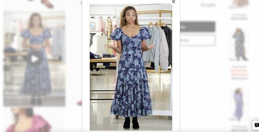
Nordstrom does a great job of incorporating videos into their product pages to give shoppers a better understanding of the product and guide their purchase decisions. In the following example, the brand’s stylist wears a dress and provides more information about it to guide shoppers.
She explains the feel of the dress and points out other elements such as the elastic banding on the neckline and the double-lining. She also discusses the size in comparison to her height and even provides suggestions on sizing down based on preference.
7. Optimize Your Checkout Process
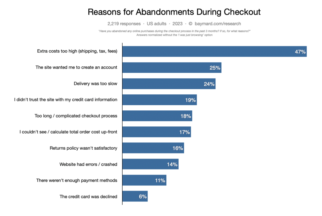
Even if people are all ready to make a purchase, something could change their minds at the last minute. Whether it’s an issue they encounter on the checkout page or a lack of suitable payment options, there are a lot of reasons they could abandon their purchase. In fact, the Baymard Institute found that the average cart abandonment rate was 70.19% across 49 different studies.
Some of the top reasons for cart abandonment include high extra costs, having to create an account, slow delivery, lack of trust in the site, and lengthy/complicated checkout processes. So it’s important to optimize your checkout process keeping these concerns in mind. For example, you could provide guest checkout options, provide faster delivery options, add trust badges, and simplify the overall checkout process.
Since one of the biggest concerns is the high extra costs and the inability to calculate total order cost up-front, make sure to address this by providing an option to calculate these costs on the product page itself. For example, you could add a field to check shipping and taxes based on pin code.
Like with your other optimization efforts, experiment with new changes to your checkout process to see what works best for you. Test different variations of your checkout page to see what gets people to convert.
Test, Optimize, Convert with Conversion Marketing
Based on what you can see above, it’s clear that experiments and tests play a pivotal role in conversion marketing. Make sure to use the tips highlighted above and keep testing and optimizing to increase conversions for your business.
Frequently Asked Questions
What is an example of conversion marketing?
An example of conversion marketing is delivering timely pop-up offers before visitors leave a website.
What is conversion in business?
In business, conversion is when someone takes a desired action such as filling out a form, downloading something, buying something, or signing up for something.
What are the top conversion metrics to track?
Besides conversion rate, some of the top conversion metrics to track include click-through rate, cost per acquisition, bounce rate, and average time on site.
How to calculate conversion rate?
You can calculate conversion rate by dividing the total number of conversions by the total number of visitors.
What are the conversion methods in marketing?
Targeted ads, pop-ups, A/B testing, checkout page optimization, page speed optimization, and CTA optimization are some conversion methods in marketing.
