Increasing engagement is about more than just sending a lot of emails and adding personalization.
You'll get better results when you focus on creating compelling and irresistibly clickable calls to action. That's how you can motivate shoppers to click that checkout button instead of abandoning their cart - or at least get them to sign up for your marketing emails. But as anyone who's ever tried to increase engagement by any real measure can tell you, it isn't easy.
Sometimes you need a few great examples from other top-notch marketers to help you on your way. So here are 20 brilliant CTA examples that can fast-track your path to engagement that gets sales. But first...
What Is a CTA?
A call to action (CTA) is a message included on homepages, landing pages, popups, blog posts, and emails that encourages visitors or readers to take a certain action. Typically, CTAs are quick phrases on buttons, but they can also be leading sentences ahead of a link, button, or other action. Some of the more common CTAs are simple phrases like “subscribe,” “learn more,” “buy now,” and “sign up.” CTAs are an important piece of your marketing funnel and can help move your leads to the next stage. You’ll hear a lot about CTAs if you explore email marketing best practices.
20 CTA Examples to Inspire You
If you want to increase traffic to your website and boost sign-ups and sales, creating just the right CTA is vital. Your CTA is what motivates visitors and readers to take next steps, so you need to make sure yours are noticeable, engaging, and irresistibly clickable. To help get your creative juices flowing and inspire your next CTA, we’ve put together this list of the best CTA examples we’ve found.
1. Purple: Learn More
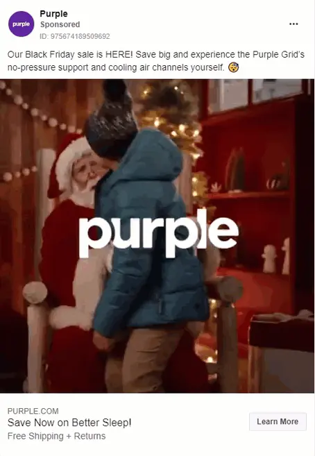
Source: facebook.com
Although “Learn More” is a pretty simple CTA, it’s perfect alongside the selling point in the ad: Purple’s mattresses have a specific design that makes them the best mattress you’ll ever own. Even though Facebook ads are pretty limiting in terms of the CTAs you can choose for your ad, this CTA combined with the fun video (and Black Friday sale offering $400 off) makes this an effective CTA example.
2. Netflix: Get Access

“Get Access” is a CTA that implies a bit of exclusivity. This CTA, combined with the rest of the copy on the page, lets users know that Netflix can offer them access to popular shows and movies that they aren’t going to be able to get anywhere else. Plus, the use of “cancel anytime” makes it even easier for users to say yes.
Netflix also has other CTAs that they show randomly. These include CTA examples like “Join the Fun,” “Start Here,” and others.
3. Evernote: Sign up for free

“Accomplish more with better notes.” Visitors to Evernote’s website understand what the app does from the moment they land on the page. Evernote uses whitespace to ensure that the bright green CTA button stands out to users. Plus, using “for free” in their CTA reduces friction for users who may be hesitant to pay for the app before knowing if it will work for their needs.
4. AppleTV+: Watch Now

AppleTV+ has a very simple CTA that’s supported by the drama of the website itself. The bright white CTA button encouraging users to “Watch Now” pops from the page as snippets of movies play in the background. It’s a great setup that reaches visitors where they are and encourages them to take that next step to sign up for the service.
The only thing we don’t love is the fact that it takes several clicks through until you get to actually watch anything. Apple could streamline the sign-up process and make it much smoother.
5. EarthHero: Treat yourself to 10% off

EarthHero is an online store built for environmentally-minded people. Their call to action is set up to speak directly to their target audience with the copy just before it that’s filled with phrases like “make a difference,” “chosen with the planet in mind,” and “sustainably.” It lets shoppers know that they can—and should—treat themselves when the products they’re treating themselves to are sustainable. It makes shoppers feel like they’re doing good for the earth and for themselves.
6. EPIC: Start a New Project With Us

Digital design company EPIC has a website that’s, well, pretty epic. When you click the menu, you’ll see the image above that includes one of our favorite CTA examples: “Start a New Project With Us.” There’s a lot to be loved about that CTA. First, they use the cost-neutral and powerful word “start” before signaling that they’ll be a partner in your project by using “with us” at the end of their CTA.
7. CloudSpot: Get Your App

This CTA example from CloudSpot is from one of their lead magnet campaigns that’s no longer live, but we can still learn from it and let it inspire us. With this campaign, CloudSpot is trying to not only grow their email list but also get more users on their app. CloudSpot uses the CTA “Get Your App” which is a great way to draw users into the offer and is better at getting users to feel that the app is for them than, say, “Get Our App.”
8. Proof: Request an invite

Few things sell better than the word “free” and the marketers at Proof are banking on it. While there are two obvious CTA examples on Proof’s homepage, we’re going to focus on the CTA that’s right in the middle of the page: “Try for free.” The headline copy primes visitors with the assertion that you can “convert up to 300% more leads and sales” which makes the “Try for free” CTA even more tempting.
9. Shakr: Schedule a demo with us today

Video marketing software solution Shakr starts off their headline with some pretty powerful words: “grow your brand.” Even if readers don’t read the rest of the sentence, their interest and desire is piqued. The rest of the copy lets readers know a bit more about what Shakr can do for them before getting to the understated CTA of “Schedule a demo with us today.” This CTA doesn’t need to be larger because the rest of the copy supports it and leads the viewer down to the CTA as the font size gets smaller and smaller.
10. Lyft: Prepare to Ride

Source: reallygoodemails.com
This is one of our favorite CTA examples that addresses the pandemic during 2020. Using the words “prepare to ride” as their CTA in this email, Lyft lets passengers know that things have changed a bit. In the email, they share information about the ride requirements and what riders need to do to keep themselves safe. The CTA lets riders know that they’ll be able to get more up-to-date information that will help them ride safely.
11. OfficeVibe: Try it free

Once again, our CTA examples turn to offers of free. OfficeVibe’s entire page is focused on getting users to commit to a free trial and uses a variation of “Try it free” throughout their site, “Get started free.” The rest of the page talks up the value of using OfficeVibe for your teams to make their CTA even more tempting.
12. Dropbox Paper: Browse template library

Source: reallygoodemails.com
In this CTA example from one of Dropbox Paper’s emails, Dropbox is trying to drive traffic to their site, specifically their template library. They start off strong with a bit of FOMO marketing (fear of missing out) by using the headline “Here’s what you’re missing…” before going into a quick description of Dropbox Paper and why the template library is valuable. Then, they include their CTA “Browse template library” before showing a few of the templates available and wrapping up with a variation on their CTA of “View more templates.”
13. Canva: Design anything

This may be one of our favorite CTA examples ever. Canva’s webpage is filled with highly visual stimulus that makes you just want to design anything, whether you really need to or not. With the addition of the CTA “Design anything,” Canva makes visitors feel as though they really can design anything with Canva. Plus, you can enter what you want to design and be taken directly to the Canva editor where they walk you through how to create your design. You can design and download before you’re presented with a sign-up form.
14. 4Ocean: Join the clean ocean movement

This is one of the more simple CTA examples but it’s just so effective. Everything about the popup is soothing. The blues and whites make you think about the ocean. The copy for the CTA (“Join the clean ocean movement”) is everything that the visitors to this site need to be ready to sign up. Plus, the 10% discount offer is a very nice touch.
15. Visit Greenland: In Winter OR In Summer

Here we’ve got two CTA examples from one site. Normally, having two calls to action is not recommended, particularly when they lead visitors to two different destinations. However, the two CTAs on the site make sense for a Greenland tourism site because Greenland in winter is quite a different vibe from Greenland in summer. It’s also a great way to start segmenting your list so you can send targeted emails based on when subscribers are thinking about visiting.
16. The Listings Lab: Fill Your Calendar With Appointments

The Listings Lab uses an excellent CTA to encourage visitors to sign up for their lead magnet. While the button itself is a decent CTA example (“Get Your Free PDF”), we think the real CTA is “Fill Your Calendar With Appointments.” Those are such powerful words for a website whose visitors are real estate agents who want to get more clients and more appointments without “wasting time at open houses, cold calling, or working even more hours than you are right now.”
17. HubSpot: Get free CRM

This CTA example from HubSpot leaves nothing to chance. It’s simple and direct, letting visitors know that they can get access to HubSpot’s CRM for free. This reduces friction with users and puts them in a better frame of mind to click the button and get started.
18. Lush: Build a gift

Lush basically has three CTA examples to look at here. The simple and directive copy leads visitors down to the “Build Your Own Gift” button. While we think the main CTA is the headline “Build a gift,” the second sentence is a great CTA, too. Then, you have the button that gives yet another great CTA example that personalizes the call to action, pointing directly to the visitor to build their own gift instead of just “a” gift.
19. Dollar Shave Club: Try the Club

Source: reallygoodemails.com
Dollar Shave Club is known for their off-the-wall ads and quirky brand personality. This email from DSC is pretty mellow compared to the rest of their marketing but the CTA “Try the Club” is very effective. The word “try” works for many readers because it implies an easy out should they not like the product. This reduces friction for users and makes them more likely to say yes.
20. Trello: Sign Up — It’s Free!

Trello starts out with a bold headline that lets visitors know what Trello can do for them and their team. The star of the show, of course, is the CTA “Sign Up – It’s Free!” As we’ve already mentioned, the word “free” really works.
Conclusion
In case you haven’t noticed from the CTA examples we’ve shared, CTAs don’t exist in a vacuum. Instead, they’re heavily supported by the surrounding copy. Of course, creating a CTA that’s short and sweet while still being compelling and irresistibly clickable also depends on making that CTA stand out. While many marketers opt to use buttons for their CTAs, you can see from the CTA examples we’ve included here that the CTA can really be anywhere in the copy. The purpose of the CTA is to motivation visitors to act, no matter where it’s placed. We recommend studying these CTA examples for inspiration you can use to create your own CTAs that are engaging and help you increase conversion.

