A great landing page can make an enormous difference in the number of leads you get and sales you earn. According to Unbounce, the average conversion rate for landing pages is 9.7%. Not only that, HubSpot reports that companies with more than 40 landing pages get 12 times more leads than those with just 15 landing pages. But what even is a landing page? And, most importantly, what goes into creating a landing page that converts? In this article, we're going to answer those questions and share with you 15 of the best landing page examples we've seen to inspire your own landing page designs.
What Is a Landing Page?
A landing page is a page with a single goal in mind. This could be to get leads, enroll visitors in your online course, sell a product, or any number of other goals you might have. Landing pages come in various lengths, with some being longform and others being as simple as a single image and signup form. Landing pages are used to eliminate distractions from visitors so they can focus on the single call to action that you're leading them towards.
15 Best Landing Page Examples
Here are some of the best landing page examples we've come across. We've included landing pages across a broad range of industries and have included detail about what makes the landing page great. You can use these designs and the accompanying details to guide your next landing page design so you can increase leads and sales.
1. Shopify
We start out our list of the best landing page examples with Shopify. This landing page is designed to get visitors to sign up for a free trial of the eCommerce platform. As you can see, the page is simple. It starts with a direct headline that tells visitors exactly what Shopify wants them to do and includes a subhead that lets visitors know why they should take Shopify up on the offer. The call to action is simple—"Start free trial"—and Shopify closes things out with three benefits of Shopify designed to convince visitors that they're worth a try.

2. Marketo
This post-click landing page example from Marketo starts out with a powerful headline that lets visitors know exactly what to expect from the report they're being encouraged to download. The bullet points let visitors quickly scan the page to find out what's included in the report so they can determine if the report is valuable to them. Marketo also includes social proof in the form of a customer testimonial and company badges. Social proof lets visitors know that other people trust Marketo, implying that they can too.

3. Holded
This landing page example from Holded is a click-through from a Google ad campaign. It includes a great headline that appeals to businesses that view themselves as "modern." The "Who's It For" section is a brilliant touch; it encourages visitors to take a look at different segments of Holded's audience so they can determine for themselves if they want to be part of the same group (Holded users). We also love that Holded offers visitors the chance to try out the product. When you get visitors to use your product during a free trial, they're more likely to turn into paying customers (if the product is good, of course).

4. ActiveCampaign
ActiveCampaign is an email marketing platform and you know that the moment you end up on this landing page. The headline is perfect, letting visitors know that ActiveCampaign can help them get their emails "in front of the right people." This tells visitors that ActiveCampaign has segmentation tools that they can use to personalize their email marketing campaigns. This hyper-focus on the visitor and their goals makes it a lot easier for people to agree to the offered free trial.

5. Studio NOOR ANISA
Studio NOOR ANISA is run by Maylene Seah, a lifestyle branding and packaging expert. In this beautifully-designed landing page example, she includes a brief introduction about herself before getting right into the benefits she can bring to her customers. The goal of this landing page is to encourage visitors to book a discovery call with her. This is a high-intent offer, so it's perfect that Seah includes more in-depth testimonials as well as a free 20-minute brand discovery call for those visitors who want to dip a toe in before committing to a 45-minute call. Seah also includes a lovely picture of herself that can increase trust.

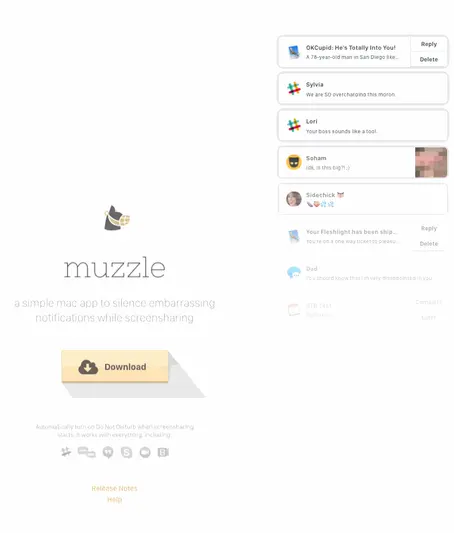
6. Muzzle
We absolutely love this landing page example from Muzzle, an app that silences and hides on-screen notifications so you don't get caught out during video calls. The landing page itself is perfect, demonstrating why you'd want such an app in the first place with a flurry of some of the most embarrassing notifications we've seen. The message is clear: do you want your coworkers, boss, and customers to see this on your screen during a meeting, or do you want to use Muzzle?
7. Slack
Slack never disappoints with their landing pages. This landing page example uses a neat scrolling feature so visitors can see everything Slack has to say without scrolling up and down the page. The signup form itself is a single field, making it more likely that visitors will complete the form. And, no matter which section of the landing page you're seeing, the form field is visible. The call to action is simple and includes a magic word ("free"). Slack also includes their normal bright and engaging colors to keep visitors visually engaged.

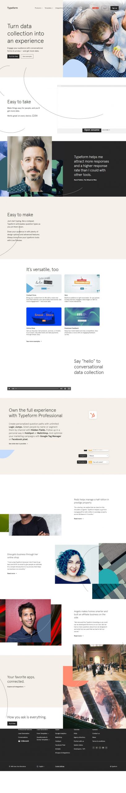
8. Typeform
This landing page example from Typeform is filled with high-quality social proof geared towards the people Typeform is trying to reach: business owners. The landing page looks great on desktop, tablet, and mobile—a good thing since Typeform is trying to let visitors know that they're mobile-ready. We love that Typeform uses testimonials to sell the product.
9. HubSpot
In this landing page example from HubSpot, they draw attention to a challenge that many SaaS businesses face: how do you target the right audience when you have several different audiences you need to appeal to? HubSpot solves this by giving visitors to their landing page the opportunity to self-segment depending on the demo they choose. This simple landing page lets visitors know that HubSpot has options for everyone and lets them choose the demo that's right for them.

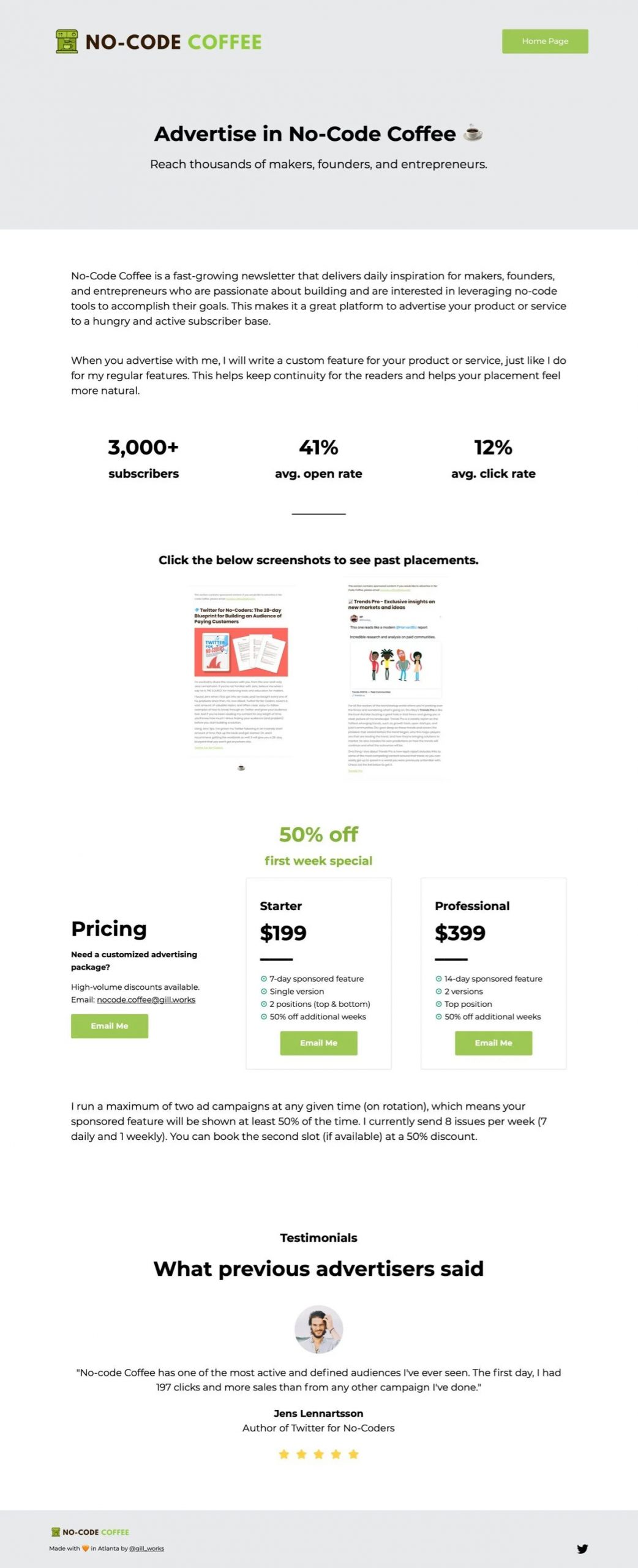
10. No-Code Coffee
This landing page from No-Code Coffee, an email newsletter for no-code fans, has a little bit of everything that those considering advertising in the newsletter might need. The headline is simple enough, letting visitors know what the page is about and the subhead immediately highlights the benefit of reaching thousands in three key segments. No-Code Coffee then includes the email marketing benchmarks advertisers will want to about the number of subscribers, open rates, and click-through rates. From there, No-Code Coffee provides examples of ad placements for previous advertisers, which we think is a great touch. Wrapping up with a testimonial from a happy advertiser is the social proof kick that potential advertisers need to motivate them to sign up.
11. OneRecruit
OneRecruit shows how you don't need huge brand awareness to create a landing page that converts. In this landing page example, OneRecruit uses marketing automation software in the form of a chatbot integrated with Typeform. This automates OneRecruit's lead capture process and helps them appeal to a broad target audience.

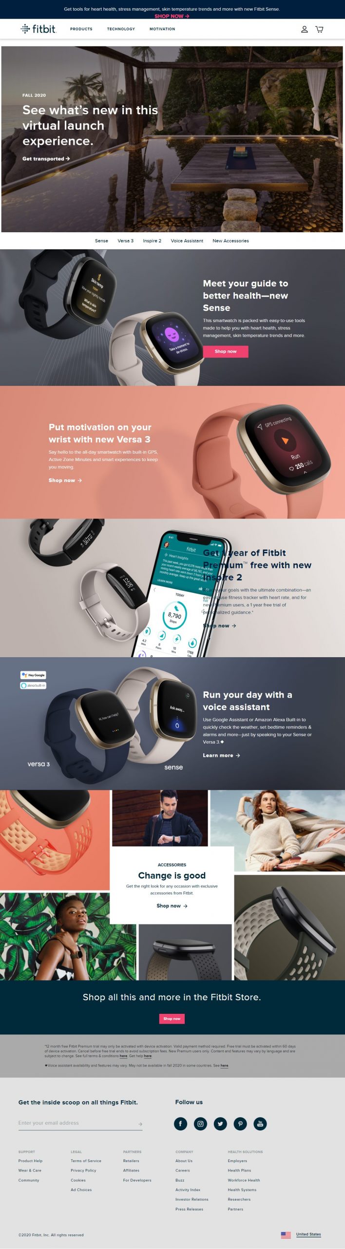
12. FitBit
FitBit is a landing page example that breaks the rules. Namely, the "one CTA" rule. Most eCommerce sites are exempt from the one CTA rule because the CTAs they include all have the same goal: make the sale. FitBit is no different. On this landing page example from the fitness brand's most recent "What's New" page, you'll see tons of beautiful imagery with bold background colors separating each section, a lot of white space to draw the eye to what's important, and images of FitBit's products in action.
13. Winc
In this landing page example from curated wine box brand Winc, they start things off on the right foot with an offer of $20 off your first order (this offer changes depending on their promotions). The headline and subhead are incredibly simple yet still let the visitor know exactly what it is that Winc does. From there, they tell you in three simple paragraphs why Winc is for you: they curate wine boxes for you based on what you already know you like. Winc wraps up their landing page with an enormous yellow box that houses a simple, yet powerful testimonial: "The proof is in the bottle."

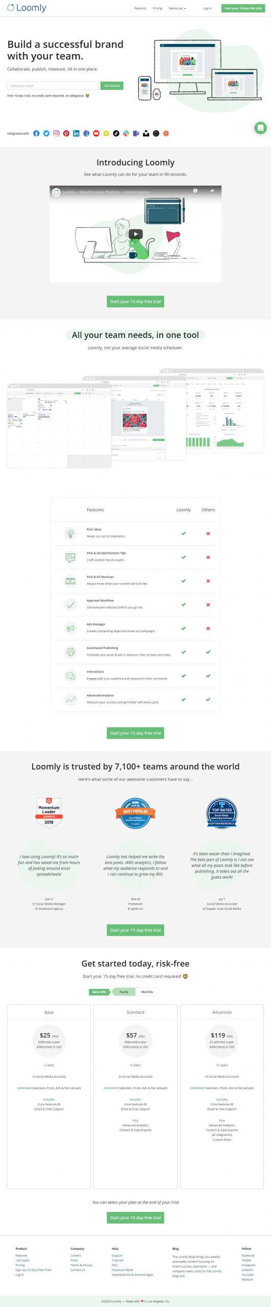
14. Loomly
This landing page example from Loomly starts out with a strong headline and subhead that let visitors know what you can do with Loomly. After the "above the fold" content, complete with a single-field signup form (are you sensing a theme?), Loomly includes a short, 90-second video that sets Loomly apart as a brand success platform and encourages visitors to sign up—or at the very least continue down the page to learn more. One of our favorite things about this landing page is that Loomly doesn't shy away from direct comparison to their competitors. And why should they? As visitors can see from the included checklist, Loomly has much more to offer than the other solutions out there. Loomly wraps up this excellent landing page with some powerful social proof and pricing.
15. Pipedrive
We love a brand that's so confident they call out their competitors by name. And that's exactly what Pipedrive does in this landing page example comparing their platform to a top rival, HubSpot. The landing page starts out with the headline "Pipedrive vs. HubSpot" and includes a few paragraphs addressing actual HubSpot users who fled the platform for Pipedrive—and why. Pipedrive highlights five reasons they're the best alternative to HubSpot before diving into more detail about the benefits Pipedrive brings to its users. The landing page wraps up with customer testimonials and features. Throughout, Pipedrive uses the call to action "Try Pipedrive for free" to encourage visitors to sign up for a free trial.

Ready to Create Your Own Landing Pages?
Now that you've seen our picks for the 15 top landing page examples, are you ready to create a landing page (or 40) of your very own? As you go about creating your next landing page design, keep in mind these tips to create a beautiful landing page that converts:
- Keep it simple. Your landing page should be nice to look at and easy to read and understand.
- Write like a real person. Avoid using buzzwords and jargon in your landing pages and instead, talk to your readers like they're friends you're just having a chat with.
- Choose your words wisely. Share your key message and don't add a lot of extra stuff. And don't repeat yourself! Your landing page should lead your visitor from start to conversion—if you're repeating yourself, you're likely taking them back to an earlier point in your marketing funnel message.
- Use social proof. Your visitors are going to trust your other customers more than they trust you. We're people, right? We trust other people, not brands. Using social proof like testimonials, influencer quotes, and customer reviews lets visitors to your landing page know that other real people trust you.
- Make it mobile-friendly. More than 50% of all web traffic comes from mobile devices. Make sure that your landing pages are responsive and look great on all devices.
- Include video. Video is a huge seller. If you're not already using video in your content marketing, learn how to create a video content strategy here.
- Test everything. Your landing pages aren't just a "set it and forget it" thing. To make sure that they're converting as well as they can, you'll want to test everything: headlines, design, page copy, your offer, CTAs, social proof, and more.


