Data is everywhere today – from Youtube algorithms to messaging applications and anywhere where people connect to the internet or use a device. Companies also have a variety of ways to collect data on their customers, from CDP software to direct user surveys.
But with a lot of data comes the need for analysis. Without it, all the data in the world will just look like a meaningless bunch of numbers. That’s where data visualization tools come in: platforms and software where a company can input data so they can understand where it comes from – and more importantly, why it matters.
Best Data Visualization Tools To Use In 2025
1. Tableau
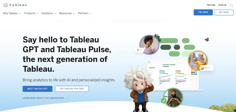
Price: Public version available (paid plans range from $12 to $70)
Highest Rated Feature: Interactive Visualizations
Notable Users: Whole Foods, Dubai Airports, Verizon, Bentley, CVS
Pros:
- Plenty of different templates for quick and easy designing
- Can integrate data from places like SAP and Amazon AWS
- Backed by Salesforce’s customer-driven insight
Cons:
Read More2. Infogram
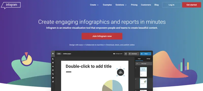
Price: Free version available (paid plans range from $19 to $149)
Highest Rated Feature: Ease Of Use
Notable Users: GTB, Fairfax Media, Warner Music Group, USA Today
Pros:
- API available to import third-party resources
- Plenty of options for infographics, maps, and charts
- Audience tracking with performance metrics
Cons:
- Data sources lacking compared to other similar applications
- Not suitable for deep dives with visualization
- Requires internet access to use
Infogram is an online tool that can quickly create clear and concise data visualizations without the need for extensive training or effort. This is primarily thanks to its drag-and-drop design, where users can simply pick, shuffle, and arrange visual elements and data with ease.
Read More3. Microsoft Power BI

Price: Free version available (paid plans range from $13 to $1000+)
Highest Rated Feature: Business Intelligence And Analytics
Notable Users: Heathrow, Bayer, Westinghouse, T-Mobile, HP Inc
Pros:
- Similar to Microsoft Excel, but with drastically expanded features
- Has a robust security infrastructure to keep data private
- Easy integration with all Microsoft products
Cons:
Read More4. Google Charts
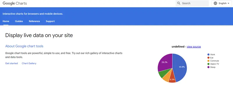
Price: Free
Highest Rated Feature: Open Source Data Visualization
Notable Users: Individual users in almost every industry
Pros:
- Requires little to no technical training to use
- Compatible with Google’s suite of services
- Visualization works across different browser types
Cons:
- Coding knowledge is required for some features
- Needs an internet connection to use
- Lack of extensive customization options
Companies looking to avoid the usual paywalls or limitations with other data visualization tools should consider Google Charts. As it’s an open-source platform, there are no features that need to be paid for, and it is highly accessible thanks to its cloud storage and data structuring options.
Read More5. Zoho Reports (Zoho Analytics)
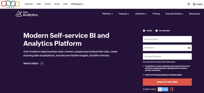
Price: Free version available (paid plans range from $30 to $459)
Highest Rated Feature: Balance Of Pricing And Features
Notable Users: Hyundai, Philips, Ikea, Southern States, Allianz
Pros:
- Integrates with hundreds of apps, including social media platforms
- Responsive customer support and community
- Automatic reporting and multi-user collaboration
Cons:
Read MoreWhy Data Visualization Is Necessary
With the technology available to us today, obtaining data is less challenging than interpreting it correctly. The sheer amount of data companies can gather goldmines of useful, actionable information, especially when presented in a visually coherent way.
But this is easier said than done: gathered data doesn’t come in conveniently presentable packages. But people are visual learners: they’re far more likely to remember something if it’s presented graphically. In fact, 65% of individuals prefer visuals for content; and as far as marketing is concerned, a little over 50% of companies pivoted to a visual content marketing strategy in the past three years.
All of this points to a very simple message: people want data, and they want it visualized.
How Data Visualization Helps Businesses
Data visualization benefits companies as well as customers: businesses still have difficulty comprehending and integrating data. Data visualization tools can solve these bottlenecks in strategy and execution, allowing companies to see what areas need attention without parsing through thousands of different data sets.
Other benefits of using data visualization tools include:
Analyzing Market Patterns, Events, And Trends
One of the best ways to create a strategic business plan is to account for past and ongoing trends in the industry. However, given that so many factors can affect trends – from cultural shifts to a random meme going viral – it can be difficult to get a clear overview of where the state of the industry is, much less where it is going to go.
Data visualization tools can help with trend analysis, with different ways of presenting data that can suit the needs of a business. By framing the data in a way that can easily be analyzed, businesses can gain greater insight into what trends drive their industry and help plan approaches that can best utilize these opportunities.
Aligning Internal Operations
Alignment is always an issue with any business regardless of size. Given the increased culture of cross-collaboration between different internal teams (sometimes across time zones and functions), it becomes important to keep data in a place where everyone can access and understand it freely.
With data visualization tools, it’s far easier for businesses to have their teams align with each other’s goals, check on each other’s performance, and overall collaborate better for a more efficient working environment. This also reduces operational costs by lowering the risk of wasted time and resources.
Understanding Customers Better
Many companies today choose to go global with their operations, which means that the data they acquire spans continents. The sheer amount of data is useful for understanding their customers, but only if it’s presented correctly.
A data visualization tool can give a company a comprehensive insight into who its audiences are, which allows them to optimize its products/services for a better customer experience. It’s also helpful when businesses choose to expand to new markets or develop their products since the gathered data can be used to improve products/services in specific ways.
Frequently Asked Questions
Is data visualization software a requirement to create data visualizations?
Technically any application that can help display data for easier overview and analysis can qualify as a data visualization tool. What makes specific tools like Microsoft Power BI more effective than options like Excel is their features that make creating visualizations easier and more accurate, like real-time data integration and automated reporting.
Is there a difference between data analysis and data visualization?
Data visualization strictly refers to the capability to display data in a way that makes it easier to analyze and understand. It’s primarily concerned with output (what the data looks like), in contrast to analysis (the process of analyzing the data). The two areas have some overlap, but data analysis acts more as the input behind data visualization.
What type of visualizations can a user get from data visualization tools?
Most data visualization tools offer a wide range of different types of visualizations, from simple graphs to interactive charts. Some applications even allow users to generate their own visualizations from scratch rather than loading a pre-made template with their own data.
What are the considerations to keep in mind when choosing a data visualization tool?
There are three specific concerns a data visualization tool should meet for any user:
- Ease of use and accessibility
- Availability of different outputs and visualizations
- Integration capabilities with different sources of data
These considerations will help gauge how easy the tool is to use (or learn), how versatile the outputs will be, and how much freedom the user must integrate the data sets that they need. Achieving a balance between all these needs is crucial for deciding the best tools available.
How secure are data visualization tools?
While specific security features will differ depending on the tool, data visualization software generally has protections in place to secure data. Given that there’s a significant amount of data that can pass through data visualization software, users are advised to always opt for tools that have a strong security infrastructure, like data encryption and consistent security updates.


