While LinkedIn is all about insightful content and Twitter is all about trending conversations, Instagram is all about aesthetics. Visuals are everything on Instagram. Even if you have valuable content for your audience, it might not have the desired impact if you don’t present it in a visually-appealing manner. This is why it’s crucial to plan your Instagram layout to create a cohesive page that instantly catches the eye.
Instagram layout planning may seem unnecessary, but it could make all the difference between someone clicking on the “Follow” button and someone leaving your page to find new content. This post provides you with some great Instagram grid layout ideas and tips to plan your Instagram page. Let’s get started.
Instagram Layout Planning:
Why Plan Your Instagram Layout?
When someone visits your Instagram profile, your content layout is the first thing that they see. So it needs to be enticing and inviting enough to make people want to follow you. Think of it as your store décor that could entice people to walk in and check out your products or in this case, the rest of your content.
Having a cohesive Instagram layout helps you maintain a strong visual identity–whether it’s for your brand or for your personal image as a content creator. For example, an instant pop of bright colors could give off a fun and positive vibe whereas you can create a minimalist vibe with muted colors and clean images.
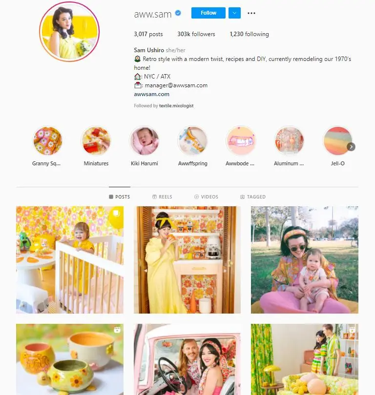
Source: instagram.com
It also shows people that you’re serious about what you do and that you’re willing to spend time on planning things out. This adds credibility to your profile, helping you come across as reliable and consistent.
Moreover, following a specific grid layout makes it much easier to plan out your content calendar. Since you already have a rough idea of the type of content that’s needed for a specific grid, it’s much easier to quickly develop content for that grid. So for example, if you’re posting graphics with text overlay for one grid, you could easily whip up some fun facts or quotes relevant to your audience or to a particular day.
8 Instagram Grid Layout Ideas
Now that it’s apparent that it’s time to get serious about planning your Instagram layout, let’s take a look at some ideas for inspiration. Here are some of the most popular Instagram grid layout ideas you can use:
1: Squares
Starting with the basics, a square grid layout is an easy way to maintain a consistent Instagram aesthetic. You don’t have to worry about how to position your images. Just make sure you’re sticking to the same color combination or filter so your page doesn’t look messy.
The idea is to maintain a visual theme that aligns with your personal or brand identity–whether that’s minimalistic, vintage, bright and bubbly, or dark and moody. This allows you to create a uniform visual identity for your profile that’s instantly noticeable even at first glance.
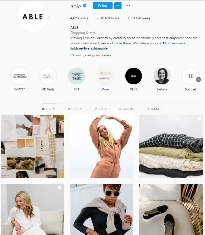
Source: instagram.com
2: Checkerboards
Another easy option is to use the checkerboard or tile layout. This involves posting two different types of content alternately to form a visual checkerboard. For example, you could share a photo followed by a quote and then another photo. Or you could also post images with two different background colors in alternate rotations.
This not only helps you diversify your content but it allows you to maintain a clean and coherent page. And your audience can anticipate what to expect next because you’re following a consistent posting sequence. Here’s a beautiful example from Honest Beauty where they post product images alternatively with text posts containing facts and stats.

Source: instagram.com
3: Text line
If the checkerboard layout doesn’t appeal too much to you but you still want to alternate between text and image posts, this layout is a great option. It involves creating a single vertical line using text-based posts. So you have a 2:1 distribution between visuals and text. That means you have more visual content to attract your audience but still have some text to help diversify your feed.
The text line typically runs down the middle but you can play around and have it run down the side of your page. What’s great about this layout is that you can easily reuse a template to create your text-based posts using the same fonts and color schemes. This is an effortless way to maintain a feed that’s consistent, diversified, and eye-catching. Alternatively, you can even coordinate each row by color or subject matter even if you don’t share text-based posts.
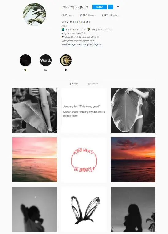
Source: instagram.com
4: Diagonal
For those who need something a little less obvious but still coherent, a diagonal grid layout is an excellent option. It involves arranging the same kinds of photos in a diagonal pattern. These photos typically focus on the same subject matter and follow the same color scheme to form a consistent pattern when viewed as a whole.
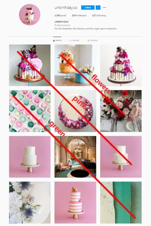
Source: instagram.com
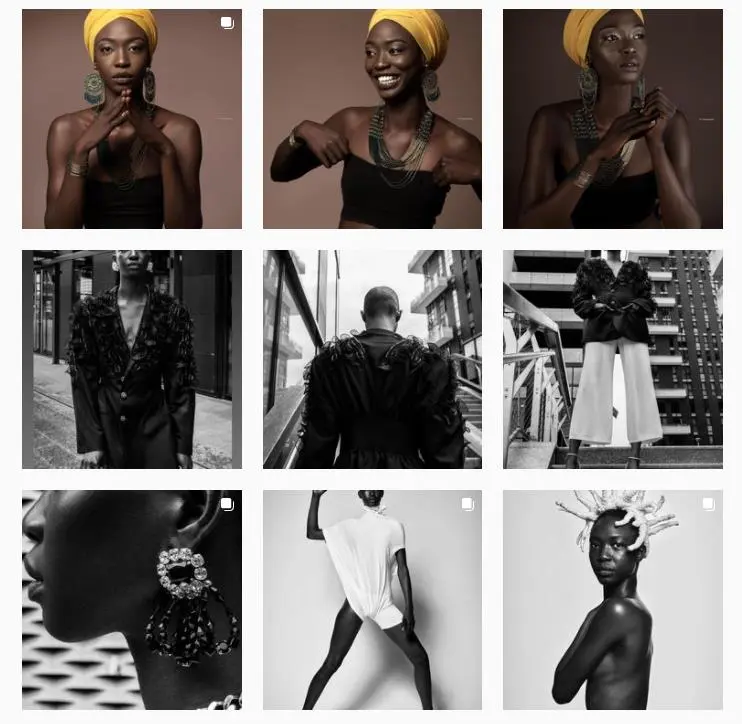
5: Row by row
The row by row layout is a great way to tell a visual story and allow your audience to follow your story in a sequence. This layout involves dedicating each row to the same types of photos. It could be photos that focus on the same subject matter, follow the same color scheme, or were taken on the same set.
Source: instagram.com
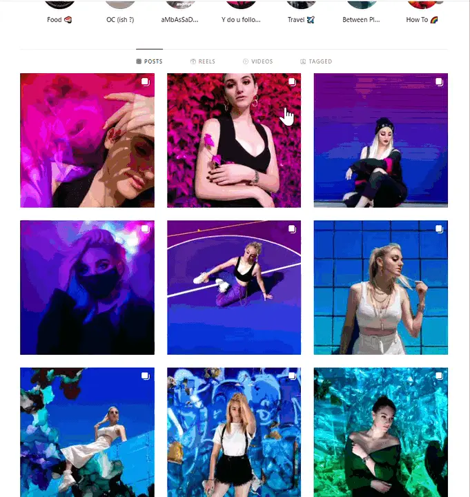
6: Rainbow
If you love colors, the rainbow Instagram grid layout is a must-try. It involves creating a layout where the color scheme changes as people scroll. It doesn’t necessarily have to be in a rainbow pattern but the transition should be seamless so that your feed looks spectacular when viewed as a whole.
This is one of the best layouts for playing with colors, although it does require a bit more planning and creativity. It’s a bit like the row by row layout except that each row has to be visually connected to the others.
Here’s a beautiful example from digital creator Sarah Peretz. The colors of her page seamlessly transition into the colors of the rainbow. It’s obvious that she took the time and effort to plan out her content so that the colors flow effortlessly into each other as people scroll through her feed.
Source: instagram.com
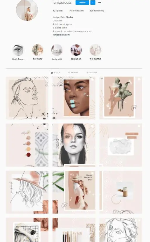
7: Puzzle
One of the most high-level Instagram grid layouts, the puzzle grid is highly strategic and requires superior image quality. It involves combining different image grids to form a larger picture much like combining different puzzle pieces.
The tricky part is ensuring that each image makes sense on its own but also comes together with the other images to form something coherent. So you have to be extremely strategic about what you include in each grid and the order in which you post the pictures.
Source: instagram.com
8: Borders
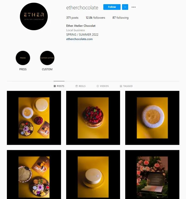
While the regular Instagram layout looks good on its own, you can tidy it up even more using borders. This involves adding a border to all of your posts so that there’s more whitespace between each image. The borders will frame the image so there’s a greater focus on the subject matter. Just make sure that you’re consistently using a similar style of borders so there’s uniformity when the layout is viewed as a whole.
Try playing around with different border styles. While square borders are popularly used, you can also try rectangle, vertical, and even round borders depending on how you want your overall feed to look.
For example, Ether Chocolate uses borders that frame their images in a vertical format. The sophisticated black borders align with the brand’s luxurious and exclusive vibe.
Source: instagram.com
Steps for Planning Your Instagram Layout
Now that you have some great ideas for your Instagram layout, it’s time to start planning yours. Follow these steps to create a consistent Instagram grid layout that stands out:
Step 1: Decide on your visual identity
Start with a clear definition of the vibe that you want to exude through your visuals. What is your brand personality and how can you showcase that using visual elements? For example, businesses may be able to use the colors of their brand logo for inspiration. Or if you’re into minimalism, subdued filters and muted color tones may be the perfect way to express that.
This is an important step for both businesses and content creators alike. When people land on your profile, the visual vibe should be instantly apparent. And defining your brand personality and visual identity can give you some direction.
Step 2: Pick an Instagram grid layout
Next, it’s time to choose between the different Instagram layout ideas that we provided earlier. Which layout would be best suited for the kind of content you want to create? More importantly, which grid layout can you maintain most effectively depending on your time and resources?
It’s good to note that you don’t have to stick to one specific layout. Instead, you can even mix things up to create your very own layout combination that aligns with your brand’s visual identity. For example, you can use the rainbow layout and add some borders to maintain a clean and minimalist feed.
Step 3: Choose your filters and colors
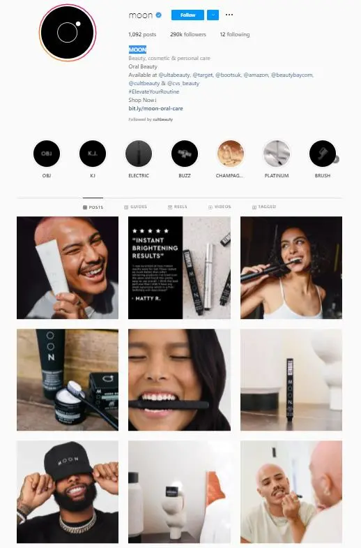
One of the key steps is deciding on the filters and colors that will help you express your brand’s visual identity. Your brand’s colors and vibe should be prominently visible even from just looking at your feed. Since consistency is the key to maintaining an eye-catching Instagram aesthetic, make sure you have this decided well ahead of time.
You could start out by taking some inspiration from your brand colors. Then decide on two or three shades that align with the colors that you want. Unless you plan on using the rainbow layout, avoid choosing too many colors as you could end up with an inconsistent feed that doesn’t really say much about your brand.
You can then find ways to incorporate these colors into your photos. For posting text-based images, you could use one of the colors as a background so your feed consists of the same color scheme throughout.
Source: instagram.com
Additionally, utilizing the same filter across all your photos can help you maintain a consistent visual identity. Choose something that complements the colors of your brand and works well with the vibe that you want to exude.
Step 4: Plan your content
Once everything’s sorted, you can start planning and creating your content based on the grid layout that you want to maintain. For example, if you want to use the checkerboard layout, plan out enough quote or text-based posts and photos to post on alternate days for the rest of the month. You’ll also have to decide on the order in which you should post them based on the intended layout.
Use a visual content calendar to simplify this process. This will allow you to visualize how your feed would look after a certain post gets published. So you can easily rearrange your posts to make sure that your page remains coherent.
3 Best Grid Planner Tools You Can Use
So now that you’re all ready to start planning your Instagram grid layout, what’s next? While you can get started immediately, having a grid planner tool makes the job ten times easier. Here are some of the best grid planner tools to use in your Instagram layout planning:
1: Later
Later is an Instagram scheduling tool that comes with a visual content calendar to simplify your content planning. The grid preview feature is super handy to help you plan your Instagram layout more effectively. This allows you to see how your feed will look so you can easily rearrange your posts to create a more cohesive layout.

Source: later.com
2: Planoly
Planoly is a visual planner that comes with an easy drag-and-drop feature. You can upload your content to the IG Planner and instantly visualize how your layout would look. From here, you can rearrange your content and schedule your posts to go out at optimal times.

Source: pages.planoly.com
3: Tailwind
Tailwind is another popular visual planner tool that allows you to preview how your grid would look. You can drag and drop your posts to easily rearrange them and make sure they look great in your feed.

Source: tailwindapp.com
Get Your Grid On
Having a cohesive Instagram grid layout is one of the best ways to instantly draw in your audience and get them to follow you. Make the most of the ideas, tools, and instructions above to start planning your Instagram layout.
Frequently Asked Questions
How do you plan layout on Instagram?
You can plan your layout on Instagram by sticking to one color combination and filter and planning the order in which your posts will appear in your profile.
How do I organize my Instagram posts?
You can organize your Instagram posts by choosing a grid layout and planning your content based on the layout.
How do I visually plan my Instagram feed?
Tools like Later and Planoly can help you visually plan your Instagram feed.
How do I make my Instagram profile more attractive?
Posting great quality photos and maintaining a cohesive feed can make your profile more attractive.
How do you make your Instagram look aesthetic?
Maintaining a consistent visual theme is essential to make your Instagram look aesthetic.

