Your online store might attract loads of website visitors each month, but that doesn’t necessarily mean that your monthly sales are as healthy. There’s a lot that can happen between landing on a website and the checkout page.
As a matter of fact, eCommerce statistics reveal that in the United States, the online shopper conversion rate is as low as 2.3%. This means that if 100 people visit your website, fewer than three will purchase a product.
Despite this, there are ways to improve your conversion rates. One way to do that is to use AI. Our State of Marketing 2024 Report found that 24% of B2B brands are seeing much higher conversion rates with AI.
The answer isn’t as straightforward as throwing in a freebie or running more ads to clinch sales. Sure, marketing and promotions are important, but those techniques can only help that much. From website design to product photography, there are many elements involved in running an online store from which consumers actually want to buy something.
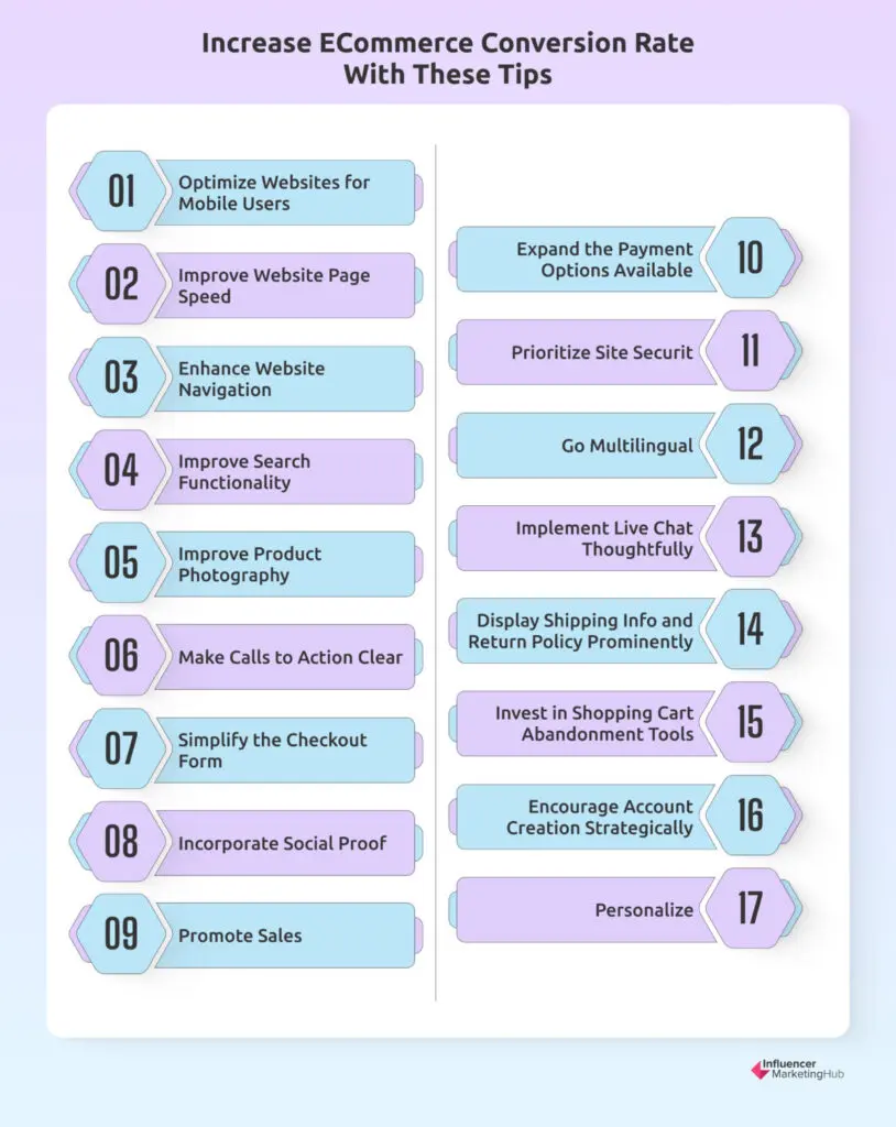
Here are 17 ways that you can boost your conversion rate, many of which you can start implementing immediately.
17 eCommerce Conversion Rate Optimization Tips That Work:
- 1. Optimize Websites for Mobile Users
- 2. Improve Website Page Speed
- 3. Enhance Website Navigation
- 4. Improve Search Functionality
- 5. Improve Product Photography
- 6. Make Calls to Action Clear
- 7. Simplify the Checkout Form and Label Both Optional and Required Checkout Fields
- 8. Incorporate Social Proof
- 9. Promote Sales
- 10. Expand the Payment Options Available
- 11. Prioritize Site Security
- 12. Go Multilingual
- 13. Implement Live Chat Thoughtfully
- 14. Display Shipping Info and Return Policy Prominently
- 15. Invest in Shopping Cart Abandonment Tools
- 16. Encourage Account Creation Strategically
- 17. Personalize
- Frequently Asked Questions
17 eCommerce Conversion Rate Optimization Tips:
1. Optimize Websites for Mobile Users
Considering that your target audience’s search typically starts on a mobile device, mobile responsiveness is a good place to start if you want to optimize your website for conversions. This is especially important if you want to reach younger audiences.
And, if you thought that mobile devices are merely used for product research, you’re wrong. Increasingly more consumers are completing the entire buyer’s journey using a tablet or a smartphone.
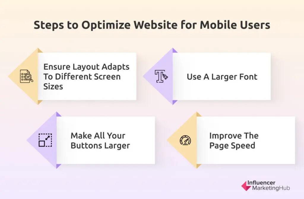
You can start by doing the following:
Alternatively, you can leave all of that to a responsive web design agency. Considering that Baymard’s mobile UX benchmark report found that the average mobile site performance is still mediocre (in fact, no sites were graded as good or perfect), this is probably the best course of action.
2. Improve Website Page Speed
Page loading speed isn’t just important for mobile users. All store visitors, irrespective of if they use a PC, laptop, or smartphone, should be treated to web pages that load quickly.
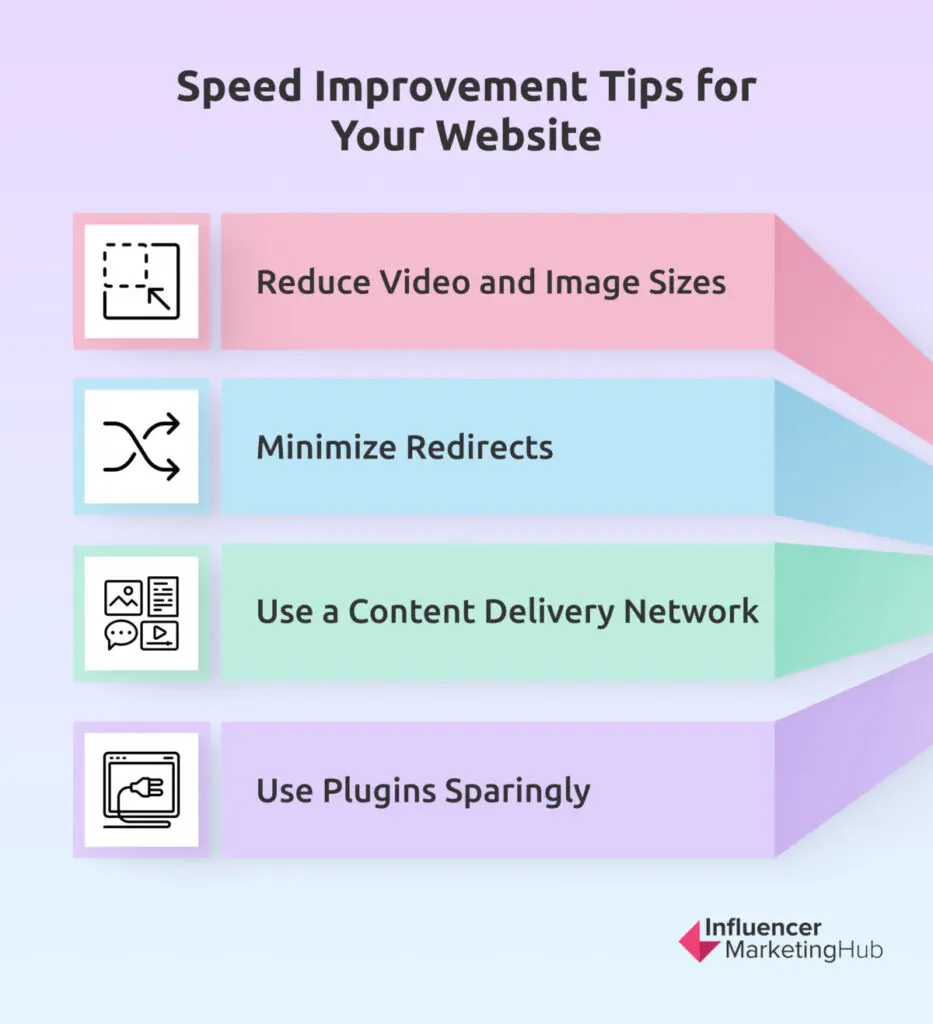
Here’s how you can improve your website’s speed:
3. Enhance Website Navigation
Not only should your pages load quickly, but it should also be easy for users to find the info or products they need, whether they’re browsing on their smartphone or computer. Without intuitive navigation all your efforts to improve web page speed will be wasted.
To keep the navigation user-friendly, find a way to display all the necessary information and elements while keeping the layout uncluttered. In the case of website design, the adage “less is more” applies too.
4. Improve Search Functionality
A search bar and product categories are two key elements that can help improve navigation. It can be a good idea to try and set up your website in such a manner that customers can search within categories. This will also help to improve the mobile experience as it will allow users to see a smaller group of products which is better adapted for smaller screens.
You can also use popular filters like color, size, gender, age, etc. to let them refine their search. Whichever feature you add should make it easier for shoppers to track down a specific product among all the thousands of other products. The goal is to speed up the search process.
5. Improve Product Photography
Product photos are the only way that customers can see what the product looks like. Sure, there’s the product description too, but it’s more challenging to visualize a product based on words alone.
Photos will also go a long way in capturing and maintaining their attention. In fact, Baymard’s large-scale usability testing has revealed that more than half of users first browse the product images after landing on the product details page.
The emphasis here is on quality. The quality should be high enough so that users can zoom in to see the product in more detail. If you need more motivation to prioritize product photography, consider this. Low-quality photos not only prevent users from learning more about a product, but they also reveal that your brand is cheap and possibly untrustworthy.
While on the topic of photography, also make sure to include photos of your employees and possibly headquarters. This can help to humanize your online brand and create trust.
6. Make Calls to Action Clear
Call-to-action buttons and prompts like “Add to cart”, “Proceed to payment”, “Continue browsing”, etc. should be clear. Not only should the instruction be unambiguous, but shoppers should also be able to see the actual button clearly among all the other website content.
At the same time, use them wisely. Too many will be overwhelming and complicate navigation.
7. Simplify the Checkout Form and Label Both Optional and Required Checkout Fields
The checkout funnel (aka the number of steps that a customer needs to take to pay for their products) needs to be as short as possible. The longer it takes, the more reason you give potential customers to abort the transaction and abandon their cart. Not only should you guard against adding too many steps, but also asking too much info.
One way that you can simplify the checkout process is by labeling both the optional and required checkout fields. This helps to eliminate validation errors which can hurt your conversion rate.
Then, to make it even easier to complete the required fields like credit card expiration date, see if you can add a dropdown menu from where they can simply select the month and year. Also, keep the required fields to a minimum. Remember that many will view it via a mobile device and every unnecessary field will make the checkout form appear lengthier and more complicated.
While it can be a good idea to encourage new customers to create an account first (more about this later), rather make it optional. Another example of an optional field is signing up for an email newsletter.
Other ways that you can simplify the checkout process are by including progress bars and thumbnails of the products added. This way, they know how many steps are left and don’t need to go back another step to double-check the contents of their bag.
8. Incorporate Social Proof
Social proof, like product reviews and star ratings, give customers reassurance. Aside from focusing on product reviews, also find ways to incorporate reviews about your store. In some instances, customers aren’t reluctant about buying a product, but buying it from you as opposed to a more well-known company like Amazon.
Customer reviews can also help you to improve your own store experience and products. While they’re aimed at future customers, store owners can use them to identify areas for improvement.
9. Promote Sales
Why limit your promotional activities to just your products? If you’re running a sale, you can also create a marketing campaign to maximize this special event.
To boost conversions during this specific period, you can, for example, share limited-time coupon codes. This way, you leverage the psychological effect of scarcity. Alternatively, you can also show the number of items left to encourage conversion.
10. Expand the Payment Options Available
Credit and debit cards might be the preferred option, but it’s not the only one. There are PayPal, bank transfers, vouchers, gift cards, buy now, pay later (BNPL), Apple Pay — the list goes on. Some stores are even cashing in on the crypto craze and offering that as a payment option.
The point is that you should offer your customers multiple ways of paying for their orders. It’s part of making it easier for them to pay for their products. Whatever you decide on should be safe, quick, and convenient.
You can also consider adding a currency switcher. This can be especially useful if you’re targeting a global target audience.
11. Prioritize Site Security
While you’re upgrading your payment options, double-check that your website is secure. Aside from offering financial security, you should also keep in mind privacy concerns.
One way to reassure them is by adding trust signals. You can, for example, add security badges like McAfee. Installing an SSL certificate is also an absolute must. Basically, you want to communicate to all those visiting your website that they can continue browsing and buying as it’s risk free.
Keep in mind that consumers don’t necessarily understand the technical nature of site security. Instead, they look for visual cues. According to Baymard’s research, reassuring microcopy and a visual robustness are examples of visual cues that communicate to consumers that the checkout page in particular is secure.
12. Go Multilingual
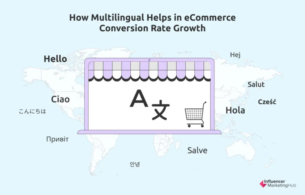
You’ve probably picked up by now that choice is critical for conversions. Another way that you can introduce more choice is by designing a multilingual eCommerce store. Not only will it help you to expand your market, but this approach also helps you to break away from your competition and break into a new market.
Add a currency switcher to that and your store just became a whole lot more inviting to shoppers from various countries. Though, just make sure that whatever you convert or translate is done correctly. Get it wrong and it can cause a costly mistake (quite literally), let alone embarrassing.
Plus, the translated copy should be just as effective as the original. Headlines should be short and encourage customers to continue reading. At the end of the day, your website copy remains one of your star sales reps and it would be a shame that it will shine less brightly once it’s been translated.
13. Implement Live Chat Thoughtfully
Live chat is one way to make your website appear more legit. It helps consumers to trust your business and offers reassurance that if they should get stuck, they have a way to reach you quickly. Plus, it can also help users to find what they’re searching for faster, helping to improve the overall user experience and offer assistance throughout the entire buyer’s journey.
However, when implementing live chat, think twice about using a popup to announce this available service like many eCommerce brands do. If the conversation isn’t initiated by the website visitor, any attempt to do so can be viewed as annoying — the opposite of what you’re trying to achieve.
14. Display Shipping Info and Return Policy Prominently
Live chat, though, is no replacement for displaying information about how returns, exchanges, and shipping work. This type of information should still be displayed clearly. Ideally, a link should be placed in the footer area as opposed to hidden on a Help page (you can always include a second link in the FAQ section).
As for the documents, it should be written with the customer in mind. Aside from being easy to read and understand, the process should also be easy. Basically, you want to give customers reassurance that if the product is faulty, the wrong size, or they changed their mind, you’ll be able to accommodate them.
As for shipping specifically, where possible, see if you can offer free shipping. It’s one of the best ways to make your shipping policy customer-centric. Another popular strategy for boosting conversions is offering same-day delivery. It can help to bring your store closer to the brick-and-mortar experience, while setting your store apart from online competitors. In this case, it will probably be impossible to offer free same-day delivery, but try to keep the costs as low as possible to make it attractive.
15. Invest in Shopping Cart Abandonment Tools
Even with all these strategies, you’ll still get customers that decide to abandon their carts at the very last minute. This is completely normal. In fact, according to Statista, the global online shopping cart abandonment rate is around 70%.
Should this be how it “ends”, there’s still something that you can do. There are various shopping cart abandonment tools, like plugins and software, that you can add to your tech stack.
You can also use strategies like retargeting and email. You can, for example, use Facebook to target those customers who visited your website by showing them dynamic ads featuring the products that they viewed.
If you have their email address, you can create an email drip campaign to send them a few strategically timed, follow-up emails. These emails can serve as reminders and gentle encouragement.
While a thoughtfully composed email should do the trick, some brands feel like adding an extra incentive in the form of a limited-time discount. It’s completely up to you, as long as you follow through with abandoned cart emails that feature an effective subject line, attractive layout, and compelling copy.
16. Encourage Account Creation Strategically
Here’s the thing: you should make it as easy as possible to buy on your website by reducing the number of steps, but taking the time to capture email addresses can go a long way. Many may not be ready to become paying customers on their first visit. They’ll need more nurturing and email remains one of the most effective channels for that.
A good time to suggest account creation is after they’ve successfully paid for their cart. To encourage this extra step, highlight that it will make it easier next time that they want to shop. You can also, for example, offer an incentive like a coupon code.
17. Personalize
Lastly, personalize. There are many top tools available to personalize your communication and the overall experience so that it's relevant to your customers’ needs.
Personalization plays a huge role in eCommerce growth. It engages your audience and, aside from helping with conversions, it can also encourage repeat purchases.
It’s also one of the areas that artificial intelligence can help. Use cases of AI personalization in eCommerce include home page optimization, improved navigation, and enhanced product discovery.
Wrapping Things Up
In design, there’s a rule that you should be deliberate about anything that you add. The same applies to creating and running an eCommerce store. Whatever you want to change or add should make it easier for online shoppers to buy from your store.
Your website’s user-friendliness and conversion rate are connected. If it’s a pleasure to browse your site, visitors will become paying customers.
Aside from paying attention to the design of your website, also expand your focus to your tech stack and marketing strategies. You can’t do it all, and you shouldn’t have to do it alone with the availability of AI, plugins, and agencies that specialize in conversion rate optimization.
Frequently Asked Questions
What is a conversion rate?
The term conversion rate refers to the number of website visitors that complete a specific goal. It’s usually to buy a product, but it can also include signing up for an email newsletter, downloading a resource, answering a survey, or following a social media page. There are a number of formulas that you can use to work out your conversion rate. One way is to take the total number of conversions (like sales) and divide it by the total number of unique visitors and multiply it by 100.
Are there any good marketing agencies that can help optimize your conversion rate?
There are several reputable agencies that specialize in conversion rate optimization (CRO). You can, for example, check out:
- Conversion
- Thrive Internet Marketing Agency
- Conversion Rate Experts
- Conversion Fanatics
- Disruptive Advertising
- Linear Design
- Viral Nation
How can you use Facebook to increase conversions?
You can use retargeting ads to target consumers who’ve already interacted with your brand in one way or another. Here’s how:
- Set up the Facebook Pixel on your website
- Create a custom audience
- Set your campaign objective
- Set a budget
- Assign your custom audience
- Choose your ad placements and delivery
- Design your ad
How can you use artificial intelligence (AI) to improve customer satisfaction?
There are several benefits to using AI. It can be very useful for personalization which can help to improve customer satisfaction. Here are some of the use cases:
- Home page optimization
- Enhanced product discovery
- AI-powered suggestions
- Ad targeting
Which AI tools can eCommerce brands use for personalization?
Online businesses that want to improve personalization can check out the following AI tools:
- Insider and MoEngage for creating cross-channel experiences
- Bloomreach for creating unique customer journeys
- Clerk.io for analyzing customer behavior and identifying trends
- Vue.ai for catalog management


