If you have only been relying on your product pages till now to sell your products, you are missing out. According to an e-commerce quaterly report by Monetate, visitors convert only half as often when they visit a product page compared to when they are directed to a landing page.
E-commerce landing pages mainly sell physical goods and serve the sole goal of motivating visitors to take advantage of an offer. Though, the offer alone is not enough to convert leads into buying customers. When designing a landing page for an e-commerce business, you need to include specific elements such as a headline, hero shot, social proof and call-to-action button to capture the attention. These elements will offer all the information your audience needs to act on your offer.
You will also need to pay attention to your marketing strategy as this will help you to understand which kind of content and brand voice to use. As your landing page is in many instances the first impression that your target audience will have of your online store, it is important that you get this right the first time around.
We have scoured the web to find examples of the best e-commerce landing pages. While these landing pages might not always tick all the boxes, they will serve as inspiration for you to design effective landing pages for your offers.
1. Winc
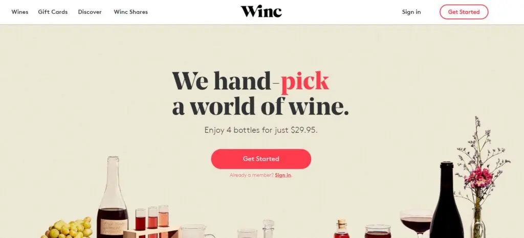
Winc, a winery that offers an online membership experience, has created a couple of successful landing pages. With the help of short, yet interesting, headlines, a clear call-to-action button and high-quality photos of their different wines, they manage to create landing pages that pop.
As their products are visually pleasing and self-explanatory, they can afford to rely more on visuals than text. Though, one key bit of text that would have improved the landing page is an actual source for the claim “#1 Personalized Wine Subscription”. Without this information, this social proof lacks credibility.
2. Vanity Planet
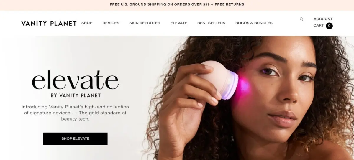
Vanity Planet’s landing page is a great example of how landing pages can be used for selling specific products. Instead of simply focusing on their entire range of products for your hair, health, skin and well-being, they cleverly chose to concentrate only on the Raedia Facial Cleansing brush.
The heading is short and captures the visitors’ attention, while the subheading offers additional text that serves to explain how the product can help their very specific target audience. It just shows how you can create an effective landing page without having to make your business the main focus.
The liberal use of white space is also applied intelligently. Not only does it make it easy for visitors to navigate their way around the landing page, but it also works well with what this cleansing brush is all about – keeping it clean.
The other elements that deserve to be mentioned are the call-to-action button and social proof. By using contrasting colors (black text against a white background), the call-to-action button is very noticeable. The choice of words – “Shop Now” – also helps to make it clear to visitors which action they should take next.
By including where their product has been featured, the product and brand become a lot more reliable. After all, when it comes to your skin regime, the risk of using an inferior product that could potentially cause visible damage is just too big.
3. LIV Watches
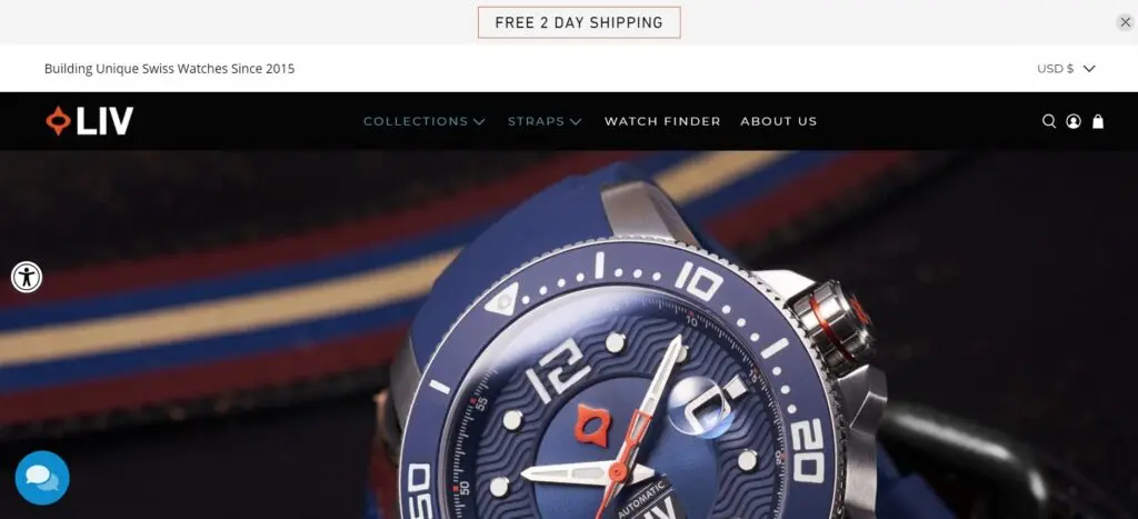
What makes the landing page of LIV Watches so effective is that they have realized that to showcase their apparel in the best light, they need to rely heavily on high-quality images. So, instead of simply inserting a carousel with photos (like e-commerce stores usually do), they have used photos throughout their landing page in various manners. By using photos of their special edition wristwatch in different setups, their target audience gets a good overview of their product and its different features. The use of close-ups and a side-profile shot also helps to showcase the superior craftsmanship. All in all, this landing page is an excellent example of how an e-commerce landing page can showcase products in various ways so that visitors can see all the important details.
4. FabFitFun
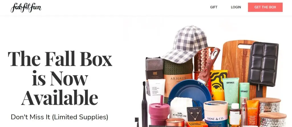
FabFitFun offers subscription-based products. In both these landing pages, they make sure to include an image to showcase the content of their gift box. By using contrasting color, the call-to-action button is easy to find. While the wording of the CTA is clear, it could perhaps be a tad too aggressive as it tries to clinch the sale immediately. That being said, the rest of the copy is effective. It is short, but communicates to visitors that their gift box provides great value at a discounted price.
5. Ermenegildo Zegna
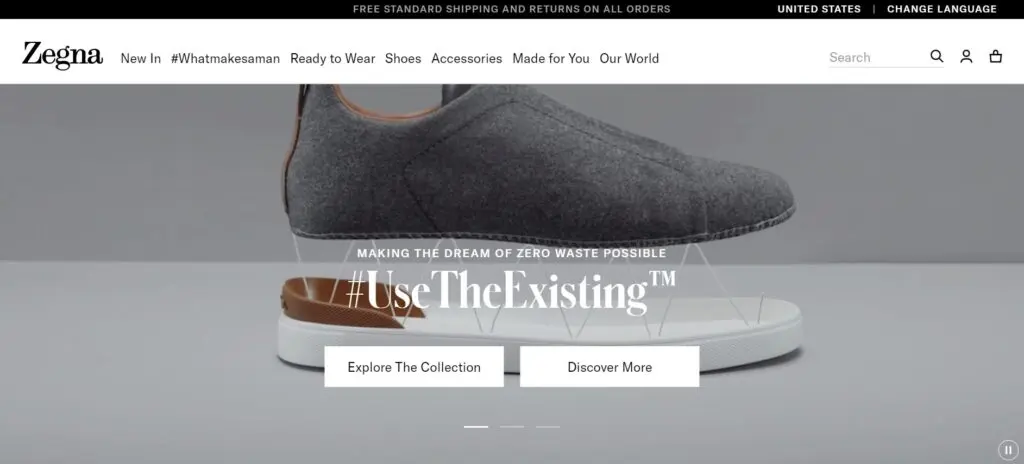
What initially started out as just being fabric makers, Ermenegildo Zegna has expanded their journey to include selling ready-to-wear luxury menswear. In this landing page, they carefully selected visuals that will showcase the type of products they provide as well as highlight their customized service of offering tailored suits that they pride themselves in. By using minimal text, the message remains clear and the focus on their luxurious products.
The call-to-action prompt is also effective. By not asking visitors to make a purchase immediately, it succeeds in beginning a personalized customer service which is one of the characteristics that sets this brand apart.
6. GoPro
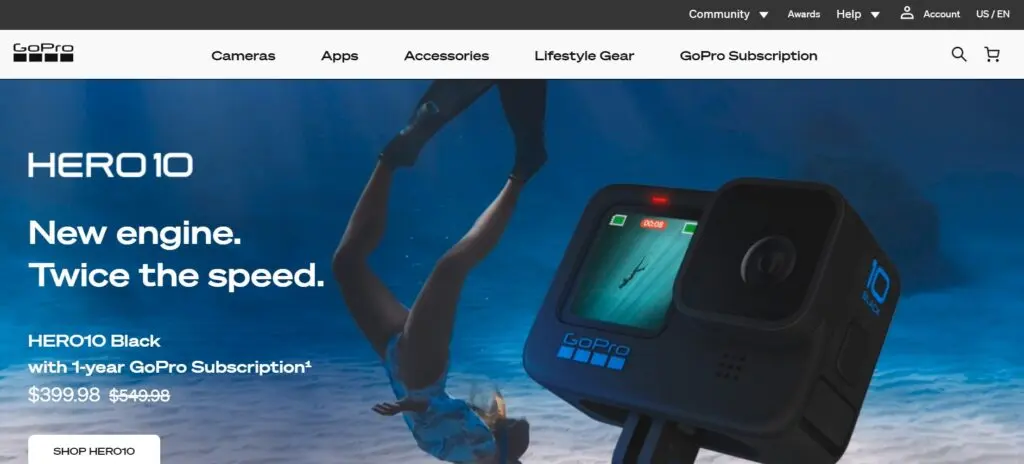
In both these landing pages, GoPro uses high-quality, powerful images to emphasize the capabilities of their product. As their products are built to take photos and make video recordings, it makes complete sense for their landing page to focus on visuals instead of text. By following this route, the landing page clearly shows the audience the high-quality visuals that their product can create.
While the text is minimal, it does successfully explain the benefits to the visitors. Instead of making the focus on the brand, the focus is on what visitors will gain - smooth video and first access to all the latest deals.
7. Mr. Draper
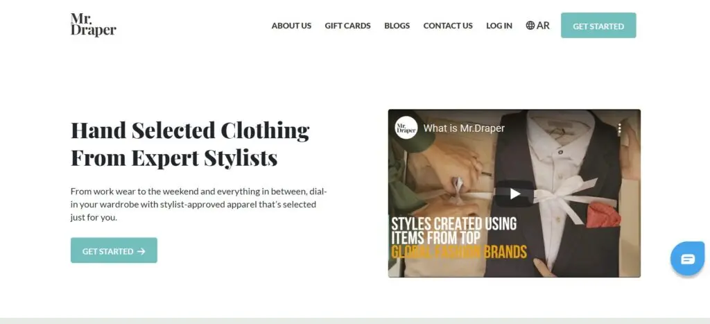
Mr. Draper offers a curated clothing service aimed at men. Their stylists will consult with you regarding your personal style, size and budget. After this consultation, they will send you clothing boxes that they have put together specifically for you. You then have five days to decide which items you will keep and which ones you wish to return.
This landing page boasts a conversion rate of 32%, making it an example of a high converting landing page. It is a perfect example of how you should include social proof in your landing page design. When including customer testimonials, it makes sure to add a photograph of the actual person, his/her name and position. Testimonials are easy to fake, but by providing this much detail, visitors can double-check for themselves that the person, in fact, exists.
Another element that we love is the bright green CTA button. All it takes is a glance and the potential customers will immediately know where they need to click next.
8. TRIBE
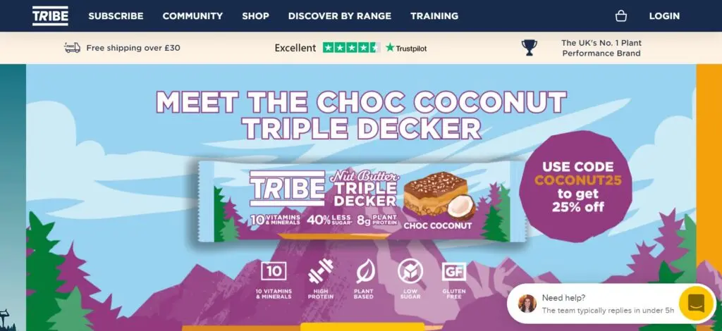
Creating a special offer for your e-commerce store can be a hassle, especially if you want only specific customers to be able to access your special deal. TRIBE’s landing page is an excellent example of how landing pages can specifically focus on marketing special offers. They created a landing page with the goal of managing which people could access their promotion.
The text in this landing page cleverly focuses on the value the special offer can bring to those who decide to take advantage of it. The image of people training also helps to explain what their product is about – helping you with your performance. This way, they do not have to use as much text which can make a landing page less interesting and more difficult to digest.
After scrolling down, you will find the social proof. While it would have been nice if the testimonials were accompanied by actual photos of the individuals, they are forgiven as they have made sure to include ample social proof. In addition to including testimonials from a reliable review site, they also referenced well-known stores that stock their product.
9. Thistle
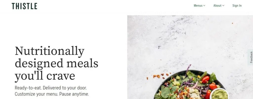
Thistle offers foodies an easy way to order healthy food. In their landing page, they cleverly use green to highlight that their products are both kind to your health and the environment. The call-to-action button is big, while the wording is clear so that visitors will have no difficulty understanding what they should do next.
They also included more than enough social proof to assure visitors that they are trustworthy. By making sure to include an actual photo of the person next to his/her review, the customer reviews become much more credible.
10. Solo Stove
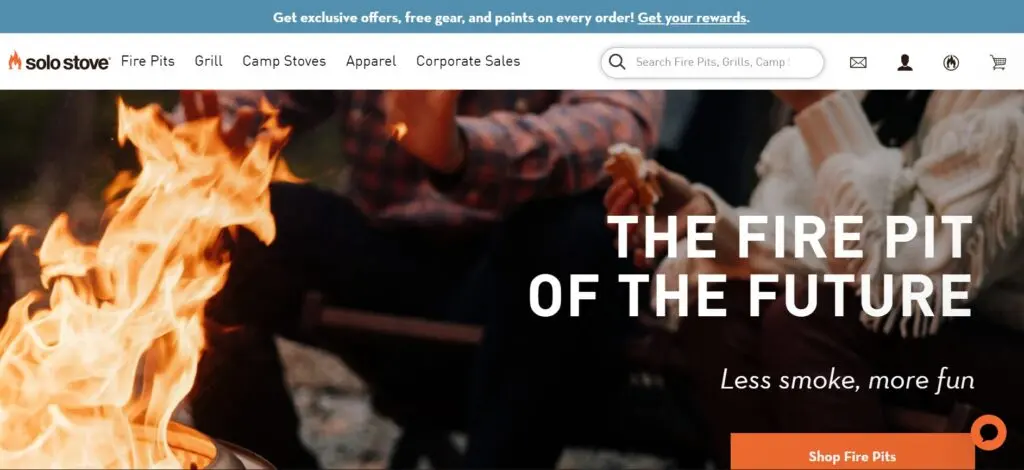
Solo Stove’s landing page uses a combination of images and text to offer explanations of the features and how their products can benefit their potential customers. This works great as chunks of text are most of the time ignored.
It also effectively incorporates a lot of orange and black to fit the energetic vibe of their outdoor cooking equipment. Also, the use of orange is a wonderful choice for the call-to-action button as it helps to let this most important element stand out. What makes the CTA even more effective is the word choice. The use of “Shop Now” instead of, for instance, “Buy Now” also appeals to a bigger target audience to include those who are not yet ready to make a purchase.
11. Infinite Moon
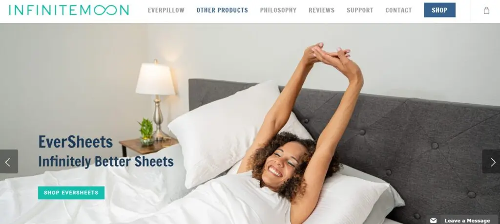
The landing page of Infinite Moon is another excellent example of how to include reviews and testimonials to assure your potential buyers that you are selling a quality product. While reviews and testimonials are some of the most effective elements to include in landing pages, they can be even more effective if you carefully curate them. It is not always best to include only the latest testimonials as Infinite Moon illustrates. Instead, they included different testimonials to describe the various advantages, such as comfort and durable materials, that their product offers.
12. CAUSEBOX
CAUSEBOX’s target audience is conscious consumers who are searching for ethical products. So, the headline, “Feel Good”, might be short, but it is extremely effective as it gets to the point immediately. The subheading then elaborates on the headline by explaining the value proposition in more detail. In addition to the well-thought-out use of text, the high-quality product images help to explain the range of products in a way that is fast and easy for the visitors to process, eliminating the need to add more boring chunks of text.
13. Troubadour
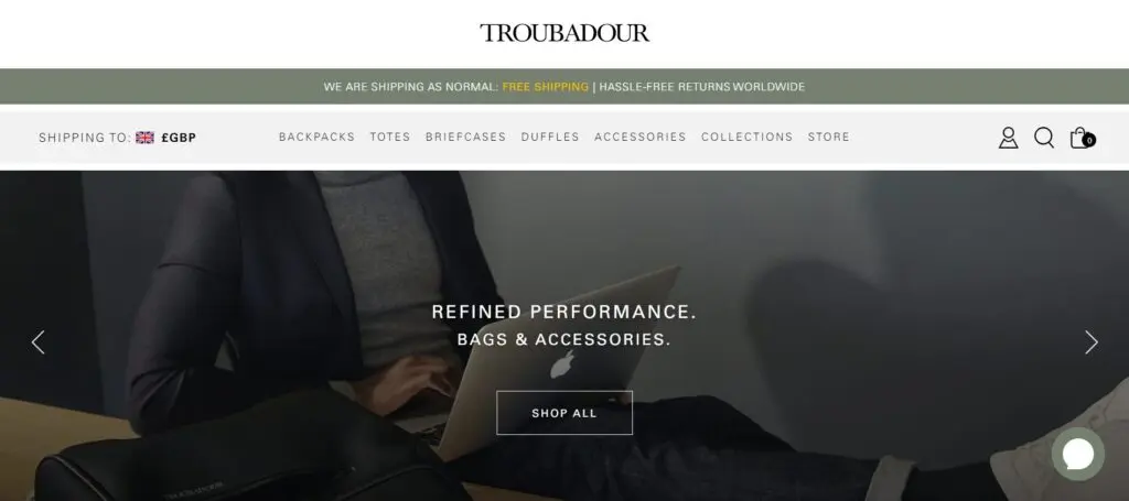
Troubadour’s landing page is a nice example of how to combine the different key elements. It has a powerful headline that evokes interest, professional product images and a clear CTA button. It also makes sure to build trust by mentioning its press mentions, including customer reviews and linking to their social media accounts. It encourages visitors to follow their brand on Instagram (where they are bound to see how many likes their rucksacks have received). While the testimonials could have been more effective by including actual photos of the individuals along with their names, the reviews still serve an important purpose – to highlight different benefits that their bags can offer their customers.
14. Blue Apron
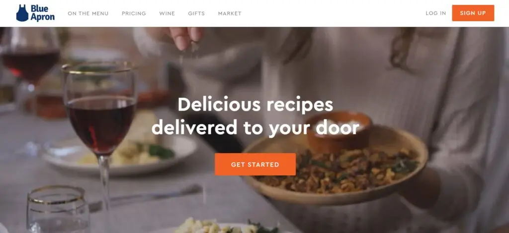
What Blue Apron does well is to create urgency. As their offer is available only for a limited time, the text helps to turn visitors into customers faster. The product images, headline and offer work together to capture visitors’ attention immediately. Then, as the visitors scroll down, all the information about how it works is explained clearly. All in all, it is a great example of the powerful effect of clean design.
Frequently Asked Questions
Should you add social proof in a landing page?
By including social proof such as testimonials, claims and where your products have been featured, your products and brand become a lot more reliable and credible. Though, to implement it effectively remember to include sources and add a photograph of the actual person, his/her name and position. Customer testimonials are easy to fake, but by providing this much detail, visitors can double-check for themselves that the person, in fact, exists.
How much text should you include in a landing page?
It depends on your type of product. Landing pages that advertise products that are visually pleasing and self-explanatory can afford to rely more on visuals than text. For example, by using photos of the product in different setups, close-ups and side-profile shots, the target audience will get a good overview of the product and its different features, without having to read a lot of text. At the end of the day, too much text can make a landing page less interesting and harder to digest.
What makes a good CTA for an eCommerce landing page?
Good call-to-action prompts on eCommerce landing pages use contrasting colors (for example, black text against a white background. This way, it is easy to find and very noticeable. With regards to the wording, it should make it clear to visitors which action they should take next. That being said, it should not be too aggressive by trying to clinch the sale immediately.
What are some tips for designing an eCommerce landing page?
Good eCommerce landing pages focus on what visitors will gain instead of making the focus on the brand itself. It also uses high-quality photos, enough white space, clear call-to-action prompts and social proof. The heading should generally be short, while the subheading can be used to elaborate on the headline by explaining the value proposition in more detail.
Should you design a landing page for your eCommerce business?
Yes! If you have only been using your product pages until now to sell your products, you are missing out. According to an eCommerce quarterly report by Monetate, visitors convert only half as often when they visit a product page compared to when they are directed to a landing page.


