A landing page is all about creating irresistible offers and helping your audience to become paying customers. While it is not very difficult to design, it does require some time and a basic understanding of the different elements you need to include. Not only should it look good, but it should also give your target audience the information that they need.
In this blog post, we’ve summarized all the key elements that you need to design a powerful landing page. To help and inspire you further, we’ve also included a few examples to show to you how other brands have incorporated these elements.
How to Create a Landing Page [With Examples]:
- What’s a Landing Page?
- The Benefits of a Landing Page
- Step-by-step Guide for Creating Landing Pages
- Select a landing page builder software
- Identify your goal
- Write your headline and subheadings
- Add images
- Include an explanation that focuses on the benefits
- Create a clear call-to-action prompt
- Add social proof and contact details
- Test and optimize your landing page
What’s a Landing Page?
In short, a landing page is a dedicated web page that you purely use for advertising or digital marketing purposes. It is the first web page that new visitors will see after they have clicked on a link that corresponds to the landing page.
If you are thinking at this moment that it sounds pretty much like your home page, you are not entirely wrong. A landing page could be something like a blog post, product page or a home page. Though, unlike your traditional home page, your landing page has been specifically created to receive and convert traffic generated by your online marketing campaign. You can, for instance, create a landing page for an online course, or to encourage people to buy a product, register for an event, phone your business or simply sign up for your monthly newsletter.
The Benefits of a Landing Page
A landing page is a key element of any online marketing strategy. When it is designed effectively, it can help you to boost conversion rates by moving your visitors more efficiently down the sales funnel, while at the same time reducing the cost of getting new leads. In fact, it is one of the most effective tools for lead generation. Simply by taking some time to design a powerful landing page, you can basically take a step back and quality leads will find you.
What makes it so great is that you can share a customized message to a targeted audience as landing pages concentrate on one product, service or special offer. This way you can zoom in, for example, on a specific product and evaluate its success.
Step-by-step Guide for Creating Landing Pages
While the steps for designing an effective landing page are not set in stone, there are elements that the most successful landing pages share. So, whether you are designing a landing page to market a new product or you need one to get people to sign up for a webinar, here are the steps that you should follow to make sure that you have included all the main elements.
Select a landing page builder software
When it comes to building a landing page, you can either build it on your own website or use a landing page builder software solution. However, creating a landing page can be a hassle, even more so if you do not have any coding experience. So, the latter option will be less overwhelming.
There are numerous landing page builder software solutions available that are easy to understand and use. Most of them have built-in drag-and-drop editors and hundreds of templates that make it very easy to create a compelling landing page quickly. Though, make sure that the builder that you select offers A/B testing (more about this later).
Identify your goal
Before you can start to play around with the templates, you need to identify what you want your landing page to achieve. Do you want to introduce a new service or perhaps simply grow your subscription list? Only after you have identified this objective will you be able to get more clarity about your message and which keywords to include.
Write your headline and subheadings
Your main headline and supporting headline are elements that should appear above the fold. Effective headlines are more than simply a summary of your landing page. It is where everything starts. While it should affirm to visitors that they have been redirected to the correct page, it also needs to arouse interest.
Your subheading should be used to fill in the key details, especially when your offering is too intricate to be explained in just a short heading. It can be that additional important detail that can help visitors to convert, while at the same time helping to make your headline more captivating. Now that visitors have landed on your landing page, it is your subheading’s job to give them a reason to stay.
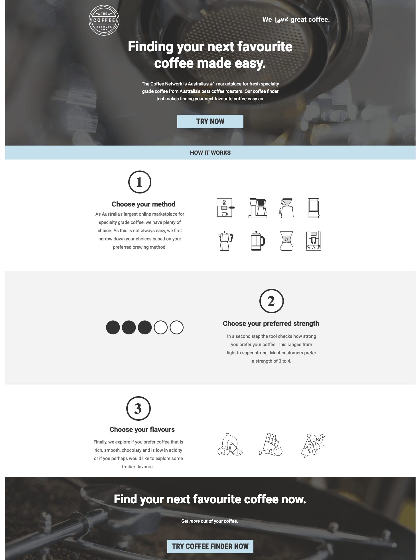
Source: unbounce.com
The Coffee Network, an online marketplace situated in Australia, uses its headlines and subheadings really intelligently. The headline, “Finding your next favourite coffee made easy” is short and clear and makes sure to keep the focus on the audience instead of the company. The subheading adds the important details that could not be included in the heading and helps visitors to convert by explaining how they can benefit by giving their products a try.
Add images
By including an image that explains the service or product, it is easier to ensure that your headline stays short as your copy will not have to do all the explaining. Also, our brains are wired to process images much faster than text. As your visitors will process your images before the text, it is key that you use only high-quality relevant images to ensure that they have a great first impression.

Source: unbounce.com
Marley Spoon does a great job of including high-quality photos of a couple of their meals. What makes their use of visuals so great is that they also use images to list the benefits visually.
If your product boasts impressive craftsmanship, close-up photos can help your audience to see precisely what they will be purchasing. Just take a look below at how LIV Watches ensures that the photographs show off their watches in various ways.
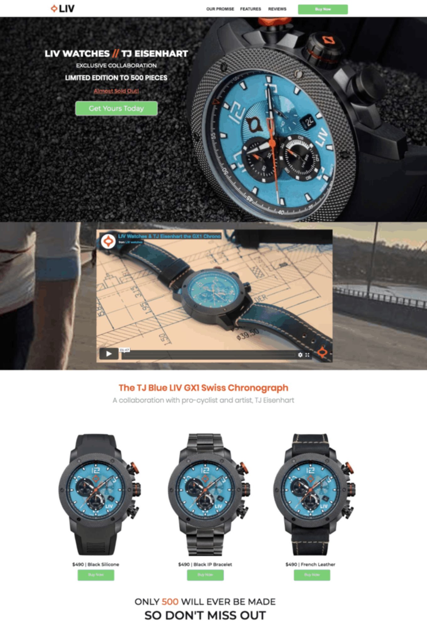
Source: livwatches.com
Include an explanation that focuses on the benefits
It should be completely clear to your visitors what your landing page is offering. If your offering is rather straightforward, your heading and subheading might be enough. Though, if it will make your heading too long, you can add another block of text or even rely on your visuals such as a screenshot of your software’s interface. In fact, visuals are easier to understand and more interesting.
Wherever you decide to include this explanation, it should focus on the advantages that you have to offer to your potential customers. In other words, it should not be a statement about your brand, but instead should be cleverly written so that the focus is shifted to how your visitors will reap the rewards.
For example, Skullcandy created its content to include a customer-focused value proposition. Rather than explain the technical specifications of their product, they instead shift the focus to how their product can help to boost their potential customers’ mood.
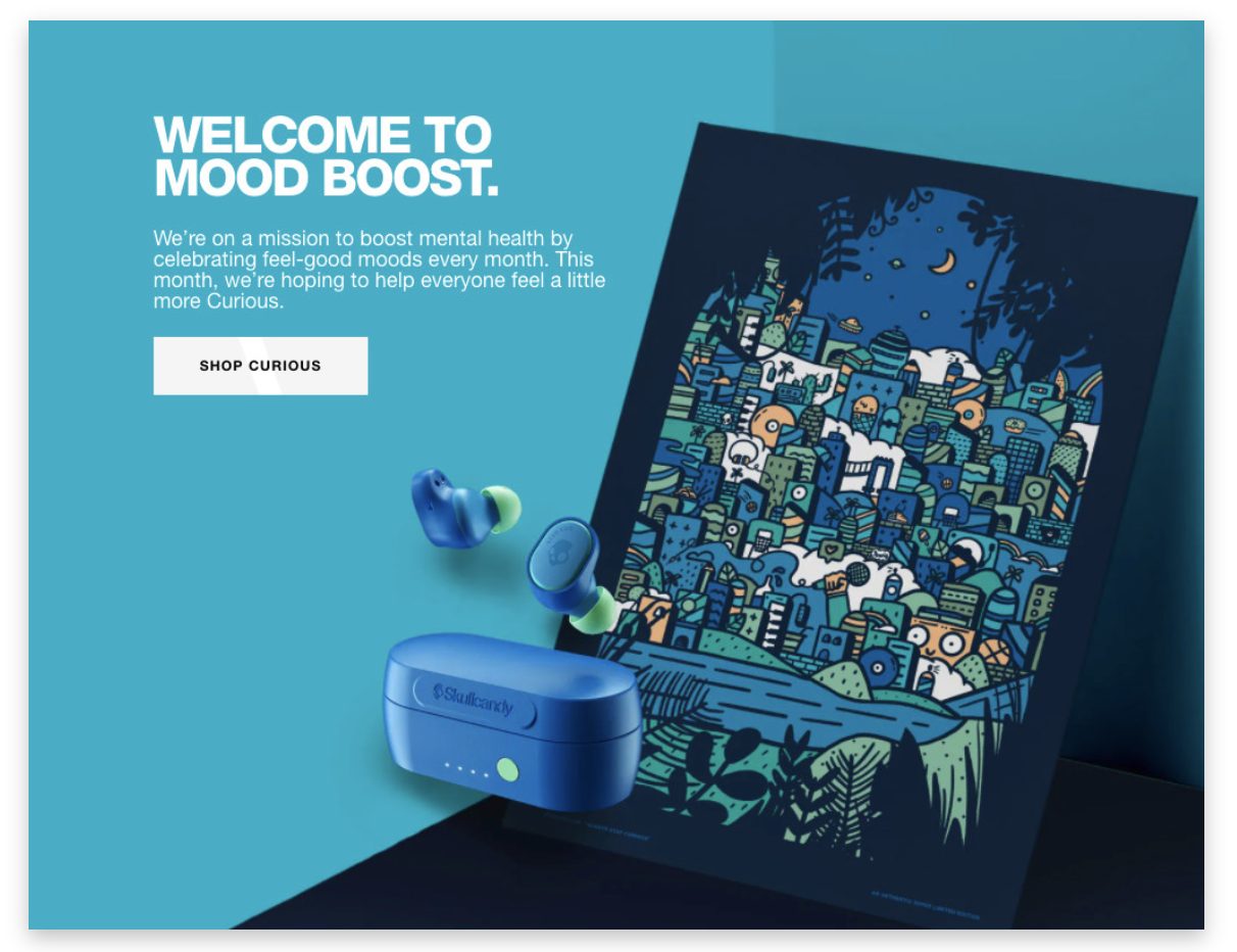
Source: bigcommerce.co.uk
Create a clear call-to-action prompt
It might come as a surprise, but your call to action is actually the most crucial element of all. The best CTAs are big enough, compelling, clear and stand out. To ensure that you do not create multiple calls to action that can leave your visitors confused, identify what you want your visitors to do beforehand. For example, should they download a guide or subscribe for your newsletter? In short, it should be easy for your visitors to tell immediately what they are supposed to do next. Contrasting colors and buttons work best!
Ermenegildo Zegna uses clear and relevant call-to-action buttons. The white button contrasts well on the dark background as does the black text of the call-to-action prompt against the white background of the button. This clever use of color helps the CTA to stand out.
Also, this landing page is an excellent example of how your call to action does not necessarily have to ask the visitors to buy something immediately. It is important to remember that the minority of customers are ready to buy something immediately. So, it is best to tailor your calls to action to where they are in the sales funnel accordingly.
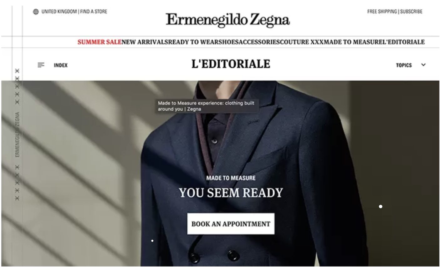
Source: .vertical-leap.uk
Add social proof and contact details
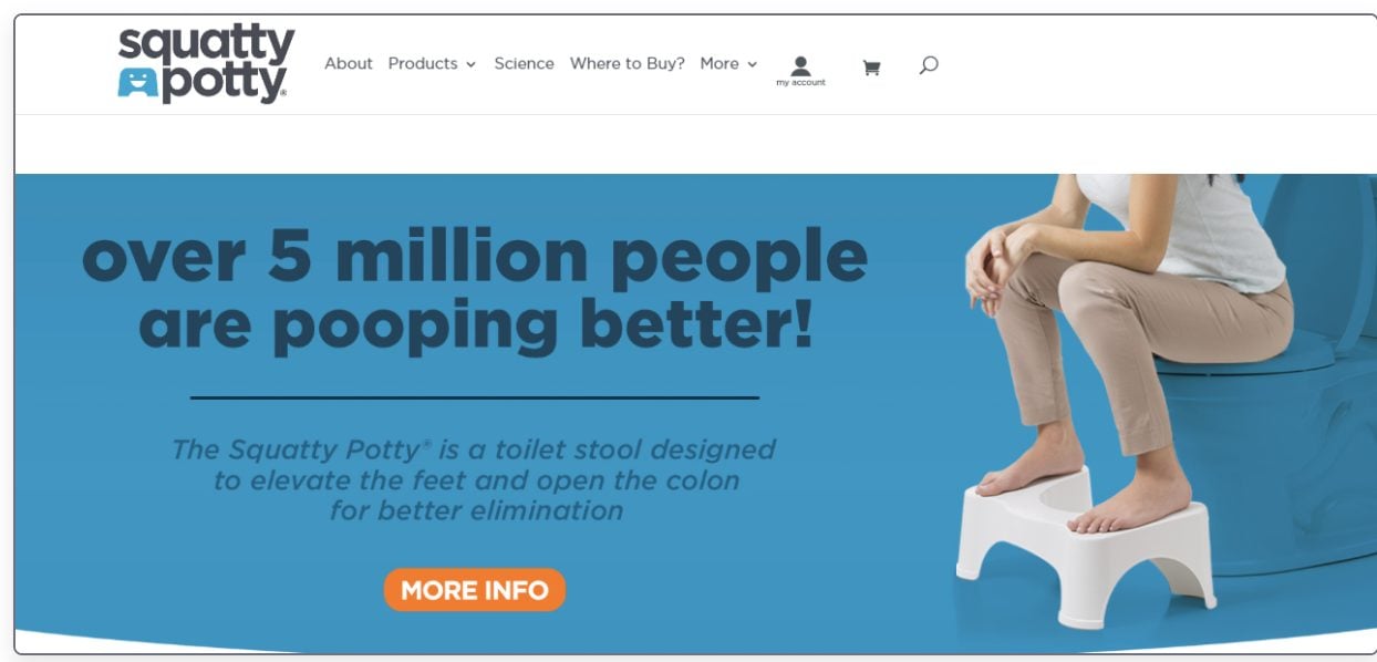
The majority of us are sceptical of marketing material. Though, recommendations and testimonials can have a significant positive impact on an individual’s purchasing choices. By including your Facebook likes or number of subscribers, your visitors will see that you already have a substantial customer base. For instance, for Squatty Potty, it makes sense simply to refer to how many people have already bought their product as the number is very impressive.
Source: cloudways.com
Though, if these numbers are not that impressive yet, it is best to stick to a few testimonials in the meantime instead. Ideally, you should include at least three written testimonials or two video testimonials that can serve as proof that your brand can deliver. The best testimonial is specific and includes a photo of the actual customer, his/her name and job title. This way, visitors could actually Google the person who has written the testimonial and even verify the review. You can even go the extra mile and add video testimonials. As a video testimonial is even more challenging to fake, this type of testimonial will be even more believable. Plus, it is much easier for your customers to share their genuine interest in your brand via this medium.
A video testimonial can possibly also offer another indirect benefit as shown by Slack. Not only did they use a video testimonial to share one of their user’s experiences, but in the video the client (Sandwich Video Inc.) also explains all the different features offered by Slack. So, in fact, the video also doubles up as a product demo.

Source: spectoos.com
Lastly, to help show your business as trustworthy, you also need to remember to include contact details like a physical address, email address and/or phone number. In short, visitors want to know that your business does really exist.
Test and optimize your landing page
After you have created your landing page, the work is not yet entirely complete just quite yet. It is really important that you also make the time to assess its performance by adding analytics tracking. By looking at metrics and heat maps, you will be able to tell what your visitors enjoy, on which links they click and via which devices they browse. This way, you will be able to collect valuable information that will identify areas that could still be improved.
After you have made a few changes, you should then also test the different landing pages and identify which version’s performance was better. Armed with this information, you can continue to tweak your landing pages to improve its performance even further. It might sound like extra work, but without completing A/B testing there is no way to tell if your marketing strategies are actually working.
Wrapping Things Up…
When it comes to designing landing pages, there are several factors to consider that include your target audience, goal, service/product, industry and value proposition. Consequently, there is no approach that will be suitable for all landing pages. Though, some elements remain the same and landing pages that work many times share these characteristics.
While these elements might sound like a long list, the design of your page should still remain simple and uncluttered to ease navigation. Fluff belongs on a bird, not on your landing page.
Now that you know exactly what elements to include, it is over to you to create a landing page. Landing pages can offer a better user experience which will help you to establish a deeper connection with your target audience. So, it is totally worth the effort.


