Websites engage consumers in an artificial reality, but they stir up real senses and emotions. As new digital tools give birth to fresh ways of communicating to target audiences through design, brands and their creative teams must be constantly aware of the factors leading to memorable online experiences.
What design trends hook netizens to their favorite brands and content creators? This article looks at 12 web design trends dominating the digital landscape.
Design Trends to Inspire Your New Website or Refresh Project:
Web Designs Trending in 2023
1. Experimental navigation
Website designers are experimenting with new layouts, moving menus away from the traditional, top-of-the-screen location.
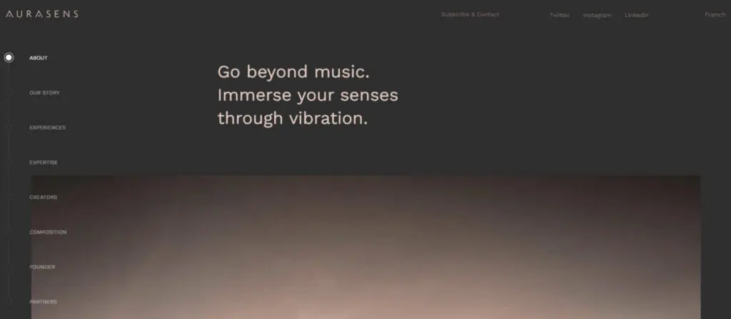
Vertical menu: aurasens.com
You can now find the menu items stacked vertically on a homepage's extreme left or right side (vertical menu) or at the bottom of the screen in the classic horizontal format.
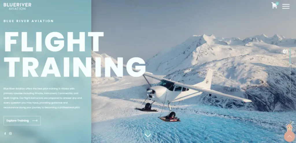
Pop-out or side menu: blueriveraviation.com
Or links to inner pages can be “hidden” and pop or slide out from the side (side menu) by clicking a hamburger icon.
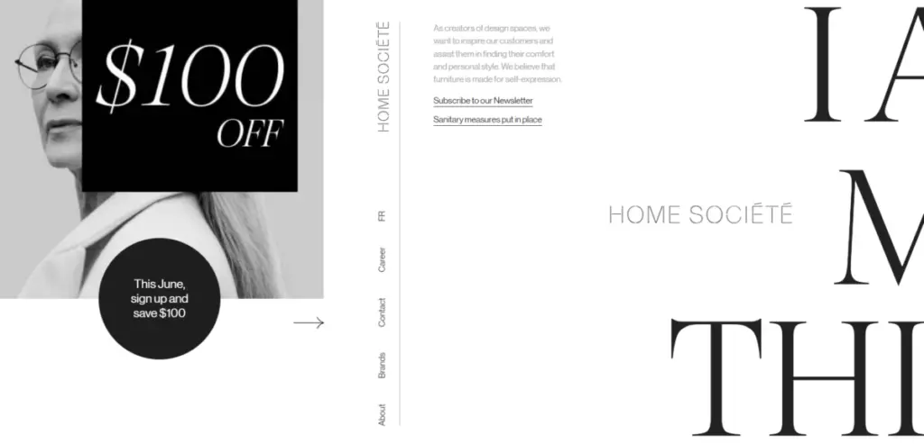
Horizontal scrolling: homesociete.ca
Horizontal scrolling is another relatively new design, which uses visual cues (like a partial image) or directional tools (such as an arrow) to indicate that more content is available from the side of the screen when you scroll down.
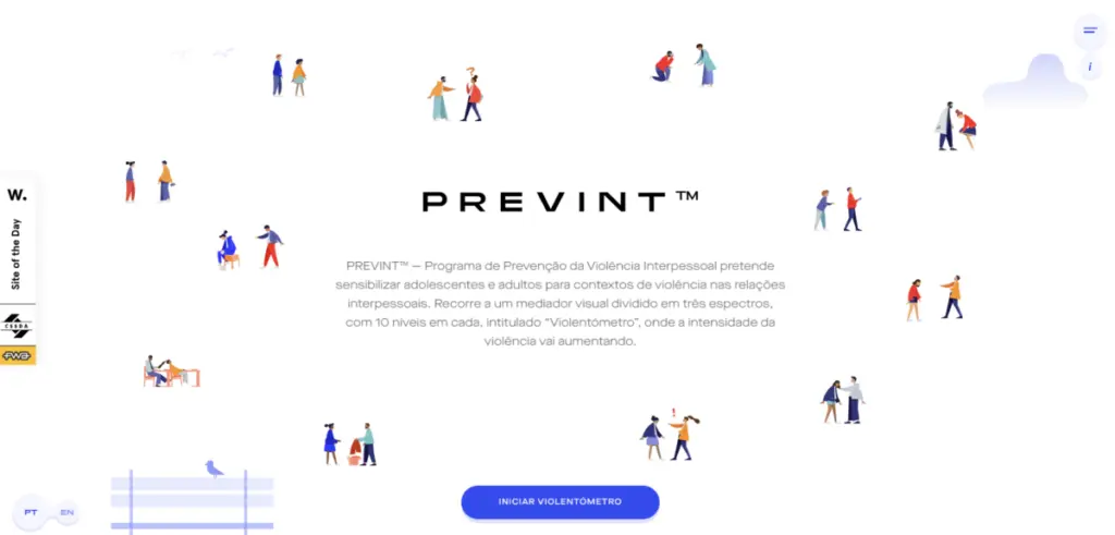
One-page navigation: prevint.pt
Also growing in popularity is one-page navigation, which features a slider—a bar or dots—that visitors click or move left to right to view other sections of the website. One-page websites are best for small businesses that don't have a lot of content, companies introducing only a single product or limited series product line, and event-based organizations announcing conferences or trade shows.
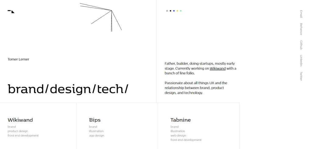
Dynamic cursor: tomerlerner.com
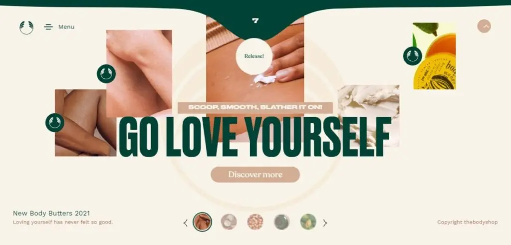
Drag interaction: bodybutters.regalepreviews.com
Dynamic cursors and drag interaction are other navigational techniques you can use to keep your website users engaged.
2. Parallax scrolling
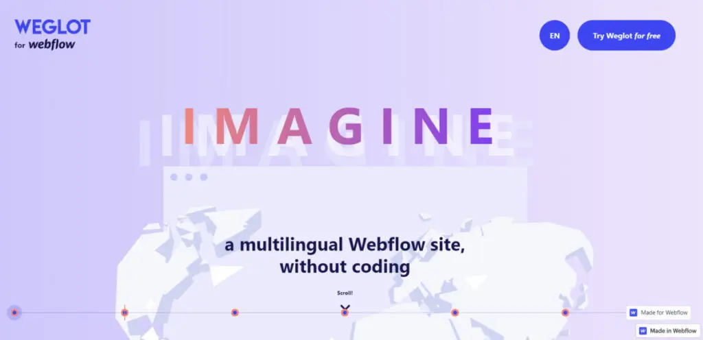
Source: translate-wf.com
Parallax scrolling continues to be a popular computer graphics technique, although its use began in 2010. Webpages with this design appear to have a 3D-like depth as foreground images move past the camera faster than the background. The parallax effect makes the site more immersive, encouraging visitors to scroll further down the website.
3. Micro-interactions or micro-animation
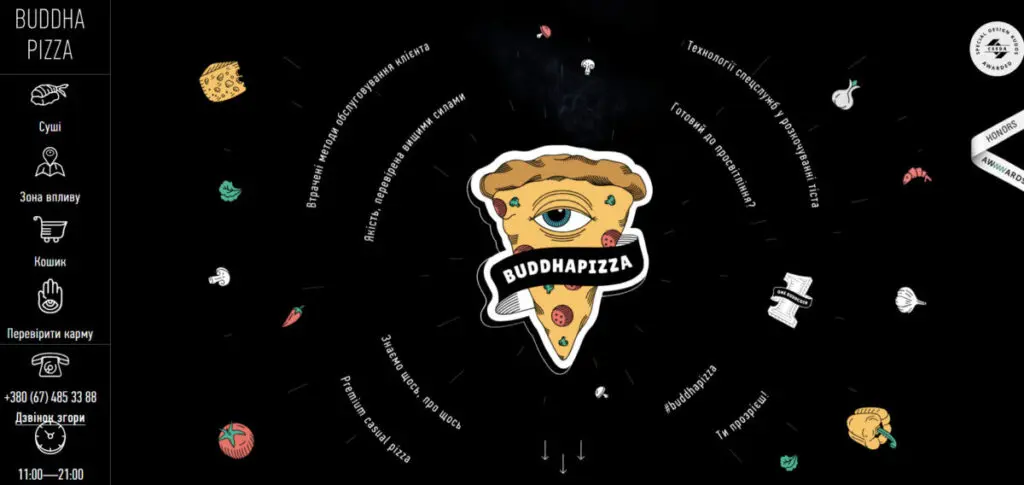
Micro-animation: buddhapizza.od.ua
Brands can use subtle animations to add playfulness to the site and highlight specific elements on a page to encourage visitors to perform certain actions. They can be images or illustrations that move or change on their own, or they may be visual effects that appear on the page when you scroll down or click and hover over an icon or button.
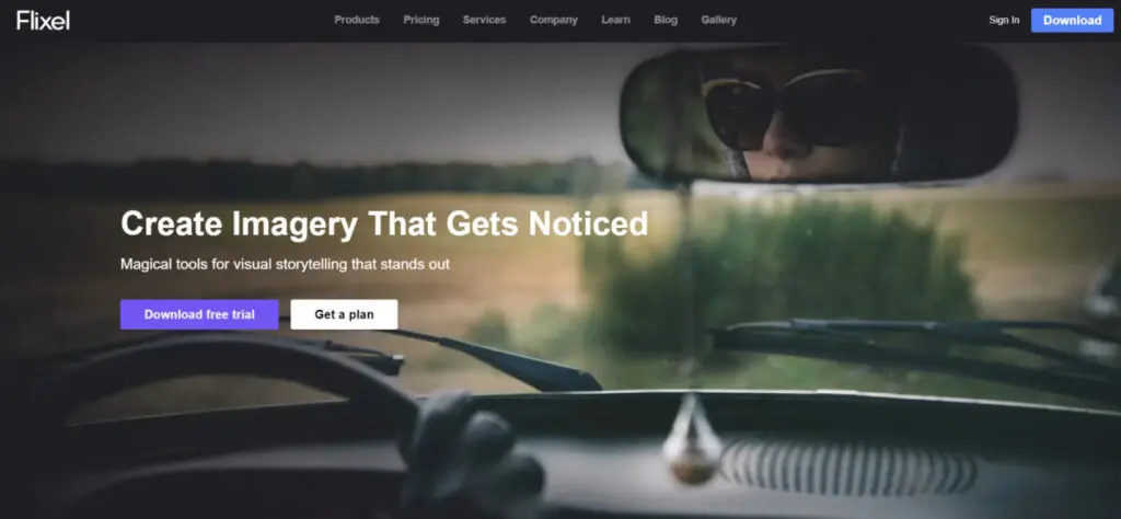
Cinemagraphs: flixel.com
Cinemagraphs or still photos with an element of repeated movement that result in a short video clip-type content also make good micro-animations.
4. 3D
Neomorphism: dribbble.com
3D images create lifelike representations of a product or service, whether the artwork is static or dynamic. One type of 3D effect is neu/neomorphism or new skeuomorphism, which is a cross between flat and skeuomorphic designs. Skeuomorphism uses shadows and highlights to simulate a real-life object. Meanwhile, the neomorphic approach uses soft shadows, low contrast, and a monochromatic color scheme to produce depth.
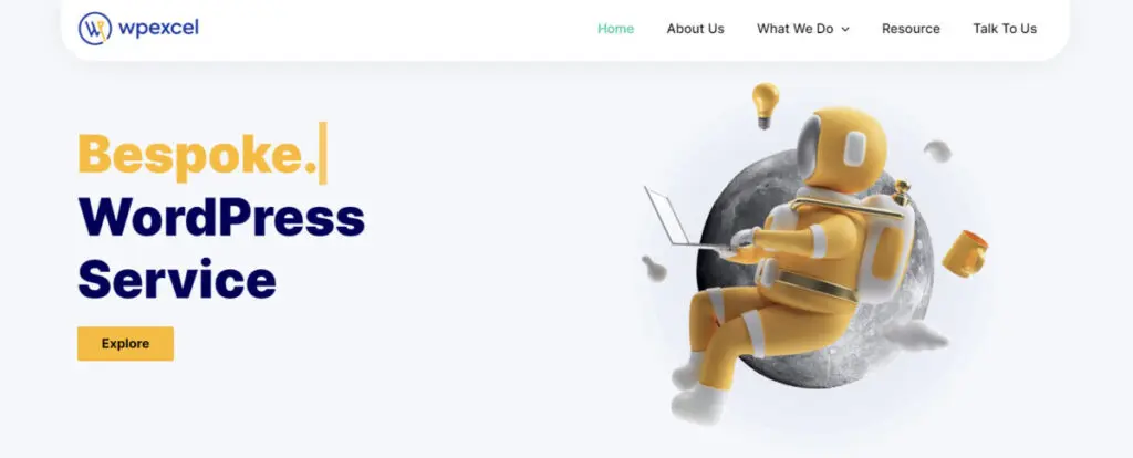
Claymorphism: wpexcel.cedcommerce.com
Claymorphism can also depict objects or scenes in 3D. Experts recommend counter-balancing its cartoonish appearance with minimal typography, strong accent colors, and good contrast.
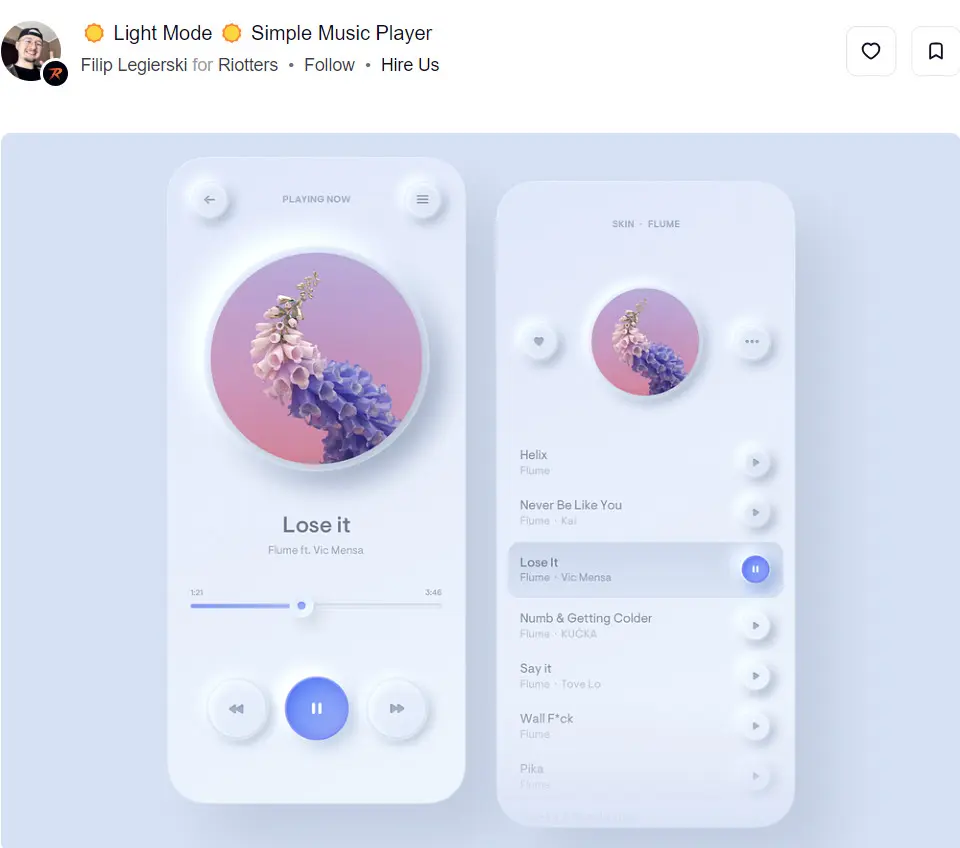
5. Custom illustrations
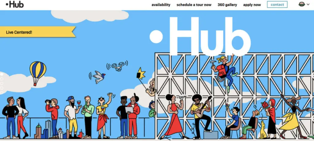
Source: hubbk.com
Hand-drawn and digitally painted images have replaced stock photography and can prevent your website from exuding a "seen it somewhere else" feel. Unique and original illustrations establish a more personalized and approachable visual identity.
6. Standout typography
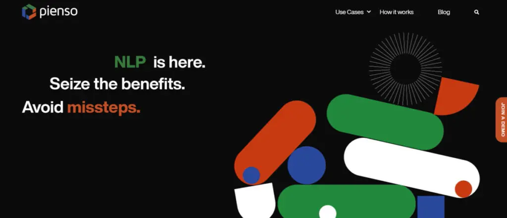
Source: pienso.com
- Kinetic or moving text: Motion-focused design also covers typography, a technique filmmakers used as early as the 1960s for introducing movie titles. The lettering expands, shrinks, moves in slow motion, flies, undergoes color change, or becomes distorted to set your brand or product's tone, establish a visual hierarchy or arrangement of design elements according to their importance, or convey emotion.
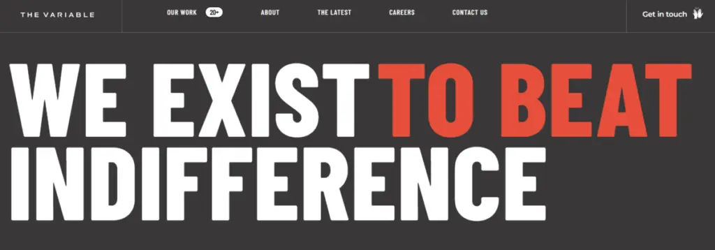
Source: thevariable.com
- Bold typography: Taglines, slogans, and headlines typically use large or oversized fonts to grab attention. They can also help focus on keywords or phrases or create contrast between different sections.
- Serif fonts: These fonts foster nostalgia while creating professionalism and elegance. Some high-contrast serifs you can try include Stigsa Display, Slabien, the Braveold serif font family, and Breadley.
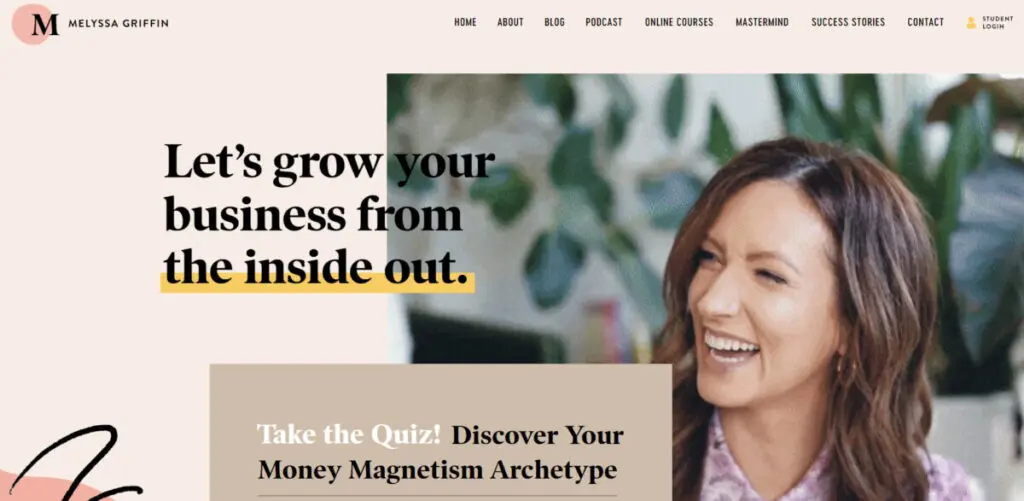
Source: melyssagriffin.com
- Layering text over graphics or images: Layering draws the eyes to related elements and maximizes the available space on the page.
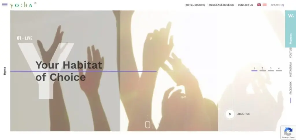
Source: yoha.com.sg
- Mixing horizontal and vertical text: Laying out text in vertical and horizontal views is unconventional and can spark your visitors’ curiosity if you apply the style to web pages with little written and visual content.
7. Minimalism
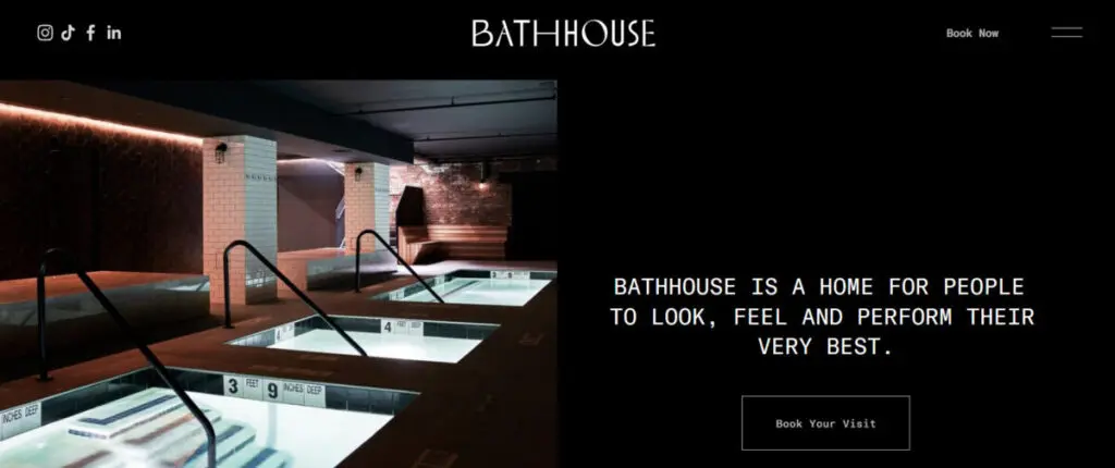
Source: abathhouse.com
The minimalist design features plenty of negative space (white or empty space), simple typography, muted color palettes, and limited design elements, including icons and navigation menus.
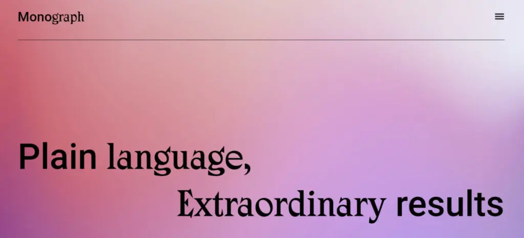
Source: monographcomms.ca
Placing only text on a website's hero section—what appears at the top of a web page or within its header (also called "above the fold" or what's immediately visible after the website loads)—is another common minimalist approach.
8. Brutalism
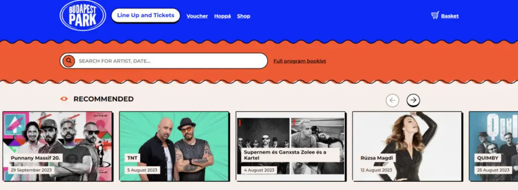
Source: budapestpark.hu
Brutalism goes against traditional color theories and alignment principles. At the same time, it lives up to its French root phrase, "béton brut"—which means raw concrete—by using uncomplicated navigation and unlayered graphics. The term originally referred to the popular European architectural style in the late 1940s and early 1950s, rejecting the decorative pomp before the Second World War. The trend declined in the 1970s and saw its revival in web design. However, designers used the term to represent the defiance of pre-2000s UI conventions.
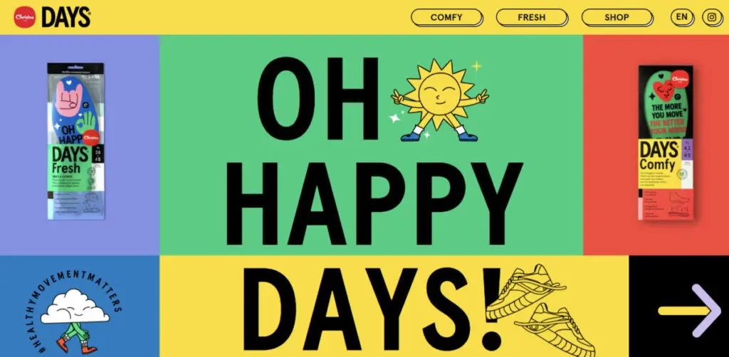
Source: days.christou1910.com
Neo-brutalism takes this style to the edge through "ugly" and asymmetrical design elements, screaming fonts, and a jarring color palette.
9. Textures and gradients
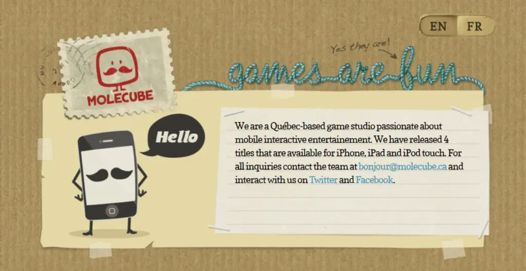
Source: molecube.ca
Using foreground or background images that create an illusion of real materials or texture—grainy, liquid, or metallic surfaces—adds depth to a webpage. Designers use color and shadows to mimic the physical world.
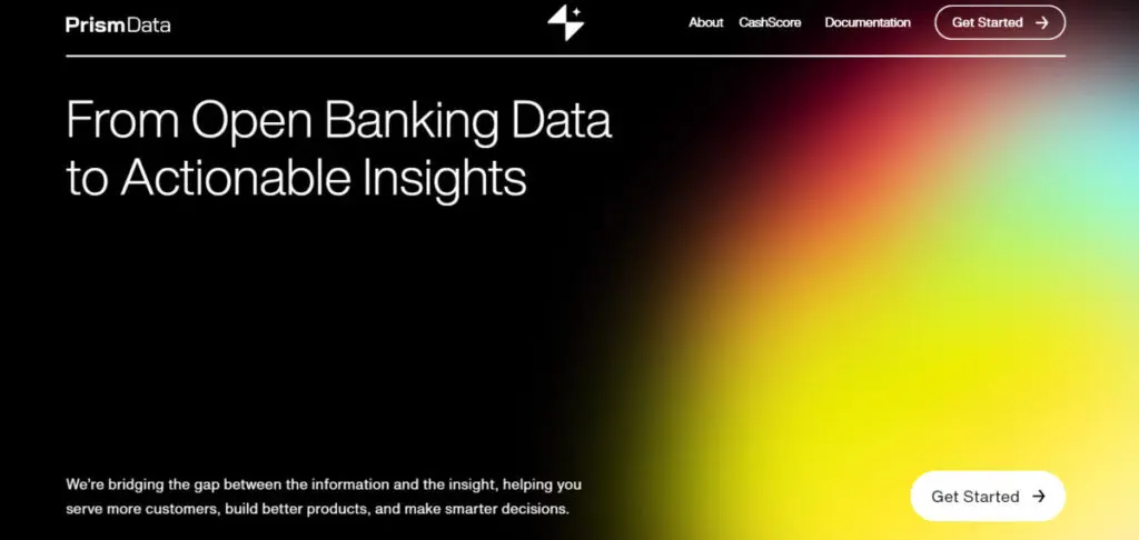
Source: prismdata.com
Gradients—or transitions from one shade or hue to another—can also infuse dimension to a website, whether the color blend is subtle or bold.
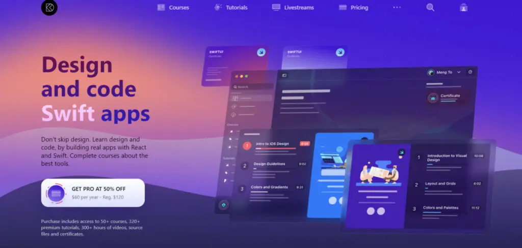
Source: designcode.io
Meanwhile, some designers use the frosted glass effect (glassmorphism) or blurry backgrounds as an alternative to gradients. This effect—also popularly applied on buttons and icons—is typically coupled with large fonts to ensure the site is still readable for visitors with visual disabilities.
10. Dark mode
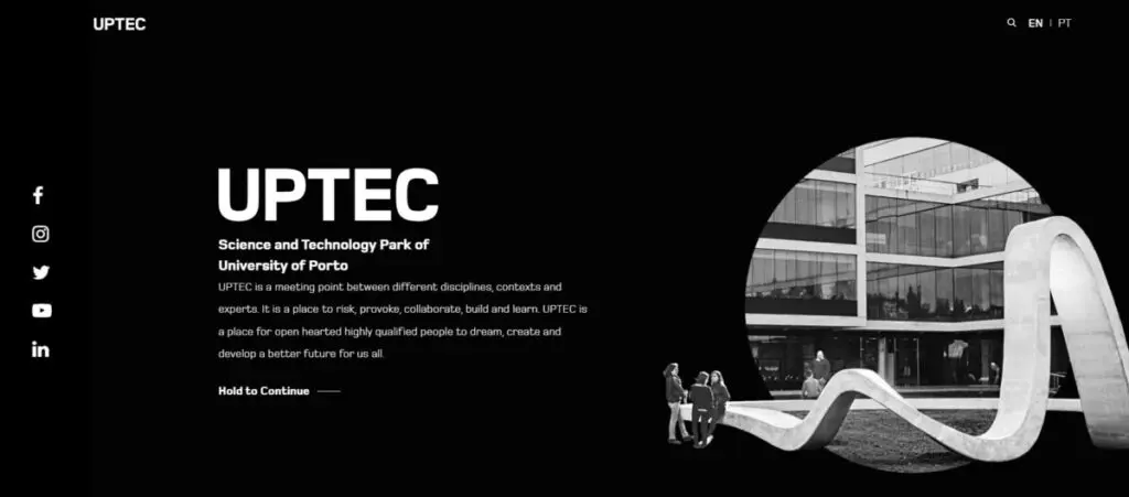
Source: uptec.up.pt
When creating websites in dark mode, designers play with different dark and gray background tones, pairing them off with white or light-colored typography to ensure the text is still easy to read.
Besides helping reduce eye strain, this design can create a sleek and sophisticated look for your brand. Or your brand can use it for a dramatic effect to emphasize your product or service's most unique features.
Offering your website in light and dark modes will benefit your brand, as 82% of netizens prefer browsing in dark mode.
11. Gamification
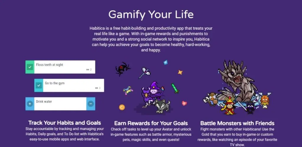
Source: habitica.com
Gamification excites website visitors through game-like features and mechanics, awarding them with points, badges, and other rewards for performing actions you set them to accomplish or participating in online challenges during their visit. Gamified websites can also have trackers to show individual progress or leaderboards if they compete with friends or others within your brand's community.
12. Virtual and augmented reality elements
AR overlays computer-generated images into the real world, allowing you to show off your product more interactively and memorably. You can include details about the product, including directions on how to use it, on the display.
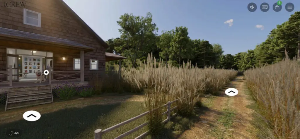
Source: jcrew.com
Meanwhile, VR takes website visitors into a simulated environment. While AR works well on products, VR can support businesses wishing to give online tours of their establishments—such as stores, museums, restaurants, homes, or hotels—and other destinations.
9 Web Design Mistakes to Avoid
Revamping or launching a new website is not just about design. To provide your visitors with a satisfying user experience that will lead to conversions, consider these nine factors that can frustrate them while visiting your website:
1. Non-responsive design
Responsiveness in web design refers to keeping your website's look and readability consistent across all devices. Since 58% of all website visits come from mobile phone users, your portal must adapt to different screens and devices to sustain engagement.
Discover more about your mobile user market in our feature article here.
2. Lack of accessibility features
Design and build your websites for easy access to everyone, including persons with disabilities. The Centers for Disease Control and Prevention says 27% of the American population has some disability. They include people with problems with vision, mobility, hearing, cognition, and speech.
Be familiar with inclusive design to ensure your website complies with the World Wide Web Consortium's accessibility standards.
Optimizing your site for voice search can help widen your reach among users who are hard of hearing.
3. Poor website loading speed
53% of online consumers expect websites to load in three seconds or less, and half will abandon the site if the site takes longer than that. Various factors, such as your image and file sizes and the server's performance, can cause delays. Website grading tools can help you determine what's slowing down your portal.
4. Confusing site navigation
Applying the most modern navigation techniques is pointless if your webpage lacks specific, organized, and easy-to-understand category labels with working links. Streamline your navigation bar and ensure hyperlinks are distinguishable from the body text. Allow the color of visited links to change so your web user will know where they are and what section they came from.
5. Inconvenient search
Your website's search function could be a savior if your site visitors experience navigation difficulties. Search engines that have an auto-complete option and operate despite the user's typographical errors, upper-lower case spellings, and singular-plural variants, will motivate visitors to stay on your site.
6. Low-quality images
Un-optimized and even irrelevant images can harm your brand. Meanwhile, professionally taken brand photos inspire confidence among your visitors. Also, choosing the right format, size, alt text, and filename can improve your SEO and loading speed.
7. Lacking or unclear call-to-action buttons
What do you want your visitors to do? Thoughtfully (or wittingly)-worded CTAs on appropriately sized and positioned buttons can help you get your desired results—as long as you don't overdo it.
8. Hard-to-find contact information
Your "Contact Us" link or section should be a click away from the user. It should appear on top of your page. You can also align it with your social media icons.
9. Text walls and typos
After impressing your visitors with your visuals and design, you must sustain their interest with scannable content. This means avoiding large blocks of text and using a writing style that suits your buyer personas.
Presenting information through sub-heads, short paragraphs, bulleted lists, and sufficient white space makes your page enjoyable to read. Lastly, don’t forget to conduct grammar and spelling checks.
Final Thoughts
Over the years, websites have evolved from being simple pages that merely displayed information about brands’ products and services to becoming dynamic sites that focus on delivering a good user experience. Today, brands leverage various web design trends to build a site that engages consumers, delivers quality content, and helps achieve their business goals. Use our list of web design trends, as well as mistakes to avoid, as a guideline to help you create a well-designed and functional website that resonates with your audience.
Frequently Asked Questions
How often should businesses redesign their websites?
The frequency of changing your website's design will depend on your goals and needs. However, experts typically recommend that brands redesign their portals every two to three years.
When is the best time to refresh or redesign one's website?
Your website is up for an upgrade when:
- It no longer reflects your current initiatives due to a new product or service lineup.
- It doesn't generate business results (traffic and conversion rates are dropping).
- It suffers from technical issues (such as slow loading and high bounce rate).
- It isn't mobile-friendly.
- It isn't accessible to users with disabilities.
- Its design is outdated.
How should one get started with updating their website?
You can clearly define your website refresh or redesign project scope by doing the following steps:
- Review your website's current state
Examine your site's design, visual and written assets, and technical aspects (such as loading time and mobile-friendliness). Conduct analytics using traffic checkers to determine your site's most popular pages (highest engagement) and pages with the highest bounce rates. - Research your competitor's websites
Competitor analysis can help identify what content your current site may be lacking. You can also find ideas from your rival's sites and modify them to help boost your online presence. - Update your keywords and other content
Review your written content for SEO and check if your business details are still up-to-date (physical address, business hours, and contact details). - Apply and gauge your target market's acceptance of new elements with A/B testing
After gathering inspiration from current trends, create two versions of your redesigned webpage for two sets of visitors. Then track the results to see which version gets more clicks. - Request feedback
Survey your customers via email or social media on how they find the new website—what they like and dislike, including the problems they encountered.


