Thanks to advances in tech, consumers expect a lot more from brands. Service should be faster. Options should be more and, ideally, personalized too.
This also has implications for your website design. A basic, functioning website will no longer do. For your business website to generate sales, you should offer great online support and pages should load quickly. It should incorporate some form of website personalization, whether that’s via product recommendations or offers that reflect where they’re at in their journey.
You’ll see that there's a golden thread among the following 10 website design trends — engagement. There’s a shift from taking a conventional approach to adding more interactive elements. While website design can still be minimalist, you should offer your website visitors more of an experience.
1. Micro Animations and Interactions
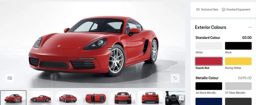
Animation is going to be major this year. From product displays and reveals to navigation, there are more ways than one that you can include it in your website design.
It doesn’t necessarily have to be major. Small animations can have a great impact. Simply including an animated hover effect can already deliver a more immersive experience.
Consumer expectations have evolved. They want to be entertained.
Animation is one way to make the overall experience more entertaining, interactive, and memorable. It can add that personal touch that’s harder to offer when running an online store.
You can, for example, use it to present product information in a more engaging and effective way that will help to keep them focused on the features and benefits of your offering. Unlike static images, adding an element of animation can make it much easier for interested buyers to visualize the products. This way, they can view products from various angles. Just make sure that the quality remains high so that they can also zoom in if they want to get a closer look.
Aside from keeping your website visitors on your page for longer and increasing the chances that browsing will convert to buying, it can also help with the post-sale phase. As customers could form a better idea of what the product looks like in real life, you can expect fewer returns.
You can also use micro interactions. Examples include letting a call-to-action button light up when a shopper clicks on it or letting the next review display when the cursor moves over product reviews. All in all, it’s a great way to improve the overall user experience.
Source: configurator.porsche.com
2. Minimalistic Design
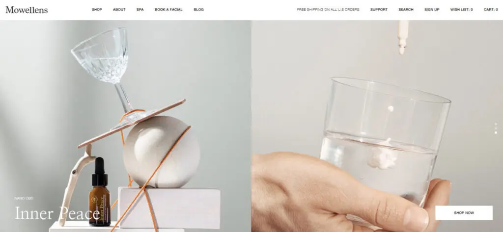
Keeping the design clean is one of the best practices for creating effective eCommerce websites, making minimalism a great trend to leverage. Uncluttered pages make it easier for website visitors to locate the products they need. What’s more, it also helps your web pages to load faster which helps improve the overall user experience and your conversion rate.
White space is your biggest asset. White or monochromatic backgrounds work best. Aside from the aesthetical benefits, it can also make your website more responsive and you’ll have an easier time adapting it for various device types.
To keep your design minimalistic, guard against adding too many elements like shadows. Instead, you can, for example, use a reduced color scheme (but avoid color gradients) as a navigation tool.
Basically, only include those elements that you really need. The fact that you love a certain graphic isn’t enough reason to include it in your website design. And those elements that you do include should ideally be simple fonts, shapes, and lines.
Source: mowellens.com
3. Large Fonts
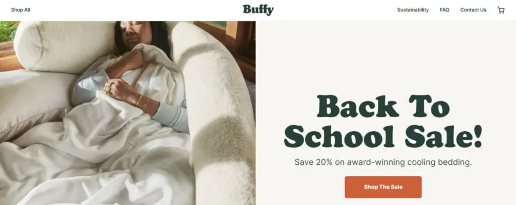
While less is more, bigger is better. This year, expect to see chunky fonts. Whether you prefer thick typefaces with sharp lines or prefer to keep it smooth and include rounded typefaces, the trend is to make it large.
Aside from breathing new life into your website, it can serve other purposes too. It helps to grab attention, highlight your message, and create an inviting tone without adding more clutter. Basically, website visitors will leave with a warm, fuzzy feeling towards your brand. It’s all about positive vibes.
To make it even more impactful, try to use warm colors. Larger fonts can pair well with orange, yellow, or even pink. Obviously, you’ll need to keep your branding in mind, but, generally speaking, brighter, unsaturated colors are currently trending.
Considering that colors and typography are two elements that have a huge psychological effect, you’ll want to pay attention to this trend. Oversized fonts might not work for all brands and are more geared towards eCommerce businesses that want to create an artistic feel and show off their fun side. That said, all brands should choose their fonts strategically.
Source: buffy.co
4. Asymmetrical Layouts
For those more adventurous, there’s asymmetrical layouts. It’s especially popular among lifestyle and fashion brands that need a more creative design.
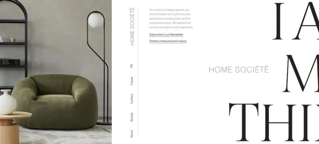
Using an unconventional layout like this can give your website a very modern and dynamic appearance and make the website experience more enjoyable. However, it’s tricky and can let your website look disorganized if you don’t know what you're doing.
To pull it off, you’ll need to incorporate loads of empty background space. Then, combine big headers with smaller visuals and let elements overlap.
You’ll also need to ensure there are focal points. What will capture their attention?
It could be an object that’s bigger or has a different texture. You can also use contrasting color to guide their gaze or use lighter and darker colors to emphasize specific areas.
While the design lacks symmetry, there should still be a sense of visual balance. Elements like different colors, objects, or textures, all carry a visual weight and you’ll need to keep this in mind when creating your layout.
Source: homesociete.ca
5. Central Navigation
Navigation menus are no longer restricted to the header and footer areas. It’s becoming more common practice for brands to place the navigation menu in the center of the home page (think back to other unconventional layout options like asymmetrical design discussed earlier).
What makes central navigation such a popular choice is that it’s also described as “thumb-friendly”.In other words, it makes it easier for mobile users specifically to access the navigation bar effortlessly, giving you another way that you can make your website design more mobile-friendly.
Remember that mobile users complete the scrolling action with their thumb. Having to extend this short, thick finger all the way to the top just to have to click on a small button tucked away in the corner to find the page that they’re searching for is unpleasant.
6. Sophisticated Chatbots
In addition to the aestical elements, website design trends can also impact the technical side of things. It’s only to be expected that artificial intelligence will also play a huge role in how designers go about creating eCommerce websites moving forward.
While the use of chatbots isn’t a new phenomenon, how brands use it will change. For example, unlike regular chatbots, AI chatbots can learn about website visitors by keeping track of patterns in data. As such, you can expect it to be used for more advanced functions like helping customers to complete the buyer’s journey and personalize the shopping experience.
This type of sophistication is more suitable for bigger businesses. Depending on the features needed, it can quickly add up to a few thousand dollars per month.
If you’re thinking about going the AI route, there are a couple of considerations. User experience and scalability are key.
The goal is to improve communication. This means that it should be easy to use and navigate, reliable, and human-like. You want the conversations to be natural and realistic.
You’ll also want to invest in a tool that can grow with your business. AI tech is advancing rapidly and it will make your life easier if your chatbot adds regular updates. Also, considering that your website traffic will hopefully grow, the chatbot that you use should be able to accommodate increased traffic too.
However, considering that chatbots are the future of online marketing, look to see how you can incorporate it into your design and business operations, even if it’s only for simple customer service support. Chatbot technology is improving continuously and it’s expected to remain a popular trend in the foreseeable future.
7. Dark Mode
Aside from central navigation, another way that you can cater towards mobile users is by including a dark mode feature. It’s one of the top web development trends and the preferred choice of more and more app users.
With this added feature (sometimes called night mode), website visitors are able to switch the colors used on your website to a darker color scheme. A good example is where you’ll use a light color for your text and display it on a dark background, instead of the other way around.
The benefits are twofold. It’s much kinder to the eyes as well as battery life.
In addition to being eye-friendly, it can also be eye-catching when done right. It can help you to create a super sleek look, helping your target market to see you in a different light.
That said, it can be challenging to get it right. Not only will you need to keep in mind your own branding, but you’ll also need to ensure that all the elements are just as visible when using dark mode.
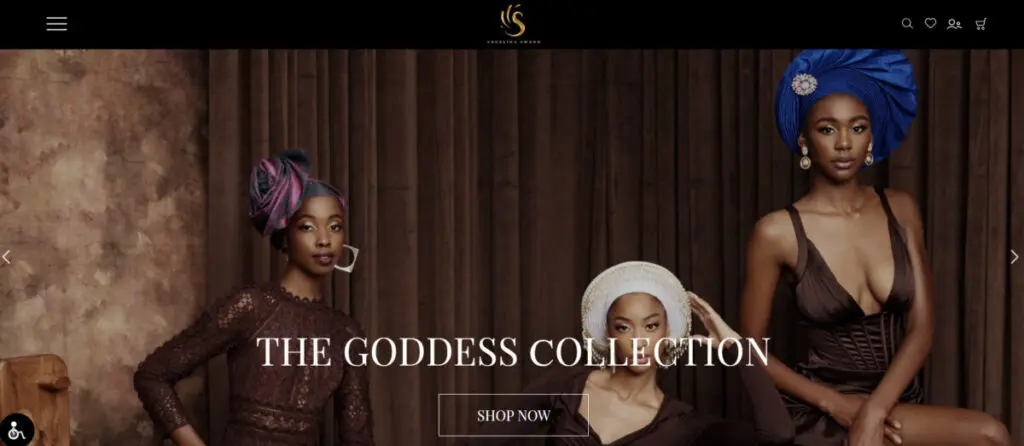
Source: angelinaswann.com
8. Better Filters
Filters play a major role in eCommerce website design. Without a proper filtering system, website visitors will have a hard time finding products, hurting your conversion rate.
Similarly to other elements on your website, you can also make it more engaging. Instead of presenting them with the conventional, drop-down menu, why not use a slider? This way, users can select which metrics they want to include in their search.
Depending on the type of products that you sell, you can also try to personalize it. Ideas include letting customers build their own product or creating a click-activated journey.
Basically, expect to see eCommerce brands have a lot more fun when designing filters.
9. Storytelling
You might associate storytelling with other marketing strategies like social media, but it can also be used in your website design. This approach can work especially well for lifestyle and beauty brands.
Interactive video can be very useful if you want to incorporate a storytelling element. Inserting a video into your hero section is also currently trending. Considering that this is often the first interaction that visitors have with your website, use it to your advantage and tell the story about what makes your products unique. It’s a great way to lure them deeper into your website and scroll further.
As for your images, go easy on the editing. You want to keep them as authentic as possible so that they can tell a real story. This is especially important if you want to target younger consumers.
Also, try to find a balance between using product photos and lifestyle pics. While a professional photographer can help you with this, you can also rely on user-generated content platforms.
UGC is one of the main eCommerce content marketing trends currently and a great way to instill more trust in your brand and products. You can, for example, combine UGC with product reviews for the ultimate mix of social proof. To help you gather UGC, you can, for example, create a hashtag contest and repurpose it for your website and landing pages.
10. Accessibility
Gearing your website more towards mobile users has been mentioned more than once already. However, that’s not the only group of people you need to keep in mind.
Increasingly more brands are realizing the big need to cater towards people with disabilities too. By making your content and design more inclusive, you can improve your SEO, boost conversions, and, more importantly, help more people to interact with your brand.
Here are some ways that you can make your website design more accessible:
- Including alt text to your images
- Incorporating strong color contrast
- Avoid using small font sizes
- Adding closed captions to videos
- Labeling all form fields
- Use descriptive URLs
If you fail to make your website accessible, don’t be surprised if people without disabilities stop interacting with your content too. As mentioned, consumers’ expectations of businesses have matured. Social responsibility has become a priority for many and increasingly more consumers are avoiding brands that ignore their duties towards the environment and society.

Source: pinkmoon.co
Wrapping Things Up
Trends come and go. So, do brands.
To ensure that your business stays relevant, you’ll need to keep your pulse on crazes and trends. You don’t have to go crazy and hop on every single trend every single time. However, from time to time, see which trends can align with your branding and target audience and try to find a way to incorporate those.
After all, a design-it-once-and-never-again approach doesn’t work when it comes to creating business websites. Just like you’ll be uploading new products, reviews, or blog posts, you’ll also need to include a website redesign in your planning.
Frequently Asked Questions
What are some best practices for designing eCommerce websites?
There are several best practices to keep in mind when you’re creating a website for an eCommerce business. Examples of some of the most important guidelines include:
- Keep the design clean
- Use easy-to-understand navigation
- Use only high-quality photos and videos
- Ensure your call-to-action prompts are clear
- Incorporate social proof like UGC and product reviews
- Try to limit the checkout to a single page
- Use responsive design
What are some of the top eCommerce websites?
If you’re searching for design inspiration, the following eCommerce websites can serve as good examples:
- Allbirds
- Pura Vida Bracelets
- Space Posters
- Burrow
- Revelry
What makes a great eCommerce website?
There are eight key elements that help to turn an eCommerce website from good into great. These are:
- Responsive design
- A design that’s visually appealing
- Product images
- Fonts and colors
- Trust signals
- User experience (UX)
- Intuitive navigation
- Accessibility
Are there any good AI website builders?
There are a number of AI-powered website builders that you can check out like:
- GetResponse
- Bookmark
- B12
- 10Web
- Durable
- Weblium
- Hostinger
What are some of the most popular eCommerce website templates?
If you’re interested in using a template to help you design a website for your eCommerce brand, you can shortlist the following templates:
- Astra
- Divi
- Unero
- Jevelin
- Metro
- Haat
- Flatsome

