“Do not judge a book by its cover.”
We all know and love that saying. It seems so easy to do, right? Wrong. In fact, that statement is the opposite of what people do. In the business world, how you present yourself matters. On social networks like Facebook and Instagram, your visual aesthetic is the determining factor of your long-term success. Today, we will be focusing on YouTube.
Everybody knows YouTube. YouTube is the second largest search engine after Google. It also happens to be the second most popular website worldwide. That’s why YouTube marketing is a huge strategy for businesses in every industry.
So where does “not judging a book by its cover” come into play with YouTube marketing and advertising? Simply put, the target audience whose attention you’re attempting to capture will judge you based on one important factor: your YouTube thumbnail image.
There are many ways to get free YouTube subscribers and grow your channel. But people will judge your content by the thumbnail image you put out. You want viewers to actually watch your content. So it is imperative to pay attention to the design, in a way that summarizes your content in a single image.
When you upload a new video to YouTube, the system chooses a random frame as a thumbnail. It also gives you the option to upload a custom image that you’ve previously edited on your computer.
Here are some of the best YouTube thumbnail ideas that will get you more clicks and viewers.
What Makes an Effective YouTube Thumbnail?
Consider the main goals of a custom YouTube thumbnail: it should help your audience quickly recognize your video, convey the video's content, and entice viewers to click.
With these goals in mind, here are seven key elements to focus on when creating a new thumbnail, whether for YouTube, social media, streaming platforms, or other video services:
- Clarity: Your thumbnail should immediately communicate what the video is about.
- Quality: Ensure the thumbnail is high-resolution, properly optimized, and visually appealing across various devices. Follow YouTube's guidelines to maintain top-notch quality.
- Competitiveness: Make sure your thumbnail stands out from others, especially those of your competitors.
- Accuracy: Avoid misleading or clickbait thumbnails. It’s important that your thumbnail accurately reflects the video content to keep your audience’s trust.
- Wording: Keep the text short and impactful. The wording should be concise and enhance the design, not clutter it.
- Graphics: The use of colors, design elements, and layout should all work together to make the thumbnail visually compelling.
- Branding: Ensure that the thumbnail aligns with your content, overall brand image, and target audience to maintain consistency.
Top YouTube Thumbnail Ideas to Boost Clicks and Viewership
Creating eye-catching thumbnails is crucial for attracting more viewers to your YouTube channel. Thumbnails serve as the first impression of your content, and a compelling design can significantly increase the likelihood of someone clicking on your video. Below are some of the best YouTube thumbnail ideas to help you boost clicks and grow your audience:
1. Think of the viewer you want to attract

Put yourself in your viewer you want to target. What are their biggest concerns?
They may have too much Internet work to do. They don’t have the time. They came across your video, hoping to have their questions answered. They instantly click to watch your YouTube video because of your brilliantly put-together thumbnail image. Ta-da! You just achieved another viewer.
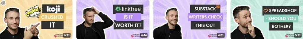
2. Show a person in your thumbnail image
Thumbnails that show a person performs better than those that don't. Short shots of people always work well. It is proven that if the thumbnail shows a person looking directly into the viewer's eyes, it will work even better.
3. Color Balance
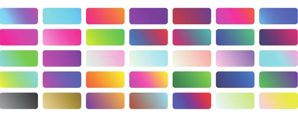
The colors you choose for your YouTube thumbnail can significantly impact its effectiveness, making the difference between grabbing attention and going unnoticed. Therefore, it’s important to carefully select your color palette when designing a thumbnail.
Generally, it’s best to use colors that align with your brand’s identity. A well-established visual identity will guide you in selecting hues that enhance your brand's recognition and appeal. You should also consider current trends and observe what other successful channels are doing.
Lastly, aim for color balance in your design. Limiting your palette to around four primary colors can prevent overwhelming viewers. Combining vibrant hues with more subdued tones helps create a cohesive and visually pleasing thumbnail.
4. Take care of the image
Use high definition images. Never upload a blurry one.
The idea is that your thumbnail is a JPG, GIF, or PNG. Measuring 1280 x 720 pixels (16: 9), and weighing less than 2MB.
Make your thumbnail image one of the best you can put out there.
5. Add text

The excellent idea is to add text to your thumbnails; this will show at a glance what the video content is about in an instant.
Text is an efficient design tactic, but don't go overboard either. More than six words in your thumbnail image would make your image look too bulky and blocky. Remember: the color of your text must contrast a lot with the background. If not, it will not be easy to read.
Note YouTube’s algorithm has changed over time. Here’s what you need to know to put out the best video content and get the most clicks, views, and subscribers.
6. Include your logo
It is always a good idea to add your logo to the thumbnails of your videos.
This way, people can quickly recognize that the video is yours, even when it is embedded outside YouTube.
Your logo is one of the most important parts of your brand. Put it everywhere. Let the world know who you are. And one great place to put them in is in your YouTube thumbnail videos.
7. Define your unique style
Work on a specific thumbnail style repeated in all your videos so that viewers can quickly identify the videos. This will make you look more consistent and professional.
Each miniature must be different, but plainly you can define colors or design standards that unify the style.
Get inspiration from your competitors, exploring visual search engines like Pinterest, or even doing unconventional methods like reading books or scientific articles. Get your creative juices flowing to find a style that resonates with you.
8. Experiment with different types of design styles
If you make several different types of videos on your channel, another good option is to define a different thumbnail style for every kind of video. You can play with design options like colors. But there are no limits to what you can do.
All your videos will have a thumbnail with a black and white background, but on that background, the video clips will have a green text, and the video lyrics a blue background.
So that when browsing the channel, the viewer knows at all times what type of content each video has.
9. Use your YouTube thumbnail to explicitly say what your video is about
Although it sounds obvious, do not use images for your thumbnails not related to the video content.
This doesn’t make you look good. Viewers want to watch videos that can satisfy whatever their needs are in that moment. Whether they want to be entertained, informed, or educated, what you put in your thumbnail image will tell your target viewers exactly what your video is all about.
Trying to fool the viewer by saying you can deliver one thing in your YouTube thumbnail image but delivering something entirely different in your actual video will only bring you bad comments and dislikes. It’s a huge no-no.
10. Think about the different devices viewers will be watching your content on

It is imperative that you make sure that your thumbnails look good on both large screens and mobile devices.
That when viewed on a small screen, the colors continue to contrast with each other, meaning that the texts remain legible.
Note
YouTube influencers are the ultimate content creators. Here’s the ultimate guide to working with them.
Don’t make your viewers work to try to understand what your video is all about. Don’t design YouTube thumbnail images that are hard to read. Your viewers will immediately go to another video to solve their problems and answer their biggest questions.
11. Determine the right size of your thumbnail
YouTube recommends a 1280 x 720 resolution for your thumbnail.
But if you want to try different proportions, it is ideal to place black bars in the image, but not to resize it.
There is no absolute rule of thumb when it comes to how to compose a frame. However, there are several guidelines you can use to help improve a composition.
What exactly is composition? It refers to how you can place various items within the frame to make it easy on the eye.
Let's start with three of the best-known composition techniques:
- Rule of thirds—This is a simple technique that helps you place the essential element in your composition in a place with the most significant visual impact. In the graph, you can see four red circles; these points are those in which the eye tends to stay the longest. "Lunatic" has excellent advice on how to place these "Rule of Thirds" lines ideally in any CSP workspace.
- Negative Space—This is the space around and between the main subject of the frame. This is the one that you will use to place the text for your composition. Negative space is important to consider when designing your YouTube thumbnail image because it allows the image to be enlarged and allows you to place additional elements to create a structured balance.
- Frame within frame—Creating a "frame within a frame" is an effective way to create depth in a scene. This technique is interesting because you make the object come off the canvas, which is an illusion that makes the composition more attractive and conveys a significant meaning.
While these are the most popular composition forms, there are many different techniques that can capture your viewer’s attention. These include opening lines, symmetry, patterns and textures, juxtaposition, and more.
12. Use attractive titles in your thumbnails

You can argue that the text is even more critical than the thumbnail image. Many will argue that a smart, witty sentence catches a person's attention and creates the need to see what it is about.
Newsflash: That’s why there are so many clickbait titles on YouTube. We’re definitely not suggesting using misleading claims for your videos, but rather showing that a first clear sentence can improve your video traffic.
The most important tip for good composition in your images is to maintain a balancing frame that works with colors and text. This kind of mindset will also help you write the best YouTube description captions.
What this means is that the arrangement of positive and negative elements in the space is placed in such a way that no area of the design dominates other regions. Each component of the composition has weight and fits into a perfect whole.
13. Use a neutral background
When you have a dull experience, such as a smooth textured spot color, it is easy to place text and maintain good readability. Having a neutral background in your YouTube thumbnail will contribute to that.
The size of the text must be as large as the composition allows. But remember that this thumbnail will be presented in different sizes, depending on the screen on which the viewer is looking at the content.
14. Use a bright or textured background
Bright or textured backgrounds in thumbnail images make your images stand out from other videos. On a background with varying brightness or texture, the text is sometimes not readable. So to increase readability you can use a border on the text.
When there is a dense texture in the background, another option is to create a box that contains the text. This option allows you to choose the font color and create a neutral background for easy readability.
15. Optimize your YouTube thumbnails for different designs
Did you know 55% to 70% of thumbnail impressions are small scale? This means that your YouTube thumbnail design should be created for a small screen.
You have made the thumbnails or thought of different ideas. Now, optimize them for your viewers' mobile experience. Most people view YouTube and other digital services on their mobile devices.
More than half the world is living on their smart devices such as phones, laptops, and tablets. A thumbnail should be what can be efficiently optimized and user-friendly on all devices.
Another point is to continually look for your competitors who have a similar channel and are dealing with the same audience.
This move is crucial if you want to succeed on YouTube.
Final Word
Creating a successful YouTube channel starts with your aesthetic. And your YouTube aesthetic starts with the thumbnail images you put out. These are just a few thumbnail ideas for YouTube videos, but there are endless options and ideas you can create. This article's goal was to give some YouTube thumbnail ideas if you are not inspired or don't know what to do.
We can’t overstate the importance of thumbnails on YouTube. They can make or break your video success. They can boost your channel’s ranking and complement your branding efforts in a big way. Use the tips, examples, and resources mentioned in this post to eliminate the guesswork from thumbnail creation and create super-successful thumbnails.
One of the most important things you can do when creating YouTube thumbnail images is to check out what your competitors are doing and creating to know how many clicks they are getting. See how their thumbnails are working the magic for them. Look at how they designed theirs. Compare your design, content, titles, color schemes, and more to get inspiration for future designs.
Frequently Asked Questions
What Makes a YouTube Thumbnail Catchy?
A catchy YouTube thumbnail is one that grabs the viewer's attention and entices them to click on the video. Key elements include:
- Clarity
- Quality
- Competitiveness
- Accuracy
- Wording
- Graphics
- Branding
What Size Should My YouTube Thumbnail Be?
Your YouTube thumbnail should have an aspect ratio of 16:9 and a resolution of 1280x720 pixels. This size ensures that your thumbnail looks good on all devices and meets YouTube's requirements.
Should I Include My Face in the Thumbnail?
Including a face in your thumbnail can be very effective, especially if it shows a clear emotion. Thumbnails with faces tend to attract more clicks because they create a personal connection with viewers.


