With a potential advertising audience of 1.64 billion people worldwide, it's crucial to make sure your profile stands out and captures attention. What will visitors see when they land on your page? Is your profile inviting and memorable? Does it showcase the best possible image of your brand? If you're serious about creating an Instagram profile that truly wows your audience, you should be using an Instagram grid. In this article, you'll find some of our favorite Instagram grid examples to inspire your own design.
What Is an Instagram Grid?
Instagram grids are themes you can use to create stunning designs from your profile feed. Instagram grids are sometimes called Instagram "puzzles," and you can create them by uploading related posts to your feed, combining the images to create a cohesive image. They typically consist of nine or 12 posts and there are several different types of Instagram grids that are popular with Instagram marketers.
7 Instagram Grid Examples to Inspire
Instagram grids follow a specific pattern using colors and imagery to let customers learn more about your brand. Of course, there are different types of Instagram grids that you can use, depending on what works for your content and your audience. Here, we'll cover 7 different types of grids along with real-life Instagram grid examples for each type. We encourage you to not copy the examples but rather use them as inspiration for creating your own Instagram grids that really make your brand pop.
1. Squares
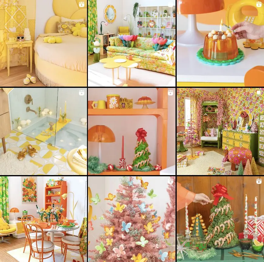
If you're looking for an Instagram grid layout that doesn't require tons of planning but still looks like it does, just sticking with one or two colors for your images and using a consistent filter on each image is your best bet. Using similar colors makes your profile feed look intentional without spending tons of time thinking about which images to include.
Here's an example of this Instagram grid from The Minimalist Instagram feed showing that you don't need flashy colors to create a stunning profile feed:
Of course, if you want to use flashy colors, this example from Sam Ushiro's Instagram shows that it works just as well:
2. Rows
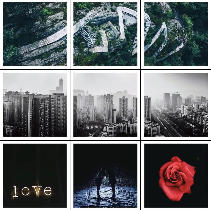
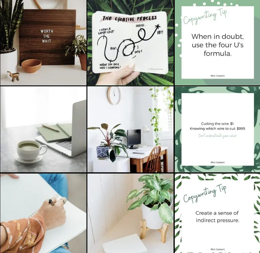
This Instagram grid example is based on a 3x3 grid with a total of nine squares. For this grid, you'll be using a visual pattern for each set of three posts. This might mean using specific color schemes, using complementary colors with a cohesive theme, or something else.
Here's an excellent Instagram grid using rows from William.Wanderlust:
Here's an example from a brand that opted to use alternating image and text post groups in each row:
3. Columns
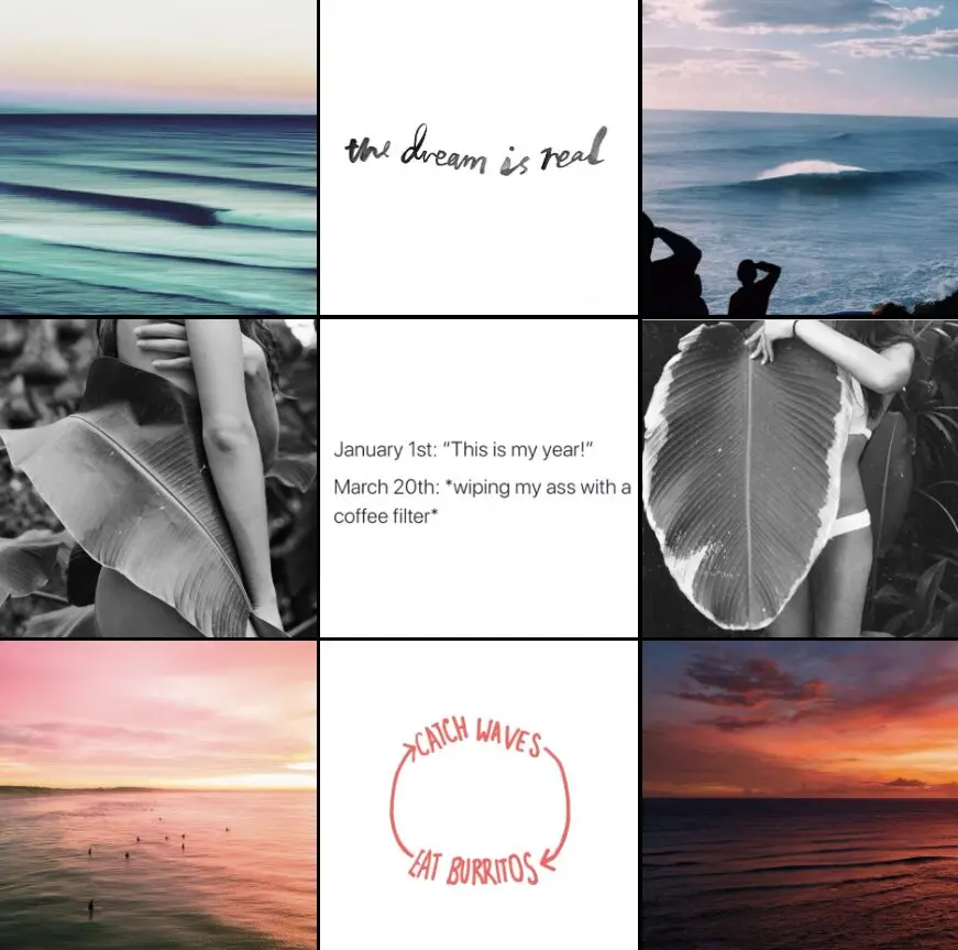
This Instagram grid type is similar to rows except the content is arranged vertically. Some Instagrammers use colorful images in the first and last columns with a simpler image or text in the middle column. Let's take a look at a couple of Instagram grid examples for this grid type.
Here's an example from My Simple Gram using two images on the outer edges with simpler images in the center column:
In this example, the brand has opted to use images for the first two columns with text-based post images in the final column:
4. Checkerboard
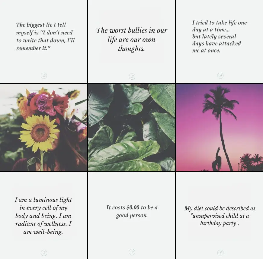
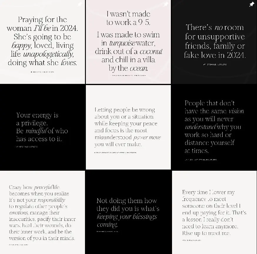
The checkerboard Instagram grid is visually appealing whether your content is image-heavy or text-based. The best part is that it looks really fancy, but all it takes is two different types of posts that contrast one another. Then, you just alternate the post images for the checkerboard effect.
Here's an example of the checkerboard pattern using text-based images only:
This example from Be Seen Optics SD shows a checkerboard pattern using a combination of image and text-based posts:
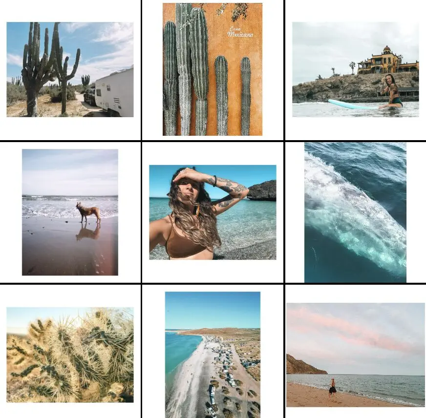
5. Borders
In this Instagram grid example, borders add an air of elegance and sophistication to the profile feed. The images are carefully curated with light backgrounds and a minimalist feel, enhancing the overall aesthetic.
This approach is ideal for creating a visually appealing and memorable Instagram presence.
6. Diagonals
Diagonal grids are a fun play on the row- or column-based grids. They look really complicated and, to be frank, they can be. If you want to create an entirely diagonal feed, you'll need four general themes for the images you use. Some Instagrammers end up feeling stuck with the themes they've chosen, so we recommend not getting too specific on your theme.
Here's one of our favorite diagonal Instagram grid examples:
As you can see, this grid uses diagonal text-based posts to break up the rest of the images. This isn't an entirely diagonal grid, but does offer an alternative if you'd rather just choose a single theme for your diagonal posts.
7. Puzzle
The last of the Instagram grid examples we're going to cover is the puzzle layout. The puzzle layout is fairly dramatic to look at. It involves images that come together to make a complete image out of your entire Instagram profile grid. This takes a lot of planning, but it's stunning to behold. For best results, each of your images should be able to stand on its own as well as come together with the pictures around it to create a single image.
Here's one of our favorites from the Netflix series Dark:
How to Create a Powerful Instagram Grid
Creating an impressive Instagram grid takes a little bit of planning, but it doesn't have to be complicated. By following the tips we outline here, you'll be able to build an Instagram grid that shares your brand's story and gets your followers excited. Let's dive into five steps you can follow to make the process easier.
1. Familiarize Yourself With the Grid
Before you start choosing images and just plugging them into your calendar, it's important to become familiar with Instagram grid. Remember that Instagram is a largely visual social media platform, so it's vital that thought be given to not only how your posts look on your Instagram profile feed, but how they hold up when viewed individually.
As you think about the grid and the Instagram grid examples we've shown you, consider how your own images will fit. Will they look good next to one another? Do you have too many things going on? What about types of content—are you using a good mix of image-based and text-based pieces? What do you want your Instagram profile feed to say about your brand?
2. Understand Design Basics
The next step is to get a solid grasp of basic design principles. Design includes:
- Space: Use space to bring attention to the important stuff.
- Balance and alignment: Spread your elements around to create a balanced look and feel.
- Hierarchy: Draw attention to the most important elements and lead viewers through your content.
- Lines and shapes: Use lines and shapes to effectively convey your brand's personality, vision, and messaging.
- Color: Color has an enormous psychological impact on consumers, so use it effectively.
- Typography: Font and font layouts give another dimension to your brand and how you want to come across to your target audience.
- Texture: Texture can make your images more visually engaging through added dimension and depth.
- Branding: Branding is what brings your brand and its story to life.
3. Plan Your Content
Now it's time to plan out your content. This is when you'll really want to consider your message and what you want your target audience to know. Once you've settled on a purpose, pick a few different content types (2–3) and start creating.
4. Include Branding
After you've planned out your content, you'll need to make sure that they have a cohesive look. Basically, you want them to match your brand. Some Instagrammers use the same filter on all of their images to create that cohesive look, others tie everything together with colors or fonts. You don't want things to look matchy, but you do want everything to look like it belongs to your brand.
We recommend going easy on effects, limiting yourself to a single filter for your images. While it can be fun to layer them up, you want your focus to be on the images themselves—otherwise, why use those images at all?
5. Build Your Instagram Grid
Now you're ready to start plugging things into your grid. Start out with a 3x3 grid and move them around until they look right. Have fun with it!
Apps to Help You Create a Visually Powerful Instagram Grid
While it's entirely possible to build your Instagram grid on your own, it's much easier to do if you have the right tools. Here are some of the best tools you can use to quickly and easily create an Instagram grid you're proud of.
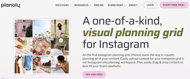
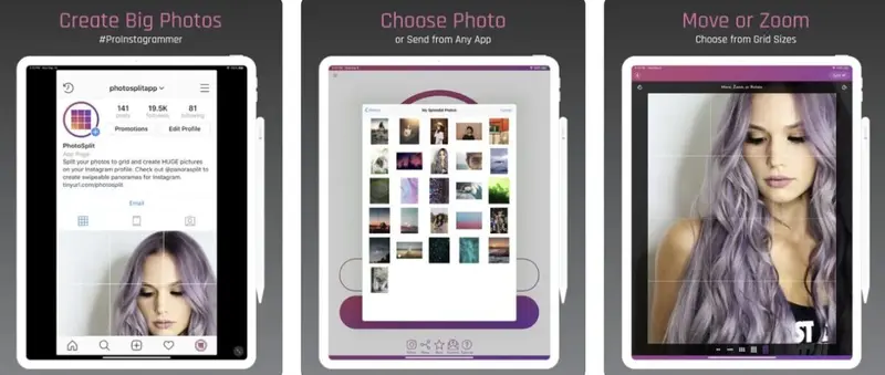
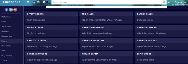
Planoly started out as the first visual planner for Instagram and has grown into an industry-leading social media marketing platform. As an Instagram partner, Planoly is often on the cutting-edge in terms of Instagram features and tools. You can use Planoly to: Preview App makes it easy to plan Instagram posts, Reels, IGTV videos, find the best Instagram hashtags, analyze your data, find caption ideas that engage, and more. You can upload as many photos, videos, and carousels as you want and rearrange them just so. Then, preview your Instagram feed before you post. PhotoSplit for Instagram lets you slice-and-dice any photo into 1×2, 1×3, 2×3, 3×3, and 4×3 grids without losing resolution. This makes it ridiculously easy to split an image to show it as a single image on your profile feed. You can even move, zoom, or rotate the image for the best look. ImageSplitter is a free Instagram image splitter that you can use to create multiple Instagram images for your grid from a single image. You can divide a single image into 3×1, 3×3, 3×4, 3×5, and 3×6 grids. Just upload your image, choose the size of your grid, click “split” and download your sliced image. Then, automatically post them to Instagram. PineTools is packed with free online tools. One of those tools is perfect for splitting an image into smaller images that you can use for your Instagram grid. You can split images horizontally, vertically, or both, as well as choosing the size and quantity of images you want to be created. Just upload your image, choose how you want the image split, and choose your output format (JPG, PNG, BMP, WEBP).1. Planoly
2. Preview App
3. PhotoSplit for Instagram
4. ImageSplitter
5. PineTools
Wrapping Up
Creating the perfect grid design for your Instagram profile feed is easy with the Instagram grid examples we've shared here. Use these designs to inspire your own eye-catching Instagram grid and really take the time to consider how you want your audience to feel about your brand when they see it. Then, use the steps we've included on how to create a powerful Instagram grid to make your vision a reality.
Frequently Asked Questions
What is an Instagram grid?
An Instagram grid refers to the visual arrangement of your posts on your Instagram profile. It consists of a 3x3 layout of your most recent nine posts, creating a cohesive look for your feed.
Why is having a well-designed Instagram grid important?
A well-designed Instagram grid helps you create a strong visual identity for your brand or personal account. It allows you to showcase your content in an organized and aesthetically pleasing way, making a great first impression on visitors and potential followers.
What are some popular types of Instagram grids?
The article covers seven popular Instagram grid types:
- Squares
- Rows
- Columns
- Checkerboard
- Borders
- Diagonals
- Puzzle
How do I plan and create my own Instagram grid?
To create your own Instagram grid, start by familiarizing yourself with the different grid types. Understand basic design principles and plan your content in advance. Incorporate your branding consistently throughout your posts. Use apps like Planoly to help you visualize and build your grid before posting.
What are some tools that can help me create an Instagram grid?
The article recommends several tools to help create Instagram grids, including:
- Planoly - a visual planner and scheduler for Instagram
- Canva - a design tool with Instagram grid templates
- Preview - an app that allows you to plan and preview your Instagram feed
- Unum - a grid planning and scheduling tool for Instagram


