Looking for email footer examples you can use as a model to create your own? We've assembled a list of 11 email footer examples for you from some of the top email marketers and brands around. Before we get to our email footer examples, though, let's take a look at what an email footer is as well as some email footer best practices you can use to create eye-catching and customer-friendly email footers that continue to promote your brand long after the body copy is over.
Email footers contain important information for your customers. Often, your subscribers will check out your email footer for more information about the brand, find your contact information, learn how to manage their email preferences, and a whole lot more. Putting effort into your email footer through a nice, well-organized design, and sharing the information your subscribers and customers need goes a long way toward inspiring trust with your audience.
What Is an Email Footer?
An email footer is the final block of content in your email marketing template. It includes important information that doesn’t make sense to include in the main body of the email. Most brands include information like:
- Contact information including your postal address
- A company logo or branding
- An unsubscribe link or button (some add email preference management)
- A call to action
- Your website or a shopping link
- How to contact customer support
- Anything legally required by your local anti-spam and privacy laws
There’s so much more that can be included in an email footer. As you can see, it’s a lot more than just your company name. It’s very much part of your brand and needs to inspire subscribers to action and catch their eye.
Many email marketers overlook their email footers, resulting in overlooked email real estate and missed opportunities. It’s seen as a place to include the items that are required from anti-spam laws and that’s it. But your email signature doesn’t only have to include that information and it doesn’t have to be boring. If you’re just putting “fine print” in your email footers, you’re missing out on the chance to share more about who you are as a brand, or share the news that your target audience should know.
Of course, there’s always a balance. You don’t want to include just the bare minimum but you don’t want to fill up your email footer with tons of links or self-promotional info. So, how can you strike that balance? What goes into a well-designed and useful email footer?
How to Design the Perfect Email Footer
For many brands, email footer design is an afterthought, if it’s thought of at all. There are so many brands of all sizes that just go with the default email footer included in the email marketing template they use and go on about their day. However, email footers, as you’ll see from our email footer examples, can be a critical component of a great email newsletter design. After deciding the basics of what you’re going to include in your footer, you can design an email footer that displays your information in a way that’s approachable to your audience.
Here are four key tactics you can use to ensure a solid email footer design that works.
Keep It Simple
There’s a lot that you can include in your email footer. Because of that, there’s always a danger of your footer getting filled to the brim with links, buttons, logos, and the legal fine print. Again, we’re back to the balancing act. You want to give your subscribers enough information that your footer is actually helpful to them without overwhelming them with the information they don’t really need.
That’s why we recommend keeping it simple with an easily scannable design. This way, subscribers will be able to find the information that matters to them quickly without being bombarded by additional information. Really think about what you need to include and how you’re going to present the information in your footer and consider using a hierarchical design that directs readers to the important stuff first.
Make It Mobile-Friendly
More and more, being mobile-friendly or mobile-first is a must for digital marketing. EasySendy even reports that mobile accounts for over 61% of all email opens. When you couple that with the knowledge that $1 billion in sales come from emails on mobile (Smart Insights), keeping your emails and email footers mobile-friendly becomes even more important.
One of the best ways to make sure your email footer is mobile-friendly is through an easy-to-read and clickable design. You’ll want to keep the text large enough for mobile users to read and ensure that your buttons and links are big enough for thumbs and fingers. That also means the spacing of those links and buttons will need to be considered as well.
Use the Space
In addition to keeping things simple and mobile-friendly, you’ll need to consider how you want to use the space. As you’ll see from our email footer examples, there’s no hard, fast rule for how big or small your email footer should be. So, if you have something important to share, share it! Just make sure that there’s ample padding between footer sections—don’t crowd your content.
Include Trackable Links
You’ll probably have a few links in your email footer, directing subscribers using CTAs or asking them to follow you on social media. We recommend using trackable links so you can track their performance. You can then test different calls to action or different icon and button styles to make sure you’re getting the most clicks.
11 Email Footer Examples to Inspire You
Now that we’ve covered how to design a great email footer, it’s time to take a look at some email footer examples and why they work. A strong email footer can really make a difference to your subscribers, either by providing them the information they’re looking for or encouraging them to stay on your email list instead of unsubscribing. Here are the email footer examples we’re loving right now.
1. Apple
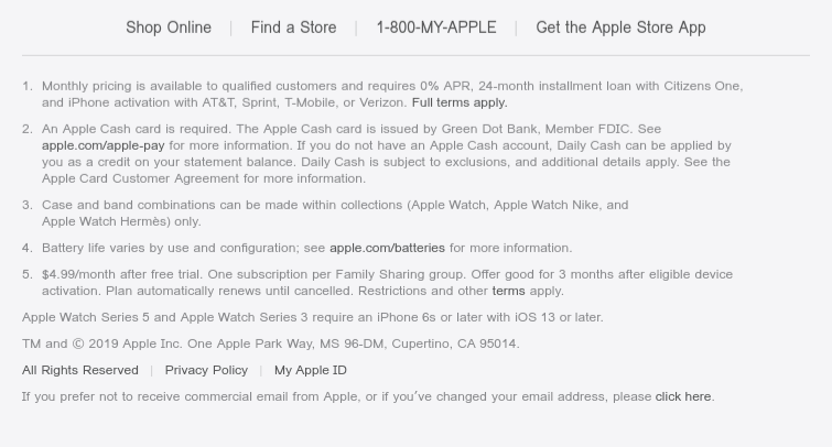
Adding a menu to the bottom of your email is important—particularly if your email is long. This keeps readers from having to scroll back up to get to the links they need to make a purchase. Apple also includes additional information in their footer about their products and what users are going to need to get the most from those products. This keeps the email copy itself from being bogged down with the legal stuff that people want to know but that doesn’t typically push them towards making a purchase.
2. AWeber
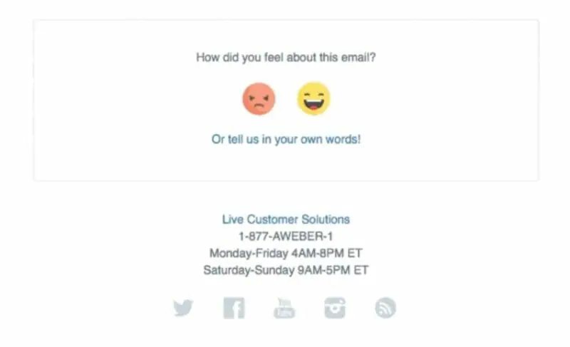
We love this email footer example from AWeber. We all want to know if our email marketing hits the target, right? What better way to find out than by asking? There are different ways you can ask your subscribers to weigh in on your emails but AWeber makes it really simple with their cute little “how do you feel” characters. You can work within your own brand’s personality and ask for feedback about any number of things using your email footer—it doesn’t need to be limited to how that specific email landed.
3. DC Shoes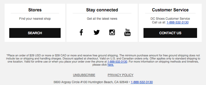
This email footer from DC Shoes is very well-organized. We love the different columns used to draw attention to store locations, social media, and customer service. This organization makes it really easy for subscribers to scan to find the information they want. Then, under that DC Shoes includes additional information about how readers can qualify for free shipping and offers them the option of calling to complete their order as well as another link to even more information about shipping and timelines.
4. Elle Johnson Co.
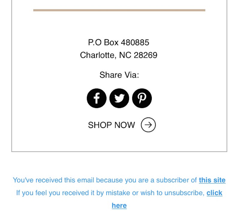
Elle Johnson Co keeps their email footer super simple, opting to focus on getting readers to share their email marketing via social media. This is a great way to generate buzz about your brand and use your current subscribers or customers to reach new ones. Then, they slip in a call to action directing readers to shop.
5. Forever 21
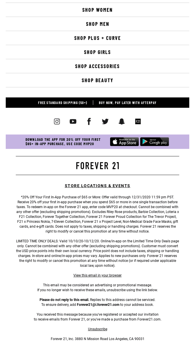
There’s a lot going on in this email footer example from Forever 21, but we think it works. To start, they’ve encouraged shopping through helpful links that work well for mobile users since they’re spaced apart nicely. Then, they make a point of including their shipping offer and payment options right underneath, where shoppers are sure to see it. Under that, you have well-spaced social media icons that make it easy for subscribers to follow the brand before providing subscribers the option to download the Forever 21 app and get a discount on an in-app purchase. Below all of that clicky goodness, Forever 21 includes a link to their stores and events before providing the legal fine print for the offers they included in their email copy. Overall, it’s one of the busier email footer examples on our list but it still works.
6. Grammarly
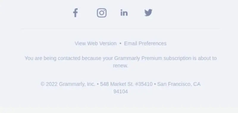
Grammarly takes us back to simplicity with their email footer. They’ve included a way for subscribers to download the app in their email body, just above the footer. The email footer, then, is focused on driving subscribers to follow Grammarly on social media using well-spaced social media icons and a lovely color scheme. Readers can then view the email via browser, make changes to their email marketing preferences, or unsubscribe before getting into the legal fine print.
7. Headspace

While Headspace has some of the more colorful and engaging emails we’ve seen, they take a reassuring and professional route in their email footers. Here they provide a way for subscribers to easily reach out to them or find answers to questions using the Headspace FAQ. They make it a point to let subscribers know that they’ll be able to talk to a real person during operating hours (a huge plus to Headspace users who expect to deal with real people). Beyond that, Headspace offers subscribers a way to connect with them on social media as well as links to the Headspace site, how it all works, another link to the FAQs, and Terms and Conditions.
8. Local Eclectic
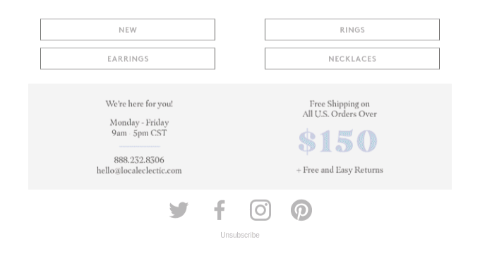
Local Eclectic has a visually appealing, muted email footer that makes us feel calm and soothed. They include a few buttons that subscribers can use to shop with them along with customer support information. What we really love, though, is the way they announce their free shipping threshold using a different color for the amount. The assurance of “free and easy returns” is also nice to see.
9. Monica Vinader
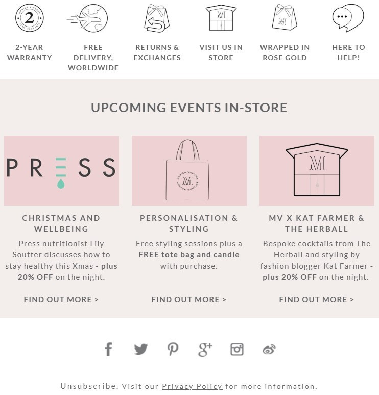
Monica Vinader is another of our email footer examples that includes a bit more information and design than you normally see here. We love the icons at the top of the footer. They share more information about the brand, its values, and how to shop before you get into a callout for the store’s upcoming events (organized beautifully).
10. Patagonia
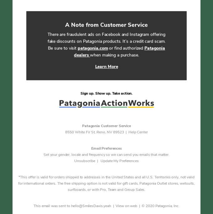
Patagonia has built up quite a reputation as a well-loved outdoor brand, and it’s no wonder. They use valuable space to alert customers to a credit card scam using fake Patagonia ads and provide shoppers links to the legitimate shopping site and dealers. After their announcement, they call subscriber attention to Patagonia’s action network so subscribers can get involved in environmental actions that Patagonia is taking. This email footer isn’t about selling so much as it is about informing and getting subscribers involved.
11. United By Blue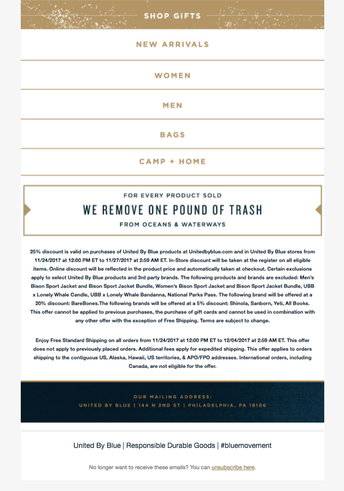
This is one of our favorite email footer examples. The colors are gorgeous, the brand includes shopping links in an easily clickable format, and even a callout to the good things United By Blue is doing. It’s sleek, informative, and just nice to look at.
Conclusion
Your brand’s email footer is the last thing your subscribers see before exiting your email. We hear a lot about the importance of first impressions, but let us tell you that those final feelings you leave with your subscribers matter too. The email footer examples we’ve included here are meant to inspire you to create your own email footers that meet the needs of both your brand and your audience. A little extra attention to your email footer’s design and content can make a huge difference.
Frequently Asked Questions
What should I include in an email footer?
Your email footer is located at the end of your email, after the body content of your email. It can include your company’s address and your name, as well as an unsubscribe link. However, it may also include contact information, social links, or legal disclaimers.
How do you write an email footer?
These are email footer best practices:
- Basic information, including your name
- Include a clear structure
- Make links easy to see
- Include useful and relevant links
- Add a menu
- Add your logo
- Include relevant achievements and awards
What is an email footer called?
Email footers are also called email signatures. It’s the section at the bottom of your email.
What do you write in a footer?
Your website footer is a sliver of content at the bottom of your webpage. It normally includes a copyright notice, a link to a privacy policy, a sitemap, logo, contact information, social media icons, and email sign-up form. The footer includes information with the website’s usability.