If you sell products online, you know how important it is to have a website that represents your brand well. Your website is your virtual storefront, and the first impression you get to make on potential customers. A huge part of making a great first impression is your eCommerce website design.
In this article, you'll find 10 of the best eCommerce sites for 2025 that you can use to inspire your next eCommerce store design. We'll also share the elements that go into a well-designed, high-converting eCommerce site so you have a better understanding of what you can do to improve your existing site or create one that hits the mark.
What Makes a Great eCommerce Site?
According to Pixolabo, the average time spent on a website across industries is 42 seconds. That means you have less than one minute to capture the attention of your site's visitors and get them engaged in what you have to offer. Other studies claim that you only have 50 milliseconds (.05 seconds) to draw visitors in.
Ouch. That's rough.
That's why it's so important to build an eCommerce site that captures interest and attention. Fortunately, there are a few things you can do to engage visitors right away. Let's take a look at the five elements of a great eCommerce site.
Responsive Design
There are over 6 billion smartphone devices in current use. These account for over half of the global traffic (58%). If your eCommerce site isn't optimized for mobile, you could be missing out on tons of sales. A responsive eCommerce site that looks great across devices is important to reducing friction for consumers seeking to buy from your shop.
Most eCommerce platforms include themes that are mobile-optimized so creating a responsive eCommerce site can be as easy as choosing the right theme. Before committing to a specific theme, we recommend testing the flow—browsing, adding to the cart, and the checkout process—to identify any gaps or problems in the process. Your goal is to make shopping your site as easy as possible for users, no matter what device they're using to access your site.
Visually-Appealing Design
While it's unlikely you'll create an eCommerce website design that appeals to every visitor who lands on your site, there are still several things you can do to make your site more visually appealing. This includes things like fonts, images, your layout, and more. Remember, your eCommerce site is your first impression. Here are a few things to consider when designing your site:
-
Product Images
Visitors to your eCommerce business rely on your product images to help them make decisions about whether or not to purchase. That's why it's so important to use product images that are high-quality and attractive.
Most marketing experts recommend using a mix of product images with a white background along with images of your products in use. Using a white background for your product images puts the focus squarely on your product and makes it easier for shoppers to see the details of your product.
Product-in-use images are important because you want shoppers to be able to see themselves using your product. This is a lot easier when they have a model to look to.
-
Colors and Fonts
Your site's colors and fonts are also an important design consideration. We've all been to a website that looks like it's a holdover from the early 1990s. Unless that's your gimmick, don't do it. Stick to a sleek and simple eCommerce website design with just two colors.
If you want to get really wild, add an accent color in, too. You'll also want to choose two fonts—one for headings and one for body copy—that work well together. If you want to keep things even more simple, you can stick with a single font.
-
Accessibility
Accessibility is another important aspect of a well-designed and appealing website. Here are 10 excellent tips to increase accessibility from QA and UAT testing company StarDust:
- Use a content management system (CMS) that supports accessibility
- Organize your content with headers
- Add alt-text tags to your images
- Use descriptive titles for links
- Use high-contrast colors
- Design forms for accessibility by using property label text fields and descriptive titles
- Use tables for tabular data
- Ensure site navigation via the keyboard
- Provide closed captions and text alternatives for dynamic content like embedded videos and GIFs
- Validate your site's accessibility through accessibility testing
Easy-to-Use Navigation
Your site's navigation includes the main navigation menu, on-site search, filters, product category pages, and what you include in your footer. The purpose of navigation is to help shoppers find what they want quickly and easily, so your navigation flow should be as narrow as possible, keeping the number of paths a user has to take to a minimum.
Bonus
Well-designed navigation will not only help shoppers find what they want, but it will also help with SEO because search engines are better able to crawl your site.
Great User Experience
User experience (UX) includes everything we've already mentioned, but it goes a bit deeper than that. User experience agencies and their experts rely on design thinking which is an iterative process used to understand the actions visitors take on an app or website.
Here are six digital design thinking best practices that UI/UX designers use to create the best eCommerce sites:
- Make an emotional appeal
- Create a smooth user journey that keeps visitors engaged
- Use gamification to reward visitors and increase engagement
- Give users navigation cues to help them navigate your site
- Offer feedback to let visitors know what's happening (like a confirmation page or email after they've taken a certain action)
- Include thoughtful automation to reduce friction
Trust Signals
How do you know if you can trust the site you're browsing? If you're buying online, you're likely using a credit card or something like PayPal that's connected directly to your bank account. And while you can certainly dispute fraudulent charges, wouldn't it be better if you could avoid being in that position altogether?
Most shoppers look for trust signals to let them know if they can trust your site with their valuable personal information. To put their minds at ease, there are three simple things you can do:
- Include contact information like mailing address, email address, and phone number
- Offer up a return policy
- Show off your security technology badges and compliance badges
- Share customer reviews, testimonials, and other social proof
10 Best eCommerce Sites of 2025
Now that we've covered the important elements for creating a successful site, it's time to get into our picks of the best eCommerce sites in 2025 to give you some inspiration.
These sites were created in eCommerce website builders like Shopify, BigCommerce, Webflow, and others, so there's no reason that you can't create an eCommerce site of your own that's just as well-designed as these examples.
1. KETNIPZ
KETNIPZ started out as an Instagram comic created by Harry Hambley and has since become an empire. The comic's main character, Bean, pops up in murals, tattoos, and all across social media. The site is quirky and fun, just like the comic itself, and uses bright colors and fun fonts to keep visitors engaged. This is a brand that clearly knows how to reach its target audience.
What Makes This eCommerce Website Stand Out?
KETNIPZ’s website effortlessly blends vibrant illustrations with quirky fonts, creating an engaging, playful experience that mirrors the comic’s unique charm. Its consistent branding keeps the audience feeling connected and entertained.
2. Larq.
LARQ is a wonderful example of how product images can really sell a product. Add to that the brand's excellent copywriting and stunning design, and you have the makings of one of the best eCommerce sites.
LARQ even includes a plastic waste calculator so you can estimate how many plastic water bottles you've kept from landfills thanks to using your LARQ water bottle. According to BigCommerce, LARQ added multi-regional capabilities to the site and increased conversions by 80% within three months.
What Makes This eCommerce Website Stand Out?
The clean, minimalist design paired with high-quality product visuals ensures that the functionality of LARQ’s products remains front and center. The integration of interactive tools like the plastic waste calculator also enhances user engagement and adds a purpose-driven shopping experience.
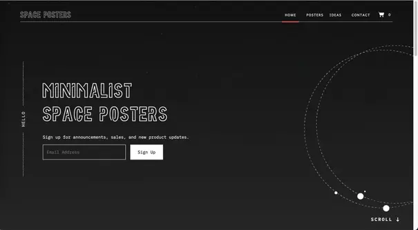
3. Space Posters
Space Posters sells minimalist posters featuring, well, space. To perfectly complement the store's products, the website is delightfully minimalist. The simple black and white website includes an animation that looks like planets in orbit and uses fun fonts and that's really it.
Space Posters knows that the people interested in their minimalist posters are also not likely to be swayed by bright, bold colors and a website that has tons of design elements.
What Makes This eCommerce Website Stand Out?
With a minimalist aesthetic that mirrors the products themselves, the site is a masterclass in simplicity, focusing attention solely on the posters. The clever use of animations and clean typography reinforces the cosmic theme without overwhelming the visitor.
4. hebe
Hebe is a boutique clothing store with a brick-and-mortar location in New Zealand at Masterton's boutique Kuripuni Village. The shop proudly promotes New Zealand-designed ethical fashion. As you would expect from a boutique clothing store, Hebe uses beautiful product images to sell its product.
The site itself is stunning and simple, with easy-to-use navigation, a powerful hero image, and fonts that are easy to read while still standing out.
What Makes This eCommerce Website Stand Out?
Hebe’s website stands out with its sophisticated simplicity and clean layout, which prioritizes user-friendly navigation. The crisp product images and cohesive design evoke the boutique feel, making the online experience as personal as an in-store visit.
5. Pura Vida Bracelets
The first thing you notice when you land on the Pura Vida Bracelets home page is the vibrant colors. The next thing? Stunning product images. As you scroll down the page, you see reviews from happy customers, more gorgeous product images, and calls to action encouraging you to shop.
We really love the notification bar at the top of the page that lets visitors know they can get free shipping or $10 for referring a friend. Plus, if visitors miss the notification bar, Pura Vida includes an aqua button on the left side of the page broadcasting the enticing message "get free bracelets."
What Makes This eCommerce Website Stand Out?
The vibrant and colorful design of Pura Vida immediately captures attention and invites users to a cheerful, beachy vibe. With its strategic use of social proof, free shipping promotions, and loyalty rewards, the site is designed to convert visitors into customers seamlessly.
6. Burrow
Burrow is a modular furniture retailer that uses a minimalist design (are you sensing a theme?) on its home page, opting to instead have the product images speak largely for themselves. As you scroll down the page, you'll come upon a video showing two average consumers unboxing their furniture. This makes the brand seem approachable and easy to use.
What Makes This eCommerce Website Stand Out?
Burrow’s clean and clutter-free layout highlights the versatility of its modular furniture while showcasing user-generated content, like unboxing videos, that enhances trust and relatability. The simple, direct design allows the products to shine without distractions.
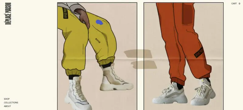
7. Désplacé Maison
The Déspacé Maison is an urban trekking store that sells shoes and accessories. The website is quirky and fun, setting it apart from other eCommerce sites that are designed with a nod to Amazon. The product images really pop thanks to mixed media using photos and illustrations.
The entire site comes together to show off the brand's personality and provides visitors a visually-appealing way to shop.
What Makes This eCommerce Website Stand Out?
Désplacé Maison cleverly integrates artistic elements with product images, creating a bold, visually engaging shopping experience. Its quirky and creative layout makes navigating through urban trekking accessories a fun and immersive journey.
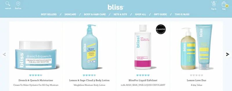
8. Bliss
Bliss is a clean, cruelty-free, spa-powered skincare brand with a website that makes you feel like you're living inside a unicorn. The colors are simultaneously bright and cheerful while still leaning towards soft pastel hues. The overall effect is a cheerful, happy one. The products are shown against a white background so you can get a clear view of them.
One of our favorite things about the website, though, is two little words in the upper righthand corner of the screen: "enable accessibility." This changes the colors of the site slightly to improve visual accessibility.
What Makes This eCommerce Website Stand Out?
Bliss’s site combines fun pastel tones with crisp white backgrounds to create a fresh, spa-like digital experience. The seamless accessibility features, like color adjustments, also make the site inclusive while maintaining its signature cheerful vibe.
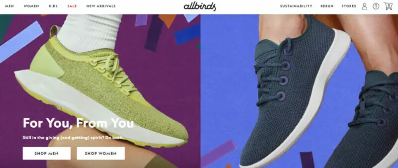
9. Allbirds
Allbirds is a sustainable, eco-conscious shoe and clothing store. As soon as you land on the home page, you know what Allbirds is about thanks to the headline "running shoes made from trees." Plus, it's intriguing! There are also beautiful product and lifestyle images that show the products in the best possible light.
As you scroll down the page, you're greeted by additional product and lifestyle images as well as calls to action encouraging you to shop. The navigation on the site is exceedingly simple, with two product categories on the left side of the menu and links to store locations and information about materials on the right side.
What Makes This eCommerce Website Stand Out?
Allbirds masterfully uses eco-conscious messaging and lifestyle imagery to tell the brand's sustainable story. The minimal navigation makes it easy for shoppers to explore while reinforcing the company's commitment to simplicity and sustainability.
10. Revelry
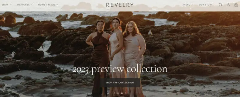
Revelry is a dress shop that focuses on bridesmaids. With the scrolling hero images at the top of the page, visitors are encouraged to shop or order swatches. The menu has several options but it's made less overwhelming by splitting the options up on both the left and right sides of the page.
As is common on the best eCommerce sites we've seen, the product images are simply stunning, showing off the products in an engaging and enticing way. One of our favorite elements of this eCommerce site is the video showing off the home try-on feature.
What Makes This eCommerce Website Stand Out?
Revelry’s scrolling hero images and video feature bring the dresses to life, especially with the home try-on option that’s perfect for bridesmaids. The site's layout strikes the perfect balance between options and simplicity, guiding users through the shopping experience effortlessly.
Wrapping Up
There are so many beautifully designed websites on the internet these days, so your website has to be something truly special to stand out. Fortunately, with these eCommerce website examples, you have an excellent frame of reference to get you started. We recommend building your eCommerce website design based on the tips and sites we've included here, but don't let that be the end of it. You'll get the best results when you test and tweak your eCommerce site. This might mean updating headlines and subheaders, changing images, updating copy, or even something as seemingly innocuous as changing the color of your buttons to see how visitors to your site respond.
The best eCommerce sites are a combination of design and function. Adapt the examples we've shared here to your brand's personality and enjoy increased sales, higher traffic, and better engagement. And don’t forget to use an eCommerce website builder to make the process a lot easier.
Frequently Asked Questions
Which is the best eCommerce website?
The top 5 eCommer websites include:
- Amazon
- Alibaba
- eBay
- Walmart
- Best Buy
What is eCommerce website examples?
Amazon is a traditional example of an eCommerce website. Amazon is one of the largest eCommerce stores. It’s a good example of a website that uses intuitive design for customers to shop.Their search engine uses filters to help customers navigate the website.
What are the 8 types of e-commerce?
The 8 key types of eCommerce include:
- Business-to-business (B2B)
- Business-to-consumer (B2C)
- Consumer-to-consumer (C2C)
- Consumer-to-business (C2B)
- Single brand website
- Marketplaces
- Affiliate websites
- Online retailers, like Amazon
What is an eCommerce website and how does it work?
eCommerce websites allow people to buy and sell physical goods, services, and digital products over the internet. eCommerce websites allow people to sell products without a brick-and-mortar location. Businesses can process orders, accept payments, manage shipping, and provide customer service as well.
What are the key elements of a great eCommerce website design?
The key elements include responsive design, visually appealing layouts, easy-to-use navigation, a focus on user experience, and the inclusion of trust signals like customer reviews and security badges.
Why is responsive design important for an eCommerce site?
Responsive design ensures that your site looks and functions well on all devices, especially mobile phones, which account for over half of global online traffic. This helps reduce friction and increase conversions.
How can product images improve eCommerce conversions?
High-quality product images, both on a white background and in-use shots, help potential customers visualize the product more clearly and make informed purchasing decisions.
What role do colors and fonts play in eCommerce website design?
Colors and fonts are crucial for creating a visually cohesive site. Using a limited color palette and matching fonts for headings and body copy can create a sleek and professional appearance.
How can eCommerce sites enhance user experience (UX)?
Enhancing UX involves creating a smooth journey for visitors, offering feedback like confirmation pages, and using thoughtful automation to reduce friction during the shopping process.


