
Instagram gives creators more flexibility with image dimensions than it once did, but the added choice also makes sizing more important. Feed photos can now use the taller 3:4 aspect ratio, Stories still require a full-screen 9:16 canvas, and the profile grid can display your creative differently from the original post.
Getting those dimensions right matters because static imagery still plays a meaningful role in social performance.
In our State of Social Media Marketing Report, image-based posts accounted for 25.3% of the content formats associated with the highest engagement, showing that well-designed static creative still earns attention alongside short-form video.
On Instagram, though, good creative can lose some of that impact when the dimensions are wrong. An image may be cropped differently on your profile, lose important text near the edges, or require additional resizing after upload.
For most portrait Feed images in 2026, 1080 × 1440 pixels at 3:4 is our preferred starting point. Instagram added native 3:4 photo support back in 2025 for both single-image posts and carousels, making it possible to publish images in the same taller proportion used by many smartphone cameras.
This guide covers the recommended dimensions for Feed posts, Stories, carousels, Reel covers, profile pictures, and the profile grid, along with the crop and export checks that help your images look the way you intended.
📥 Download the Instagram Image Sizes & Crop Cheat Sheet
Instagram’s image specs are relatively easy to look up. The harder part is remembering how each format behaves once it appears in the Feed, profile grid, Stories, carousels, or as a Reel cover.
We created the Influencer Marketing Hub Instagram Image Sizes & Crop Cheat Sheet as a practical reference you can keep alongside your content workflow. It brings the key 2026 dimensions into one place, along with visual profile-grid crop guides, Story safe-zone guidance, Reel-cover layouts, carousel sizing, export recommendations, and a final pre-publish checklist.
Use it when you’re designing new creative, resizing an existing asset, or checking that important text, products, logos, and subjects will remain visible after Instagram applies its different previews and crops.
- Instagram Image Sizes at a Glance
- Instagram Feed Post Sizes
- Instagram Profile Grid Size and Crop Guide
- Instagram Story Image Size
- Instagram Carousel Image Size
- Instagram Reel Cover Size
- Instagram Profile Picture Size
- Why Is Instagram Cropping My Image?
- How to Resize an Image for Instagram
- Best Instagram Image Format and Export Settings
- Keep Your Instagram Images Sharp in 2026
- Frequently Asked Questions
Instagram Image Sizes at a Glance
Instagram uses different image dimensions depending on where your creative appears. For Feed posts, 1080 pixels wide remains the most practical working width, while the height changes with the aspect ratio you choose.
Here are the Instagram image sizes we recommend using in 2026:
Instagram Image Format | Recommended Size | Aspect Ratio |
Feed Portrait | 1080 × 1440 px | 3:4 |
Classic Portrait | 1080 × 1350 px | 4:5 |
Square Feed Post | 1080 × 1080 px | 1:1 |
Landscape Feed Post | 1080 × 566 px | 1.91:1 |
Instagram Story Image | 1080 × 1920 px | 9:16 |
Portrait Carousel | 1080 × 1440 px | 3:4 |
Classic Portrait Carousel | 1080 × 1350 px | 4:5 |
Square Carousel | 1080 × 1080 px | 1:1 |
Lnadscape Carousel | 1080 × 566 px | 1.91:1 |
Reel Cover Working Master | 1080 × 1920 px | 9:16 |
Profile-grid Design Reference | 1080 × 1440 px | 3:4 |
Profile Picture | 320 × 320 px | 1:1 |
Currently, Instagram supports vertical Feed images at both 4:5 and 3:4, with 1080 × 1350 and 1080 × 1440 as the corresponding working dimensions. The current profile grid also uses a taller 3:4 preview, which makes the newer 1080 × 1440 canvas especially useful when profile presentation matters.
If You Remember One Instagram Feed Image Size
Use:
- 1080 × 1440 px
- 3:4
We recommend this as the strongest all-around starting point for a new portrait Instagram Feed image in 2026.
Instagram introduced native 3:4 photo support in May 2025, allowing photos captured at that ratio to appear without being forced into the older square or 4:5 formats. The update applies to both individual photos and carousel posts.
The ratio also aligns naturally with Instagram's current taller profile-grid previews, reducing the amount of composition planning needed between the Feed post and profile view.
That does not make 4:5 obsolete. A 1080 × 1350 portrait remains fully supported and is still a useful choice for brands with existing 4:5 templates or compositions that work better at that height.
Think of 3:4 as the new default option, rather than a replacement for every other Instagram image ratio.
What Is the Best Instagram Image Size in 2026?
The best Instagram image size depends on whether the image is destined for the Feed, Stories, a carousel, a Reel cover, or your profile.
For a standard portrait Feed image, our recommendation is:
- 1080 × 1440 pixels at 3:4
It gives you more vertical space than a square image, is natively supported by Instagram, and corresponds with the taller shape now used in profile-grid previews.
For other placements, use:
- Feed portrait: 1080 × 1440 / 3:4
- Classic portrait: 1080 × 1350 / 4:5
- Square: 1080 × 1080 / 1:1
- Landscape: 1080 × 566 / 1.91:1
- Story: 1080 × 1920 / 9:16
- Reel cover working master: 1080 × 1920 / 9:16
The choice matters because each ratio creates a different composition.
A 3:4 or 4:5 image gives a product, person, or piece of editorial creative more vertical space in the Feed. A square works well when the design is intentionally centered. Landscape is useful when the width of the scene carries information that would be lost in a portrait crop.
Stories and Reel covers require a different approach altogether because their working canvas is much taller.
The practical rule is:
Choose the Instagram placement first, then design for its aspect ratio. Avoid designing one image and relying on Instagram to crop it for every placement.
Instagram Image Size vs. Aspect Ratio
These terms are closely related but describe different things.
Image size refers to the dimensions of the file in pixels. For example:
- 1080 × 1440 px
Aspect ratio describes the shape of that image:
- 3:4
Two files can have the same aspect ratio while using different pixel dimensions. A 540 × 720 image and a 1080 × 1440 image are both 3:4, but the second contains more pixels.
For Instagram production, the ratio determines how the content is framed, while the pixel dimensions determine how much image information you provide within that frame.
A useful working system is therefore:
Choose the ratio first then build at the recommended dimensions. Check the crop next, and then export for that placement.
For Feed photos, that means starting with one of Instagram's supported shapes rather than asking the platform to correct an incompatible image after upload.
Next, we'll break down each Feed format individually, starting with the newer 3:4 Instagram post size, followed by 4:5 portrait, square, and landscape images.
Instagram Feed Post Sizes
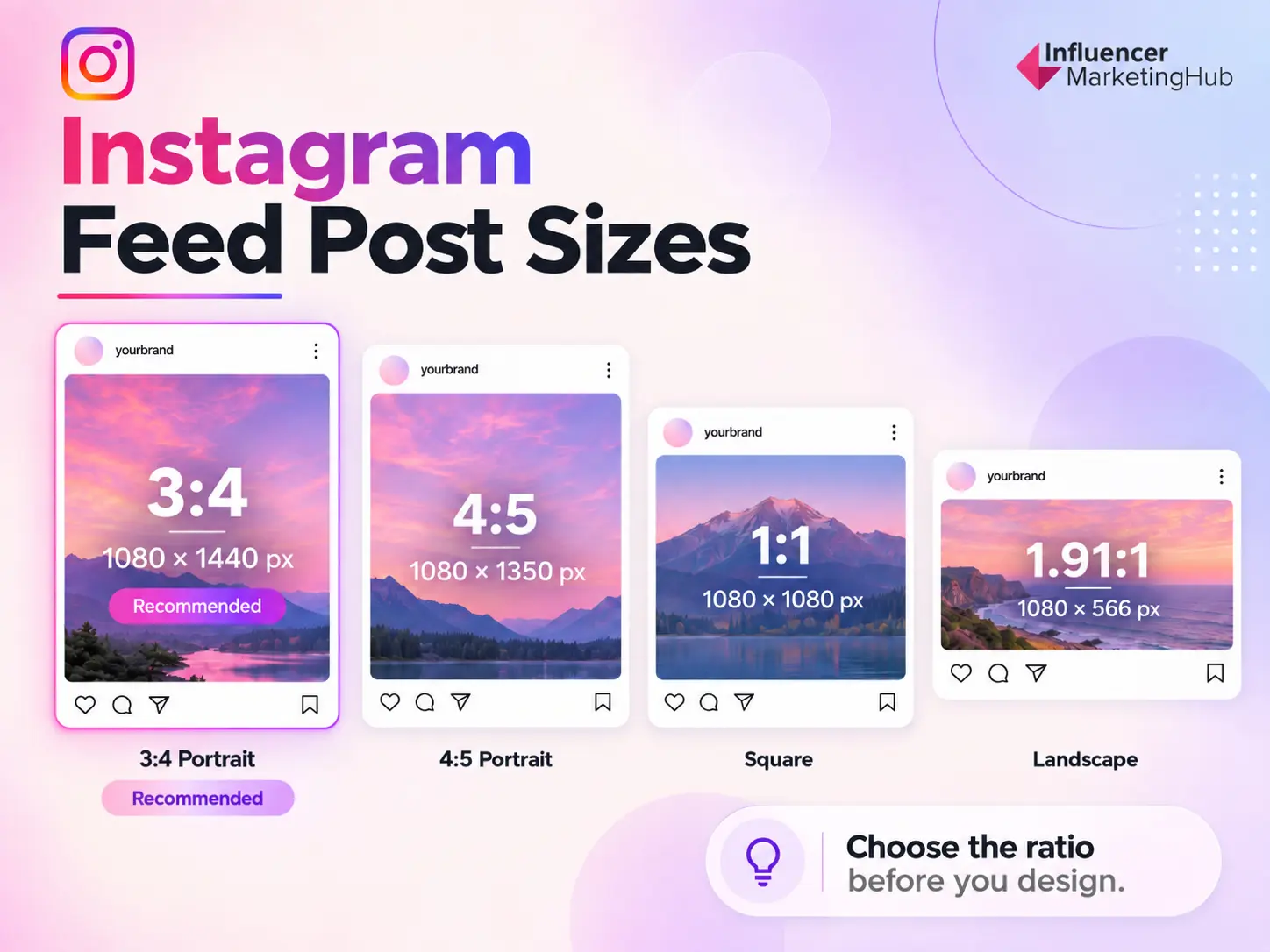
Instagram Feed images no longer revolve around a single square format. You can publish square, landscape, and two portrait ratios, including the newer 3:4 format that Instagram added natively in 2025.
For most new portrait creative, we recommend starting with 1080 × 1440 pixels at 3:4. The other formats remain useful when the composition calls for a different shape.
| Feed format | Recommended size | Aspect ratio | Best suited to |
| 3:4 portrait | 1080 × 1440 px | 3:4 | Current default for portrait creative |
| 4:5 portrait | 1080 × 1350 px | 4:5 | Existing portrait templates and campaigns |
| Square | 1080 × 1080 px | 1:1 | Centered or symmetrical compositions |
| Landscape | 1080 × 566 px | 1.91:1 | Wide scenes and horizontal creative |
The right choice depends on the image itself. A portrait of a person or product can use the extra vertical space available in 3:4, while forcing a wide group photo into the same frame may remove information the image needs.
3:4 Instagram Post Size
- Recommended size: 1080 × 1440 pixels
- Aspect ratio: 3:4
The biggest Instagram image-size change to account for in 2026 is native 3:4 photo support.
Instagram introduced the format in May 2025, allowing 3:4 photos to appear in the Feed as they were captured rather than being forced into one of the platform's older ratios. The change applies to both single-photo posts and carousels.
For marketers, that makes 1080 × 1440 a particularly useful working canvas. It gives you more vertical room than 4:5 while also matching the shape of Instagram's current 3:4 profile grid. Current Instagram sizing guidance now includes 1080 × 1440 alongside the older 1080 × 1350 portrait format.
Use 3:4 when you are:
- Creating new portrait-first Feed assets
- Publishing smartphone photography already captured at 3:4
- Designing editorial graphics that benefit from additional height
- Planning content with the profile grid in mind
The added space is especially useful for layouts that need to accommodate a subject and supporting copy without compressing everything toward the center.
💡 Influencer Marketing Hub Recommendation
If you are creating a new portrait Feed template from scratch in 2026, make 1080 × 1440 / 3:4 your first option.
4:5 Instagram Post Size
- Recommended size: 1080 × 1350 pixels
- Aspect ratio: 4:5
The arrival of 3:4 does not make 4:5 an outdated Instagram format.
A 1080 × 1350 image remains fully supported and is particularly useful for brands that already have established social templates, campaign assets, or design systems built around 4:5. Current sizing guidance continues to list both portrait ratios.
Visually, 4:5 is slightly wider relative to its height than 3:4. That can suit product layouts, quote cards, promotional graphics, and compositions that need a little more horizontal breathing room.
The main difference to consider is the profile grid. Instagram's current grid uses a 3:4 preview, so a 4:5 post can be framed slightly differently when someone visits your profile.
We will show exactly what that means in the crop guide below.
Square Instagram Post Size
- Recommended size: 1080 × 1080 pixels
- Aspect ratio: 1:1
Square posts remain supported on Instagram, and there is no need to abandon them when the creative is genuinely designed around a square composition.
A 1:1 canvas still works well for:
- Centered product photography
- Logos and brand announcements
- Symmetrical graphics
- Quote cards
- Creative that also needs to work across other square placements
What has changed is the context around the image.
Instagram's profile grid no longer displays every post inside the old square thumbnail system. Since the grid now uses taller previews, a square post can be shown with a tighter horizontal crop when viewed on your profile.
That makes central composition more important than it was when both the Feed asset and grid thumbnail were square.
Landscape Instagram Post Size
- Recommended size: 1080 × 566 pixels
- Aspect ratio: 1.91:1
Landscape is the widest standard Feed format and makes sense when the width of the image is part of the story.
Examples include:
- Group photography
- Landscapes
- Interiors
- Event scenes
- Wide product arrangements
- Before-and-after compositions designed horizontally
The tradeoff is screen space. A landscape image occupies less vertical room in a mobile Feed than either 3:4 or 4:5, and its composition differs significantly from Instagram's tall profile-grid previews.
Avoid converting an image to portrait purely to use more Feed space if doing so removes the subject or context that makes the photograph work.
For landscape creative, keeping the most important element relatively close to the center also makes the image easier to adapt when Instagram displays it elsewhere.
Instagram Profile Grid Size and Crop Guide
An Instagram image has two related but separate presentations:
- The image you publish to the Feed
- The thumbnail people see when they visit your profile.
Instagram moved its profile grid away from square thumbnails in January 2025, replacing them with taller, vertically aligned previews. The change was intended to better reflect the vertical photos and videos people increasingly publish on the platform.
Current sizing guidance treats the grid as a 3:4 format, making 1080 × 1440 pixels a useful design reference when checking how important elements will appear on your profile.
That does not mean every Feed image now needs to be uploaded at 3:4.
It means your Feed canvas and your profile-grid presentation can have different shapes.
3:4 Posts in the Instagram Profile Grid
A 1080 × 1440 / 3:4 Feed image naturally matches the current grid shape.
That makes 3:4 the easiest format when you want the Feed composition and profile presentation to remain closely aligned.
A headline positioned comfortably within the canvas, for example, requires less adjustment between the two views than it would on a square or wider image.
This is one of the reasons we recommend 3:4 as the default starting point for new portrait creative.
How a 4:5 Instagram Post Is Cropped in the Grid
A 4:5 post measures:
- 1080 × 1350 pixels
If we calculate a centered 3:4 preview using that full 1350-pixel height, the visible width is approximately:
- 1013 pixels
That leaves roughly 34 pixels per side outside the central 3:4 area.
These measurements are an IMH calculated production guide, not crop margins published by Instagram.
The practical impact is relatively small, but it matters when text, logos, faces, or product details sit very close to the left or right edge.
A 4:5 Feed design therefore does not need to be rebuilt simply because the grid is 3:4. It needs enough horizontal breathing room for the critical content.
How a Square Instagram Post Is Cropped in the Grid
The difference is more noticeable with a square post.
A standard square image is:
- 1080 × 1080 pixels
A centered 3:4 region using the full 1080-pixel height is:
- 810 pixels wide
That leaves approximately 135 pixels per side outside the central 3:4 region.
Again, these are IMH calculated crop guides, rather than official Instagram safe-zone measurements.
For square creative, keep critical information comfortably toward the middle instead of placing headlines, logos, or products directly against the left and right edges.
What About Landscape Images?
Landscape images present a bigger composition challenge because their full Feed canvas is significantly wider than the profile-grid preview.
Trying to reduce that difference to one universal pixel margin is less useful than treating the grid as a separate presentation.
For landscape posts:
- Keep the primary subject close to the center.
- Avoid placing essential copy at the far edges.
- Check the actual profile thumbnail before publishing.
Instagram also introduced thumbnail editing for profile-grid posts in 2026, giving users more control over how existing images and clips are framed on their profiles. That provides another opportunity to correct an awkward grid presentation after choosing the Feed composition.
The feature is useful, but we would still design with the grid in mind from the beginning rather than relying on thumbnail adjustment to rescue a difficult layout.
What Should Stay Inside the Instagram Grid Safe Area?
Anything that changes the meaning of the image should remain comfortably inside the central composition.
That usually includes:
- Faces and primary subjects
- Products
- Headlines
- Brand logos
- Prices and promotional offers
- CTA copy
Decorative backgrounds, textures, scenery, and other non-essential elements can extend farther toward the edges.
A useful design test is:
If this element disappeared from the profile thumbnail, would someone still understand the post?
If the answer is no, move it inward.
Instagram Profile Grid Crop Reference
| Feed image | Original canvas | Central 3:4 reference | Approx. content outside central crop* |
| 3:4 portrait | 1080 × 1440 | 1080 × 1440 | None |
| 4:5 portrait | 1080 × 1350 | ~1013 × 1350 | ~34 px each side |
| Square | 1080 × 1080 | 810 × 1080 | 135 px each side |
| Landscape | 1080 × 566 | Placement-dependent | Preview individually |
*The 4:5 and square figures are IMH calculations for a centered 3:4 design reference, not official Instagram crop specifications. Instagram's thumbnail controls can also let you adjust the visible framing.
💡 Influencer Marketing Hub Recommendation
Design the Feed image for its intended format, then perform a separate 3:4 profile-grid check before publishing. That gives you the benefit of square, 4:5, or landscape creative without sacrificing the way the post looks on your profile.
Instagram Story Image Size
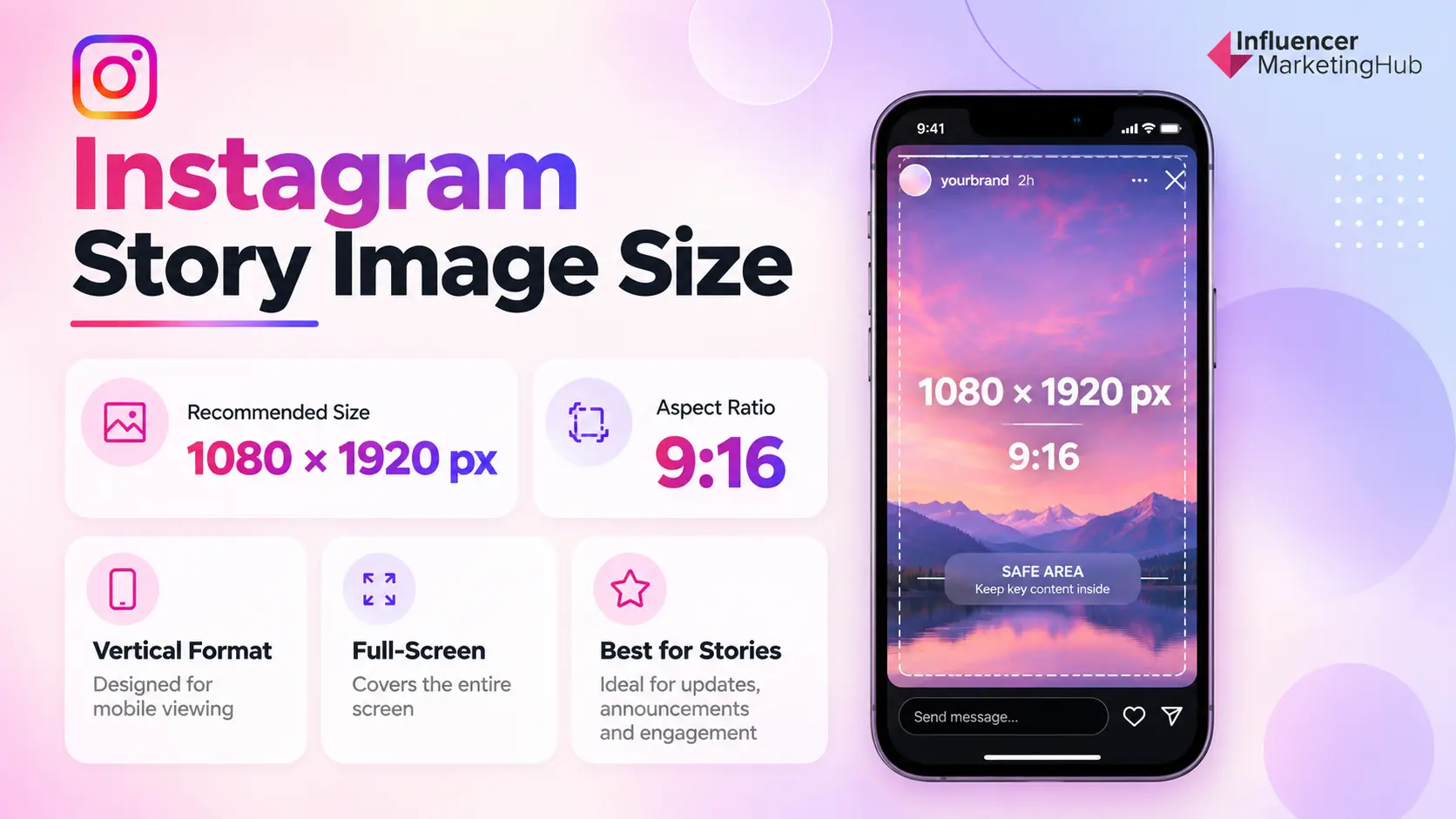
Instagram Stories use a much taller canvas than Feed posts, so images designed for the Feed usually need to be reformatted before they are reused here.
For Stories, use:
- 1080 × 1920 pixels
- 9:16
This fills the vertical Story viewer and gives you the most control over where subjects, text, branding, and interactive elements appear.
| Instagram Story specification | Recommended setting |
| Image size | 1080 × 1920 px |
| Aspect ratio | 9:16 |
| Orientation | Vertical |
| Best use | Full-screen Story creative |
A square or Feed portrait image can still be placed inside a Story, but it will not naturally fill the 9:16 canvas. Instagram may leave additional space around it, or you will need to enlarge and crop the original image.
For planned Story creative, it is better to start with the vertical canvas rather than adapting a finished Feed graphic afterward.
Instagram Story Safe Zones
Correct dimensions give you the full Story canvas. They do not guarantee that every part of that canvas will remain equally visible.
Instagram places interface elements around Story content, including account information and progress indicators toward the top and reply or interaction controls toward the bottom. Stickers, links, polls, and other elements can occupy additional space depending on the Story.
That makes the outer portions of the canvas less suitable for essential information.
Keep these elements comfortably inside the central area:
- Headlines and supporting copy
- Faces and primary subjects
- Products
- Logos
- Prices and offers
- Promo codes
- Important CTA text
Background photography, colors, patterns, and decorative elements can extend closer to the edges.
For production, roughly 250 pixels at the top and bottom can be treated as a practical caution area, rather than a hard Instagram specification. Interface layouts can vary, so the final Story preview should always be the deciding check.
💡 Influencer Marketing Hub Recommendation
Build Stories at 1080 × 1920 / 9:16, keep essential information toward the center, and treat the top and bottom of the frame as interface-heavy areas.
A good test is simple: if Instagram covered the element, would the Story still communicate what you need it to? If the answer is no, move it inward.
For more guidance on structuring the content itself, see our guide to Instagram Stories.
Instagram Carousel Image Size
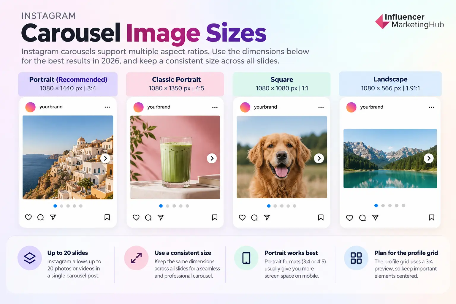
Instagram carousels give you more room to build a sequence, but the individual images still need a deliberate canvas.
For a new portrait-first carousel in 2026, our recommended starting point is:
- 1080 × 1440 pixels
- 3:4
Instagram added native 3:4 photo support in 2025 for both individual image posts and carousels, so images captured or designed at that ratio can now appear without being forced into the older 4:5 format.
You can also build carousels using the other supported Feed dimensions:
| Carousel format | Recommended size | Aspect ratio |
| Portrait | 1080 × 1440 px | 3:4 |
| Classic portrait | 1080 × 1350 px | 4:5 |
| Square | 1080 × 1080 px | 1:1 |
| Landscape | 1080 × 566 px | 1.91:1 |
For most branded or educational carousels, portrait formats are the stronger starting point because they give typography, products, photography, and supporting information more vertical room on a mobile screen.
How Many Images Can an Instagram Carousel Have?
Instagram allows up to 20 photos or videos in a single carousel post, doubling the platform's previous 10-item limit.
That does not mean every carousel needs 20 slides. The extra capacity is useful when the story genuinely requires it, such as:
- Step-by-step guides
- Event or campaign recaps
- Product collections
- Before-and-after sequences
- Data or educational carousels
For a marketing carousel, the number of slides should still be determined by the story rather than the technical maximum.
One further consideration is your publishing workflow. Native Instagram functionality can move ahead of third-party scheduling platforms and API-based publishing, so check the tool you use if you are planning a carousel with more than 10 items.
Should Every Instagram Carousel Image Be the Same Size?
For a deliberately designed carousel, we recommend using one consistent working ratio across the entire sequence.
Instagram's support for different photo shapes gives you flexibility when uploading casual photography, but consistency makes a designed carousel much easier to control.
Using the same canvas across the sequence helps maintain:
- Typography: Headlines and supporting copy stay in predictable positions.
- Spacing: Margins and visual hierarchy remain consistent from one slide to the next.
- Swipe continuity: Visual elements can intentionally continue across cards.
- Templates: Future carousels become easier to create from the same system.
- Crop control: You know how every card should behave in the Feed and profile grid.
For example, if the first slide is designed at 1080 × 1440 / 3:4, create the remaining designed slides at the same dimensions unless the content gives you a specific reason to do otherwise.
💡 Influencer Marketing Hub Recommendation
Choose the carousel ratio before building Slide 1, then design the entire sequence around that canvas.
3:4 vs. 4:5 for Instagram Carousels
Both portrait formats work well. The choice comes down to how your creative system is built.
Use 3:4 / 1080 × 1440 when:
- You are creating a new carousel template
- You want to take advantage of the taller native photo format
- Profile-grid presentation matters
- Your source photography is already 3:4
Use 4:5 / 1080 × 1350 when:
- Your brand already has established 4:5 templates
- Existing campaign assets use 4:5
- The slightly wider composition suits the layout better
There is little value in rebuilding a well-designed 4:5 system simply because 3:4 is newer. The important change is that marketers now have both portrait options available, rather than being restricted to 4:5.
For more ideas on structuring the sequence itself, see our guide to using Instagram carousels.
Instagram Reel Cover Size
A Reel cover is an image asset rather than part of the video itself, so it deserves its own sizing workflow. The cover needs to work when the Reel is opened full-screen and when Instagram presents a tighter preview on your profile grid.
For production, we recommend starting with:
- 1080 × 1920 pixels
- 9:16
Instagram’s published Reel cover recommendation is 420 × 654 pixels, but a higher-resolution 1080 × 1920 working master gives designers more room to build the cover alongside the Reel itself and manage crops across different placements.
| Reel cover specification | Recommended setting |
| IMH working master | 1080 × 1920 px |
| Working aspect ratio | 9:16 |
| Instagram-published recommendation | 420 × 654 px |
| Profile-grid preview | 3:4 |
| Keep center-safe | Headline, face, product, logo |
The important distinction is that the full Reel cover and the profile-grid preview do not use the same shape.
A cover can look perfectly balanced when viewed with the Reel, yet lose part of a headline, face, logo, or product when Instagram presents it inside the taller profile grid.
How Reel Covers Appear on the Profile Grid
Instagram’s current grid uses a 3:4 preview, while our Reel-cover working canvas is 9:16.
That means the profile version shows a shorter vertical portion of the full cover.
The practical implication is simple. Avoid placing essential cover content near the extreme top or bottom of the 9:16 canvas.
Keep these elements comfortably within the central composition:
- Reel headline
- Face or primary subject
- Product
- Brand logo
- Series or episode marker
- Other information someone needs to identify the Reel
Decorative photography, backgrounds, textures, and color can extend across the full cover.
💡 Influencer Marketing Hub Recommendation
Design for 9:16. Compose for 3:4. Build the complete cover at 1080 × 1920, then check that every critical element still works inside the central 1080 × 1440 region.
This is especially important for brands using a repeatable Reel-cover system. A consistent central layout makes the profile grid easier to scan and reduces the chance of titles shifting unpredictably from one Reel to the next.
For the video dimensions themselves, see our full guide to Instagram video sizes.
Instagram Profile Picture Size
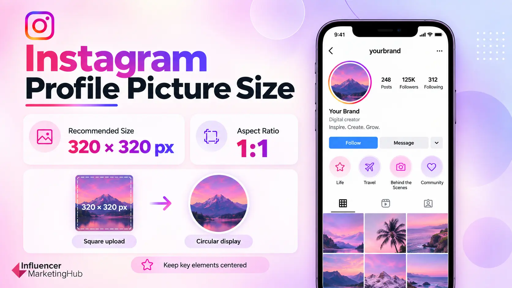
Instagram profile pictures are much simpler than Feed images, but the circular display means composition still matters.
Use:
- 320 × 320 pixels
- 1:1
The source image should be square, while Instagram displays it inside a circular frame.
That circular crop affects the outer corners of the file, so logos, faces, initials, or other identifying elements should sit comfortably toward the center.
| Profile picture specification | Recommendation |
| Working size | 320 × 320 px |
| Aspect ratio | 1:1 |
| Source shape | Square |
| Display shape | Circle |
For a personal or creator account, leave enough space around the face so the circular crop does not feel overly tight.
For a brand account, avoid designing a logo that touches all four sides of the square canvas. Give the mark enough breathing room to remain legible when it is reduced to a much smaller profile icon.
Simple rule: Design the file as a square, but judge the composition through a circle.
This matters particularly for logos containing small text. A wordmark that looks sharp at 320 × 320 can become difficult to recognize once it is reduced inside Instagram’s interface, so simpler marks generally work better.
Why Is Instagram Cropping My Image?
Instagram cropping usually happens because the image you uploaded and the placement displaying it use different aspect ratios.
That distinction is easy to miss because the same image can appear correctly in the Feed and still look different in your profile grid, Stories, or another Instagram surface.
The fastest way to diagnose the issue is to identify where the crop occurs.
| Problem | Likely cause | Best fix |
| Sides disappear on profile | Feed ratio differs from 3:4 grid preview | Keep critical content centered |
| Story does not fill the screen | Feed image reused in a 9:16 placement | Rebuild or reframe at 1080 × 1920 |
| Reel-cover text disappears | 9:16 cover is shown in a tighter grid crop | Compose important content for 3:4 |
| Landscape image feels heavily cropped | Wide composition shown in a vertical preview | Keep focal point toward the center |
| Carousel slides feel inconsistent | Sequence uses different design canvases | Build all designed slides at one intended ratio |
Your Image Uses a Different Ratio From the Placement
A 3:4 Feed post and a 9:16 Story are both portrait formats, but their shapes are very different.
Taking a finished 1080 × 1440 Feed graphic and stretching it to 1080 × 1920 will distort the image. Enlarging it until the Story canvas is filled can cut content from the sides.
Instead, create the new 9:16 canvas and reframe the existing creative inside it.
That might mean repositioning:
- The subject
- Headline
- Logo
- Product
- CTA
- Supporting graphics
The same principle applies when adapting square, landscape, or 4:5 assets.
Your Feed Image and Profile Grid Use Different Shapes
This is one of the most common sources of confusion in 2026.
An image can use a perfectly valid Instagram Feed ratio and still appear differently on your profile because the grid uses a 3:4 preview.
That is why we recommend performing a separate profile-grid check for:
- 4:5 posts
- Square posts
- Landscape posts
- Reel covers
The Feed composition should still be designed for the original format. The grid check simply helps you protect the elements that matter most.
You Reused a Feed Image in Stories
A Feed image at 3:4, 4:5, or 1:1 will not naturally fill a 9:16 Story canvas.
You can keep the complete image visible by placing it within a designed vertical Story layout, or crop and reframe it when the source image gives you enough room.
For branded creative, the first option can work especially well. The unused vertical space can hold:
- A headline
- Background color or photography
- Supporting copy
- Stickers
- A link
- CTA messaging
This usually looks more intentional than forcing the Feed image to fill the Story frame.
Your Reel Cover Works Full-Screen but Breaks on the Grid
A Reel cover built at 1080 × 1920 / 9:16 has more vertical space than the 3:4 profile preview.
Text placed at the extreme top or bottom therefore carries more crop risk.
The fix is to compose critical information inside the central grid-safe region while allowing decorative imagery to use the full cover.
Instagram Is Cropping an Unsupported Feed Ratio
For standard Feed photos, use one of the supported working formats covered earlier:
- 3:4
- 4:5
- 1:1
- 1.91:1
Uploading creative outside the supported Feed range gives Instagram less room to preserve the original framing.
Where possible, crop the image yourself before upload. You will have much more control over which part of the photograph or design is removed.
💡 Influencer Marketing Hub Recommendation
Treat cropping as a design decision rather than something Instagram should solve for you. Choose the destination, set the correct canvas, reframe the creative, and preview the final placement before publishing.
How to Resize an Image for Instagram
Resizing an Instagram image is less about changing the pixel count and more about protecting the composition. A square post, 3:4 Feed image, and 9:16 Story all frame the same creative differently.
The simplest workflow is:
- Choose the destination.
Start with the format you are publishing to: Feed, Story, carousel, Reel cover, or profile picture. - Set the correct canvas.
For example, use 1080 × 1440 / 3:4 for our recommended Feed portrait or 1080 × 1920 / 9:16 for Stories. - Reframe instead of stretching.
Move or crop the image so the subject fits the new canvas naturally. Stretching distorts people, products, logos, and other visual elements. - Check the final crop.
For Feed posts and Reel covers, preview how important elements will appear on the 3:4 profile grid. For Stories, check that text and products remain clear of interface-heavy areas. - Export for the final placement.
Create the Instagram-ready version from your highest-quality source rather than repeatedly resizing an already compressed image.
🌟 Need to Resize an Existing Instagram Image?
Use our Social Media Image Resizer to quickly adapt existing creative for Instagram and other social platforms while working with the correct target dimensions.
Best Instagram Image Format and Export Settings
Once the canvas is correct, the export should preserve as much of the original quality as possible without creating an unnecessarily complicated workflow.
| Setting | IMH recommendation |
| Feed width | 1080 px |
| Photos | High-quality JPG |
| Graphics and text-heavy designs | PNG where supported |
| Color space | sRGB |
| Source file | Highest-quality original available |
| Export workflow | Export once for the intended placement |
JPG vs. PNG for Instagram
JPG is the safest general choice for photography and images with lots of colors, gradients, or detail.
PNG can work better for designed graphics, illustrations, and assets containing sharp text or flat colors, provided the publishing method supports it.
There is no useful universal rule such as “always export at 80% or 90% quality.” Different editing tools calculate compression differently. Instead, use a high-quality export that retains detail without repeatedly recompressing the same image.
Why Does Instagram Reduce Image Quality?
Instagram processes images after upload, so some difference between your original file and the published version can occur.
Quality problems tend to become more noticeable when the source has already been weakened before Instagram receives it. Common causes include:
- Starting with a low-resolution image
- Enlarging a small image to fit a larger canvas
- Downloading and re-uploading previously compressed social images
- Using screenshots instead of original files
- Repeatedly exporting the same JPG
- Applying excessive compression during export
The safest workflow is straightforward:
Start with the best original → resize for the correct Instagram canvas → export once → preview before publishing.
Uploading a larger file cannot restore detail that was lost earlier in the process. Correct dimensions and a clean source usually matter more than chasing the biggest possible export.
📥 Stop Guessing How Instagram Will Crop Your Images
Knowing the correct dimensions is only part of the job. The same image can appear differently in the Feed, profile grid, Stories, or as a Reel cover, which means a technically correct file can still lose an important headline, product, logo, or subject after Instagram applies its different previews.
The IMH Instagram Image Sizes & Crop Cheat Sheet puts the 2026 dimensions, profile-grid crop guides, Story safe-zone guidance, Reel-cover layouts, carousel sizes, export recommendations, and final checks into one visual reference.
Keep it beside your design workflow when creating new assets, repurposing existing creative, or checking a post before it goes live.
Keep Your Instagram Images Sharp in 2026
Instagram image sizing is easier once you separate the file you upload from the way Instagram displays it across the app.
For most new portrait Feed images, 1080 × 1440 pixels at 3:4 is the strongest starting point. Stories use 1080 × 1920 / 9:16, while square, 4:5, and landscape posts remain useful when the creative calls for them.
The dimensions are only the first step. Profile-grid crops, Story interface areas, Reel-cover previews, and carousel consistency all affect how the final creative appears.
Start with the correct canvas, keep important content away from vulnerable edges, export from a clean source, and preview the final placement before publishing.
For a faster reference, keep the Instagram Image Sizes & Crop Cheat Sheet alongside your design workflow.
If you’re also creating video or paid Instagram creative, these guides cover the corresponding specs:
Frequently Asked Questions
What size should an Instagram post be in 2026?
For a portrait Feed post, we recommend 1080 × 1440 pixels at 3:4. Instagram also supports 1080 × 1350 at 4:5, 1080 × 1080 at 1:1, and approximately 1080 × 566 at 1.91:1.
Is Instagram 4:5 or 3:4 now?
Instagram supports both 4:5 and 3:4 portrait photos. The 3:4 format is newer and aligns naturally with Instagram's taller profile grid, while 4:5 remains fully supported.
What is the best Instagram image size?
For most new portrait Feed creative, use 1080 × 1440 pixels / 3:4. The best size can change depending on whether you're creating a Feed post, Story, carousel, Reel cover, or profile picture.
What size is an Instagram Story image?
Use 1080 × 1920 pixels at 9:16 for Instagram Stories. Keep essential text, products, logos, and faces away from the interface-heavy top and bottom areas.
What size should Instagram carousel images be?
For a portrait carousel, we recommend 1080 × 1440 / 3:4. You can also use 1080 × 1350 / 4:5, 1080 × 1080 / 1:1, or landscape dimensions when they better suit the creative.
What size is the Instagram profile grid?
Instagram's current profile grid uses a 3:4-style preview. We use 1080 × 1440 pixels as the practical design reference when checking how Feed posts and Reel covers will appear on a profile.
What size should an Instagram Reel cover be?
Instagram publishes a Reel-cover recommendation of 420 × 654 pixels. For production, we recommend designing from a higher-resolution 1080 × 1920 / 9:16 working master and checking the central 3:4 profile-grid crop.
Does Instagram still support square posts?
Yes. 1080 × 1080 / 1:1 remains a supported Instagram Feed format. Just remember that the profile grid now uses a taller preview, so keep important elements toward the center.
Why does Instagram crop my images?
Cropping usually happens because the uploaded image and the surface displaying it use different aspect ratios. A Feed post, Story, Reel cover, and profile-grid preview can all frame the same creative differently.
How do I stop Instagram from reducing image quality?
Start with the highest-quality original, use the correct target dimensions, avoid enlarging low-resolution images, and minimize repeated downloads and re-exports before uploading.


![Instagram Ad Sizes for All Post Formats [2026 Cheat Sheet]](https://s.influencermarketinghub.com/imaginary/resize?width=400&height=200&type=webp&url=https://influencermarketinghub.com/wp-content/uploads/2020/01/58e98fbd-instagram-ad-sizes-for-all-post-formats-2026-cheat-sheet.jpg)
