A landing page is a web page designed for a single purpose, to elicit a single response from visitors. No matter what your goal, creating a landing page can increase your conversions. If you're interested in getting more subscribers to your email list, selling a particular product, or learning more about your customers, a landing page is a way to make it happen. But exactly what is a landing page, what's the purpose of a landing page, and how do they work? Keep reading to find out the answers to those questions and more.
What Is a Landing Page (And Why They Matter to Your Business):
What Is a Landing Page?
As we mentioned, a landing page is a webpage with a single purpose or goal. The main purpose of any landing page is to get visitors to that page to take some kind of action, typically involving signing up for an email newsletter or buying a product. Many marketers also use landing pages as the go-to page visitors land on after clicking through from an ad or promotional link.
There are several different types of landing pages, including:
- Lead capture pages
- Sales pages
- Squeeze pages
- Splash pages
- ...and more
The different types of landing pages can be used for different types of marketing goals, with sales pages designed for getting more sales, lead capture pages for growing your email list, splash pages for promoting offers, etc.
While some marketers believe any webpage can be a landing page, we believe that it's important to distinguish landing pages from other types of pages, especially your homepage.
What's the Difference Between a Landing Page and a Homepage?
The main difference between a landing page and a homepage is purpose. Homepages are designed to tell visitors more about your brand and business. While you can optimize a homepage for conversions, landing pages are built for conversions. A homepage encourages visitors to click around, read something, maybe take a look at your About page. A landing page is geared towards a specific campaign with a specific goal—and no distractions.
How Do Landing Pages Work?
Landing pages help you eliminate the things that distract your visitors and get them to focus on your offer. What makes landing pages so beneficial is that people end up on them after they've already clicked from somewhere else, like an email, social media post, ad, or elsewhere on your website. This means that your landing page is showing up in front of visitors who you already know are interested in what you have to say. If they weren't, they wouldn't have ended up on the page. This typically results in higher conversion rates than those you'll experience on other pages of your website.
Why You Need More Landing Pages
As you can probably tell by now, landing pages are vital to a strong marketing strategy. They help you create a targeted and customized marketing experience that will move visitors further down your marketing funnel and earn you more conversions. Here's what landing pages have to offer and why you should create a special landing page for each of your marketing campaigns.
- Single Call to Action: Since landing pages include a single call to action, you can easily move visitors through to conversion.
- Limit Distractions: On a landing page, there's nothing to do but convert. Getting rid of navigation and extra information or links keeps attention focused on your goal.
- Customization: Landing pages can offer your visitors a completely customized experience from click to conversion.
- Targeting: Customization lets you target exactly the right audience for your offer.
How Many Landing Pages Do You Need?
According to research, websites with 10–15 landing pages see a 55% increase in conversions compared to sites that have fewer than 10 landing pages. Websites with more than 40 landing pages can see a 500% increase! When you consider the customization and targeting landing pages offer, it's no surprise that they convert better. We recommend creating a custom landing page for every marketing campaign.
Before You Start Building a Landing Page
Before you jump in and start building a landing page, there are some things to consider that will make the process easier and more advantageous:
- Set a Goal: What do you want your visitors to do on your landing page?
- Check Out Your Competitors: What are your competitors doing with their landing pages?
- Target the Right Audience: Who is your audience for this offer and what do they want?
- Customize Based on Source: Where are visitors to your landing page coming from? How can you make the transition from source to destination more cohesive?
Once you have your landing page plan in place, you can use a landing page builder software to create your landing page quickly and easily.
Elements of a High-Converting Landing Page
While each landing page is different, there are seven key components that every high-converting landing page shares. Let's take a look at each.
1. Unique Selling Proposition
Your unique selling proposition is all about what sets your product or service apart from your competition, what makes your product and offer special.
2. A Headline
Your headline is the first thing visitors to your landing page will see. Keep it concise and interesting, making sure to directly reference your unique selling proposition. You might also wish to include a subheading to either extend the idea from your headline or to share more information related to your headline and offer.
3. Compelling Copy
Your landing page copy doesn't have to be long but it should focus on your unique selling proposition and convey all of the pertinent information visitors need to make a decision on your offer. This could be a hundred words or a thousand words. Don't get hung up on word counts, just focus on creating copy that will drive visitors to act.
4. A Hero Image or Video
Many landing pages include an eye-catching image or video near the top of the page. These are called hero images and serve to engage visitors to your page as well as share with visitors what your product looks like or how it works.
5. Benefits
When building the copy for your landing page, it's important to include the features and benefits of your product or service. What is it that visitors will get if they take you up on your offer? What will their lives look like once they have your product or service? Be sure to include a combination of features and benefits when talking about your product or service. Not sure what the difference is? Features are specific qualities while benefits are all about the way your product or service impacts the lives of your customers for the better.
6. Social Proof
Social proof is based on the idea that people will do what others around them do. You'll see social proof in the form of case studies, customer reviews and testimonials, endorsements, awards and credentials, user-generated content, and other forms. Social proof is effective because people trust people, not companies.
7. A Call to Action
Finally, your landing page needs to include a very targeted and specific call to action that actually inspires visitors to act. The best CTAs let visitors know exactly what they'll be getting. You can check out this list of CTAs to help you boost conversions.
Calls to action are typically attached to forms since businesses need to collect certain information from visitors before they can count the conversion. If the goal of your landing page is to get subscribers for your email newsletter, for instance, you'll at least need to ask visitors for their email addresses. If your goal is to get visitors to make a purchase, you'll need to collect the necessary information to complete that purchase. A good rule of thumb is to keep your forms as short as possible so your visitors are more likely to complete them and convert.
Take a look at more of the best landing page examples.
How to Optimize Landing Pages
The ultimate goal of your landing page is to convince visitors to take the action you want them to take. Of course, this means you'll need to ensure that you have the right kind of information on your landing page so your audience understands your offer well enough to take advantage of it.
Despite being simple pages with a single goal, there's a lot that goes into creating a high-quality landing page that's going to convert. After you've answered the questions from the previous section, it's time to create and optimize your landing page. We recommend considering these optimization tactics as you're creating your landing pages so you're not stuck rewriting a landing page when you discover that'd be easier than optimizing it.
- Write a great headline to draw your audience in
- Use a single CTA that tells your audience what you want them to do
- Include visually appealing images or videos that will grab the attention of your visitors and keep them engaged
- Use social proof in the form of testimonials, reviews, user-generated content, etc. to show visitors that other people just like them are interested in your offer
- Include different payment options to minimize friction for your visitors
- Test your page to ensure that your headline, images, videos, copy, and CTAs are working as well as you need them to
How to Fix Common Landing Page Mistakes
Landing pages differ across industries and purposes but there are still some common mistakes that marketers make when creating their landing pages. In this section, we're going to address the three most common landing page mistakes and how to fix them.
Long Forms
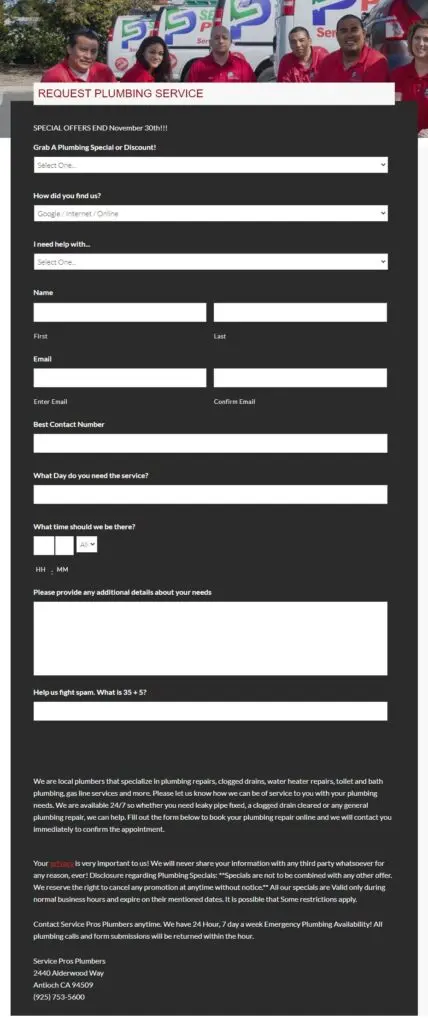
This landing page has entirely too many form fields. We would recommend breaking down this form into a multi-step form and including a progress bar so users know how much more time they're going to be spending filling it out. According to research by Venture Harbour, multi-step forms can lead to 300% more conversions. Wherever possible, limit your form fields to no more than five or break your form into a multi-step form.
Burying Your Call to Action
Some marketers put their call to action so far down their landing page that visitors leave before they get to it. We recommend keeping your call to action and accompanying forms higher up on the page. If your page is on the longer side, it might make sense to repeat your call to action and form at various places later in the page.
Including More Than One CTA
Here, you can see that the landing page includes the main CTA ("Download eBook Now!") as well as a CTA to subscribe to the company's blog. Plus, there are social media icons that visitors can follow without taking the desired action on the page. We recommend sticking to a single call to action on your landing page and including any additional calls to action on a confirmation page or in a follow-up email.
Wrapping Up
A landing page is intended to get a specific action from visitors. They're best used as part of a marketing campaign targeting conversions. While you can use SEO tools to optimize your landing pages for search, you might find it more beneficial to focus on conversions. No matter what you choose, using the tactics included in this article, you'll be off to a great start!


![How to Create a Landing Page [A Step-by-Step Guide With Examples]](https://s.influencermarketinghub.com/imaginary/resize?width=400&height=200&type=webp&url=https://influencermarketinghub.com/wp-content/uploads/2021/01/How-to-Create-a-Landing-Page-With-Examples.jpg)